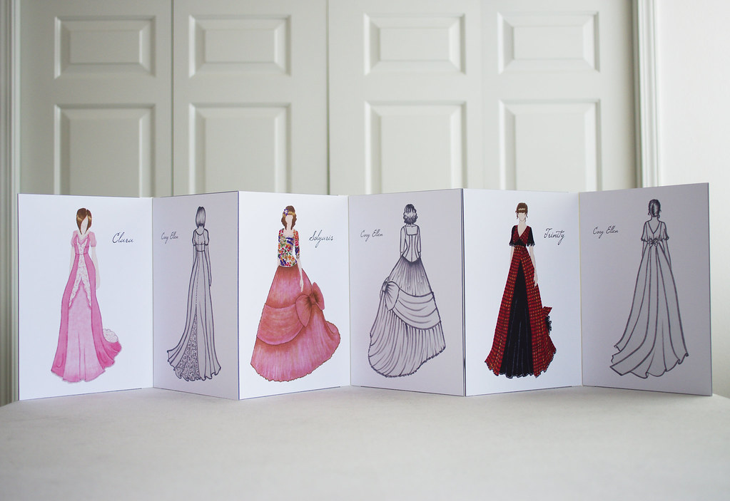
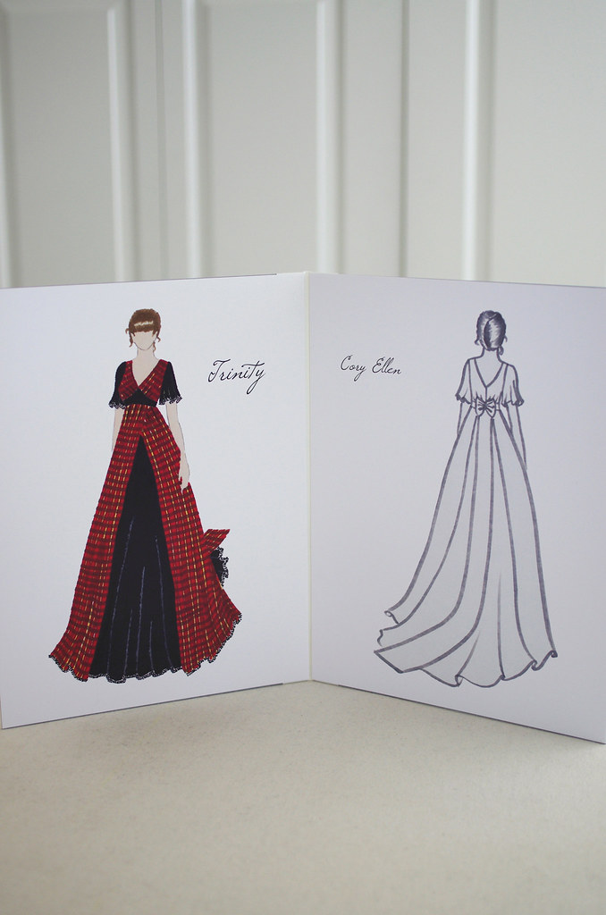
Today I presented my three ballgown designs to the director of NYFA. My presentation has been several months in the making, and I'm very excited and proud of how it turned out! The director will be choosing my gown in the next week or so, but in the meantime, I wanted to share my designs and some of the process behind my presentation.
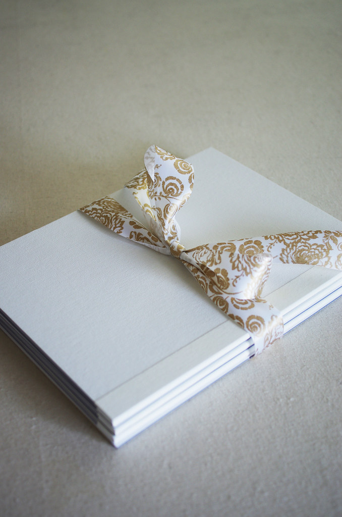
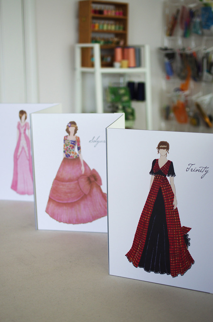
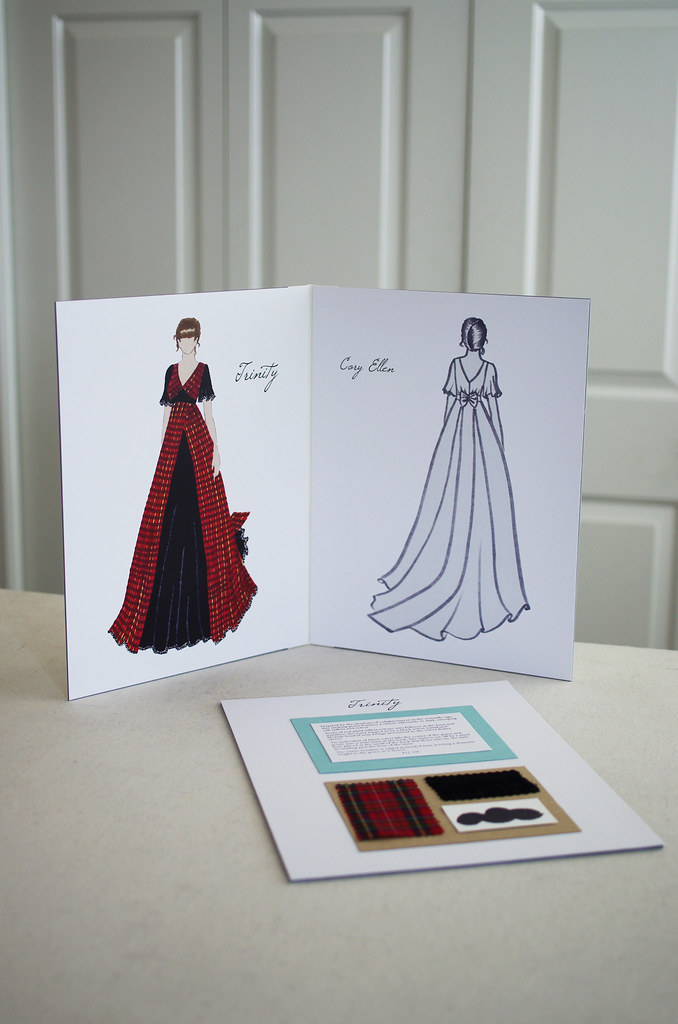
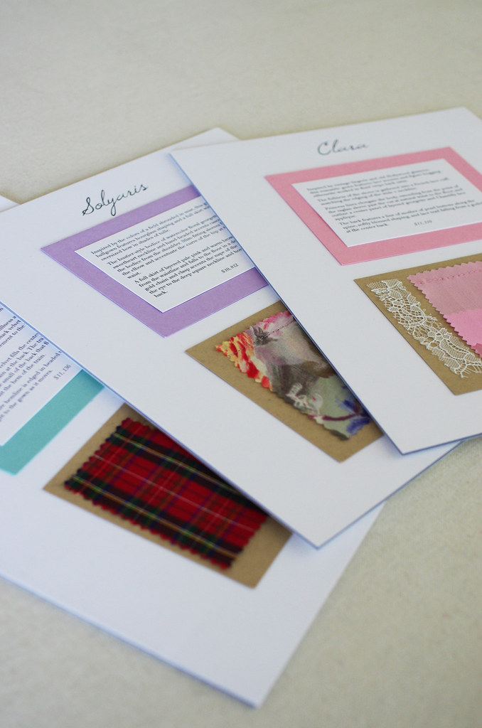
For my presentation, I wanted some very specific things: slightly oversized boards that were still manageable to handle; a clean background, preferably white; carefully reproduced prints of my original illustrations; a balance of consistent and individual elements between the three description boards to tie them all together while also maintaining some distinguishing characteristics. I wanted my presentation to be simple but designed, hand-worked but professional.
I ended up making the presentation boards out of rigid, canvas-lined 9x12" paper boards and bookbinding tape, which allows them to be free-standing. I did each illustration by hand with Copic markers and pencil, scanned and edited in Photoshop, laid out in InDesign, printed professionally on 80-pound cover stock and cropped to fit the boards, and mounted with Glue Dots.
The description boards have the title of each gown printed on the background, with each description mounted on a complementary colored cardmaking paper. I used the same natural brown cardmaking paper for the background of each swatch, punched holes through it with my unthreaded sewing machine, and hand-sewed the swatches on with matching thread.
Overall, the whole process probably cost around $200, which is actually pretty reasonable considering that the gowns themselves are priced around 11K each.
The Designs
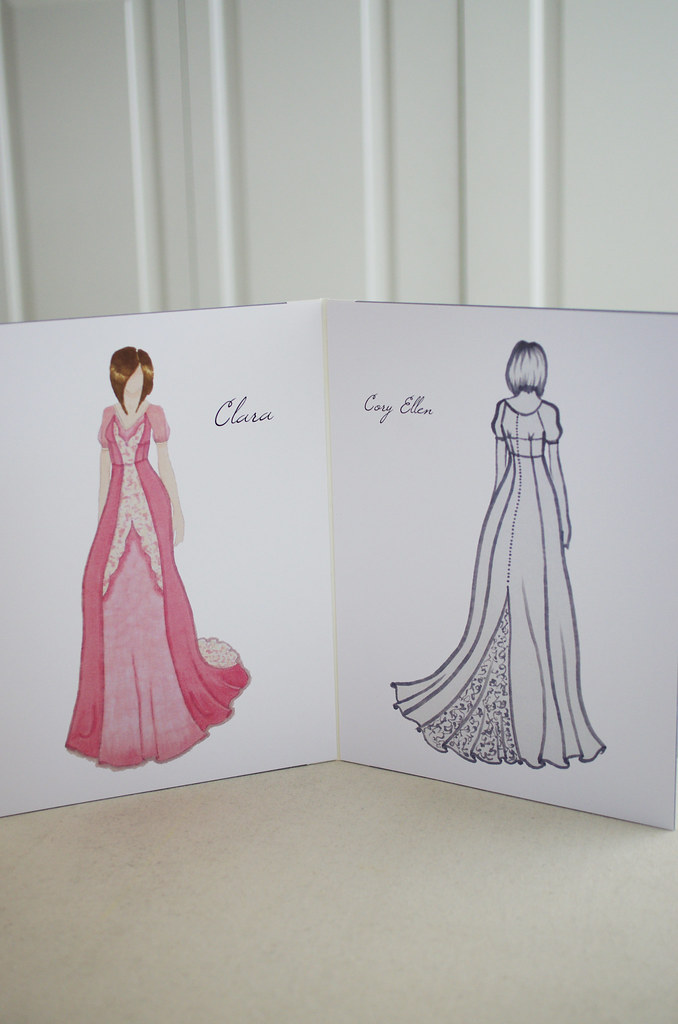
Clara
Clara is the most romantic of the three gowns, named after the main character from the Nutcracker, which was the first ballet I saw as a little girl. The silhouette is drawn from 1930s, and the overall feel of the gown was inspired by old Hollywood glamour and vintage lingerie - think Elizabeth Taylor's iconic slip in Cat on a Hot Tin Roof and slinky bias-cut gowns by Madeleine Vionnet.
This gown is very true to my aesthetic; everything from the shade of soft pink, to the fluidity of the silk crepe back satin, to the lace details, is reflective of my first fashion loves - the girly and the pink and the fluttery. I'm quite taken with the back; the gentle bloused shaping and the way the lace falls from the buttons along the spine. With its elegant shape, classic color, and finely wrought details, Clara represents everything I think a ballgown should be.
Solyaris
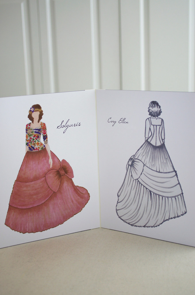
Solyaris came to me in one big whoosh of inspiration one day shortly after we watched the 1972 Tarkovsky film. There was a particular scene where the main character was standing still in a field shrouded in mist, and I realized that the color palette would be absolutely stunning in a gown: veiled purples, soft beiges, and infinite shades of smoky green.
When I revisited a photo of a glorious Dior gown from the 1950s, suddenly it all clicked into place: a fitted bustier-style bodice worked in watercolor floral silk georgette, organic beading details, and a full tulle skirt with an oversized bow. To set off the deep square back and provide some extra stability to the gown, I added a delicate gold chain with a clasp at the nape of the neck. I love the ethereal feel and extravagant silhouette of Solyaris, and since it was the first gown I illustrated, it holds a special place in my heart.
Trinity
Trinity is probably the most stylistically daring gown for me; it's a much darker, texturally interesting design than I usually gravitate towards, but somehow that has made me love it all the more. It was a challenge to design, and as I did, I often thought of Alexander McQueen, gothic horror in the Enlightenment period, and the Manhattan project: the shadows of anxiety around progress and innovation; the necessity of darkness to the experience of light.
For this gown, I drew inspiration for the silhouette from Victorian revival fashion from the 1970s. Black silk velvet seemed like an appropriate choice to set off the light, crisp feel of the red plaid taffeta. With a heavy beaded trim that gives the sleeves and hemline swing and substance, the interplay between textures and color gives Trinity a sense of drama and movement.
________________________
Thank you to everyone who's stuck around since my hiatus - I hope that you enjoyed seeing my designs, and I'll be sure to share when the final gown is chosen. I love all three of these pieces fiercely for very different reasons, so it will be a little hard to let go of the two that aren't chosen, but it's a really exciting prospect to make my ballgown a reality!

