Friday, June 26, 2015

WIP: Nusa

nusawip2 nusawip

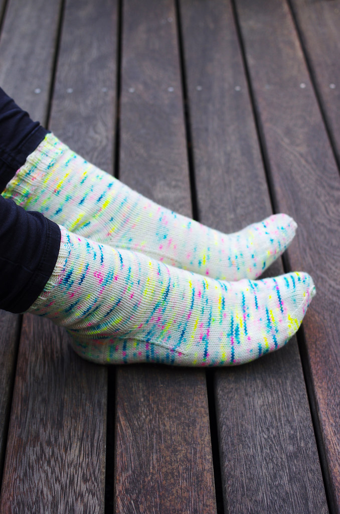
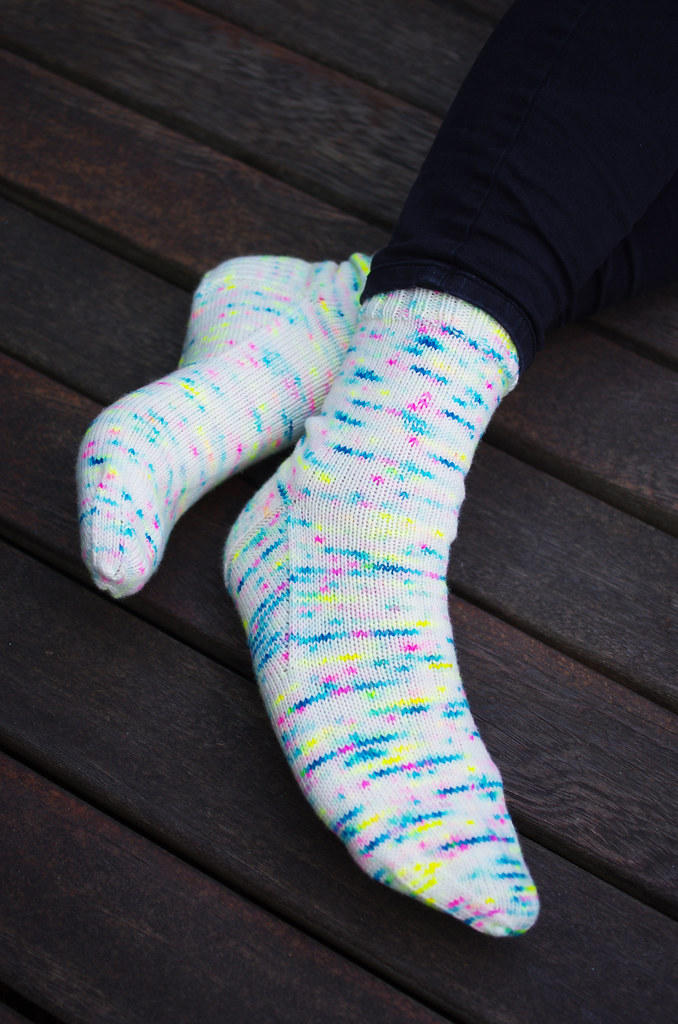
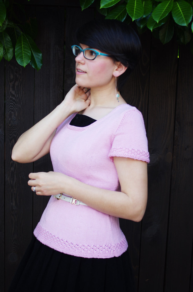
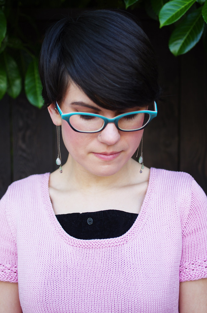
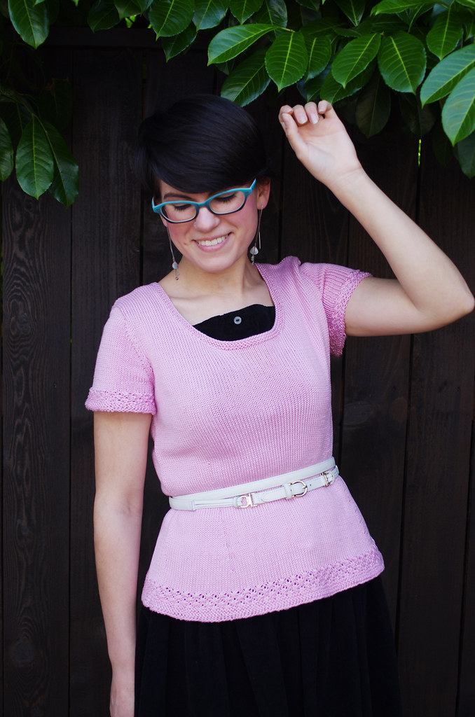
Woomph! It's been a busy couple of weeks here at the Rat Castle. Unpacking, doing laundry, deep-cleaning the old place... blech. Luckily, we're getting close to being done with our old apartment, which means we can start focusing on the new place. We're already learning the quirks of our little house - the slightly tilted floors, the deadbolt that locks a certain way, the basement door that can't quite accommodate a full-sized couch through it - but even so, there's something really nice about caring for a place that we actually own. The other night after dinner, I cut down a thatch of blackberry canes underneath a bush in the front yard, and as dusk settled, I looked back at my work and felt a sort of pride for this lopsided piece of earth that I had coaxed into order. It's a new feeling, that pride, and one that I'm beginning to really enjoy.

(Edited to add: Speaking of Pride, the Supreme Court of the US ruled on Marriage Equality today, which nicely coincides with Pride weekend. I'm so happy and proud for my country, and so happy and proud for my LGBTQ dear ones, I hardly have words. So much love today!)

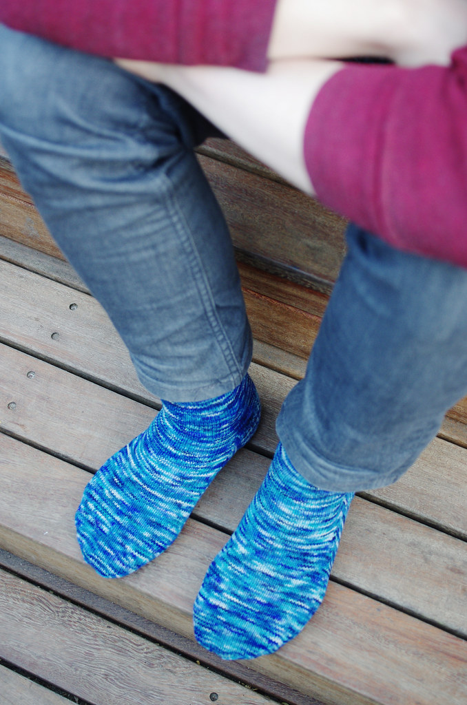
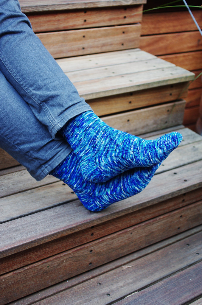
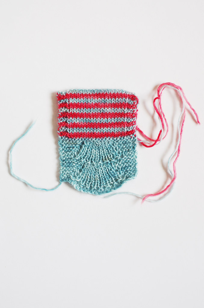
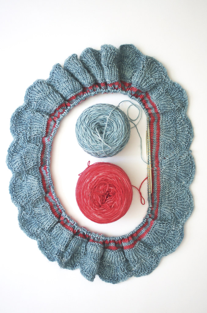
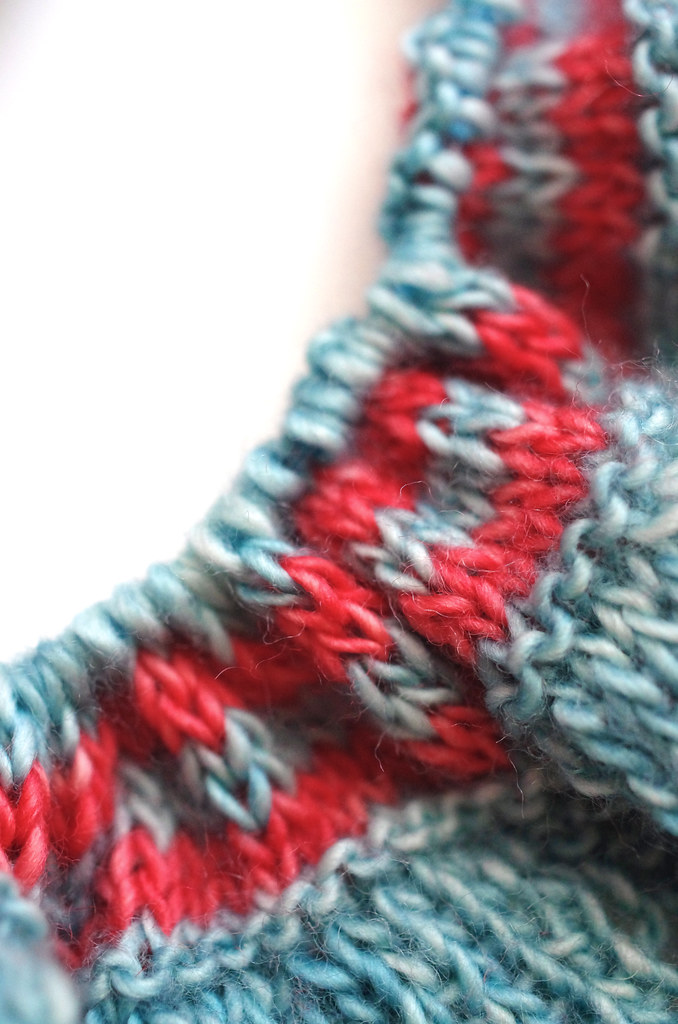
In between all of that, though, I've been working on the Nusa cowl sample - my contribution to the Three Fates Design Challenge - which I started sometime last week and have been steadily humming away on since. I've had to rip it back about 4 million times, specifically at that pesky color join, but now it's on its way! Now I have miles of striped stockinette to knit before I have to think again, thank goodness...

Happy Friday, and happy Pride, friends!
<3
Cory

Wednesday, June 17, 2015

FO: Socks, and More Socks!

Untitled UntitledUntitled Untitled

Even though moving has dominated our free time over the last month, I've managed to fit in some major knitting of the sock variety! I've finished up not one but two pairs of socks in the last few weeks: one for me and one for Lumberjack. They're both plain socks, dead simple to knit, which was perfect for my scattered, exhausted brain. So even though my studio is still covered in boxes, our kitchen is half-unpacked, and the whole house is due for a good vacuuming... at least our feet are nice and warm?

More details on Ravelry here and here.

Happy Wednesday, friends!
<3
Cory

Friday, June 12, 2015

FO: Custom Fit Blouse

Untitled UntitledUntitled Untitled

Oh, this one. I started this Custom Fit blouse a long time ago, probably back in November or so? Knit in Ultra Pima on small needles, this was a physically difficult fabric to create, so it took me quite a while to finish this sweater.

Overall, I'm glad that I went through the process, but the final product isn't quite what I'd hoped. As I've mentioned to many of our Custom Fit customers at the shop, it can take a sweater or two to tweak the pattern to your exact specifications, and my own experience was no different.

As far as my own fit issues go, here's a couple of things I would change, if the thought of tearing out this sweater didn't make me immediately curl up into a ball, pill-bug style:

- The width of the shoulders is very good, but the depth of the armhole is a little bit too much - I can feel the shoulder seams raising up every time I lift my arms. (I also like the armholes on my blouses high and tight, so that's a personal preference thing too.) Easy fix there.

- I did the Close Fitting silhouette, and it's just not fitted enough for my taste. The cotton yarn I used also stretched past my schematic measurements by about an inch total, so that can account for some of it. But even so, the schematic called for 2.5 inches of positive ease in the waist, which is way more than I'd usually prefer. I would have liked to see a very fitted option. As a busty person who can easily look 10-20 pounds heavier with less fitted silhouettes, I prefer to have a skosh of negative ease in the waist in knit blouses, which doesn't seem to be possible with Custom Fit given the sweater templates available. (Other Custom Fit folks, feel free to correct me if I'm wrong about that!)

- Holy cats, the sweep of the hip is huge on this thing! There is so much extra fabric at the hip that it is unwearable with anything but a very full skirt. This is probably a gauge problem, and probably would have been fine if I hadn't gone up a needle size on the Daisy Stitch edging.

Overall, I think Custom Fit is a powerful product for knitters interested in garment construction, particularly prolific sweater knitters. The measuring process is a bit more in-depth, but well worth it for the detailed fit information it provides. I think it's worth it for any knitter to give it a whirl.

For me personally, I'm such a control freak, and I have such specific tastes in silhouettes and fit, that I don't think Custom Fit is the right program for me, and that's okay! I love understanding the nitty gritty details of design and construction, and now I know that I really do want to get my hands dirty with some math to get the fit I want.

And in the meantime, my Custom Fit sweater is gonna go chill at The Fiber Gallery with its Custom Fit sweater buddies.

More details on Ravelry here.

Happy Friday!
<3
Cory

Wednesday, June 10, 2015

Making It Home, Part I: The Studio

 Untitled Untitled

Untitled

Although most of the house didn't require any extra work before we moved in, my studio was the one room that I really wanted to change. The room was lavender, and though it was a lovely color for its former use - the bedroom of the previous owners' young child -  for my purposes, it wasn't quite right. It made the room feel very dark, particularly in the late afternoon, which is when I get a lot of my best work done.

So when I started thinking about a new paint color, I really wanted to consider the character of the room as a whole unit, particularly because it's connected to a beautifully restored 40s bathroom with yellow and sage green fixtures. Although the house was built in 1925, the studio and back bathroom were later additions, which would explain why the bathroom is old, but clearly not original to the house.

I hemmed and hawed over color for a while - do I match the bathroom with a sage green? Do I leave it lavender? Do I go for a soft turquoise? Sure, maybe, I guess. But nothing felt quite right.


The Carlyle - 1250 Ocean Drive (Kichnell & Elliott, 1941.)
Image from Tropical Deco: The Architecture & Design of Old Miami Beach

Untitled

Then one morning, I woke up and realized that the choice was right there in front of me: pink! Because why the hell not? It works well with the Tropical Deco-vibe of the color palette, and it has the added bonus of being my favorite color.

So off to the paint store we went, and got four different shades of pink, from pale to bright. I had always heard that bright color can overwhelm a room really easily, so it's better to err on the side of a lighter color. But as the swatches dried and I looked at all my options, I realized that a bright pink was what I wanted, damn the experts.

Untitled Untitled

But then - as is a risk with any decision that rejects every shred of common sense and conventional experience - in the middle of the process, I was suddenly struck with doubt. It took two coats of paint, and it was hard to cover the lavender, and we had to do some major touch-up work, which added hours of work and wretched anticipation onto the whole project. So there was some late-night painting, and a small amount of crying, and a hefty dose of self-doubt.

And at those moments, I had to remind myself how sure I had felt at the beginning. How carefully I had made the decision. How much preparation and time we had both spent on the project already. And I held onto the hope that at the very least, it would be okay - maybe not perfect, not great, but okay. So we did the work, I held my breath, and I waited for the paint to dry.

And in the end?

Untitled

I shouldn't have worried. I absolutely love it.

Happy Wednesday, friends.
<3
Cory

Monday, June 8, 2015

Three Fates Design Challenge Part II: Color Inspiration

City Lights
Colourful Corals at Maripipi _DSC0526


As I've talked about a bit before, color is an incredibly important part of my design process. Different combinations of colors evoke specific feelings and images to me, which are often paired with a textural or graphic detail. I feel most satisfied with the design process when a material gently suggests its form to me - in contrast to a forced effort on my part to make design elements play together - and coming to this design was rather effortless in that respect.

When I saw my two colors together, they immediately made me think of Nusa Penida, the island off the coast of Bali where I did a Winter Term project during my junior year of college. In reality, the colors I chose are not truly the colors I saw on Nusa; rather, they are a representation of the memory of color. When I look back at photographs, the blue is never as bright as the feeling of it was. In remembered color, there is only the essence of the thing: the blue water, nearly seamless with the sky; the outriggers of the boat we took from Nusa back to Bali, painted red, skating along the water's surface. The feeling of the sun on my neck, the island receding into the horizon.

And that essence was exactly what I wanted to feel when I looked at the design. Using the Creative Commons search filter on Flickr, I was able to find some beautiful photos with the color palette and character I wanted, which you can click through above. Though they're not all pictures of coral and sky, they're true to the feeling that I want to convey.

Untitled

And this is the part where the process gets cool, I think: I took those colors and put them together with a stitch pattern that felt right with the design, and ended up with something that is more than the sum of its parts. When I look at this swatch, I see all sorts of other threads that I never intended to include: the Bear Tracks pattern echoes the shape of a fan of coral; the thin red stripe those outriggers I mentioned; the stockinette a placid ocean, fringed by waves of garter stitch.

So even though I make color choices by instinct pretty early on  - often without a specific image in mind! - they subconsciously guide many other aspects of the design process. Pretty neat!

You can read Ariel's post about color inspiration here.

Three Fates Design Challenge

Part I: Swatching
Cory
Ariel

* all images were collected from Flickr and each are used with permission under a Creative Commons license. These images have not been altered in any way, and copyright belongs to the original authors linked above. Information about the specific Creative Commons licenses for these photos can be found here and here.