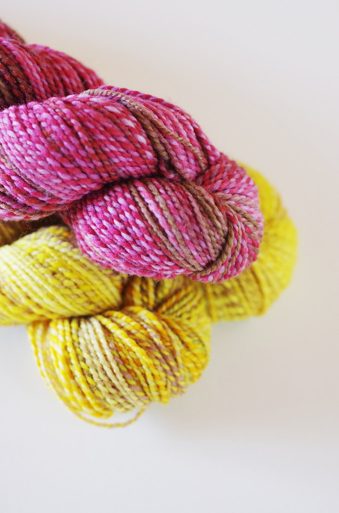
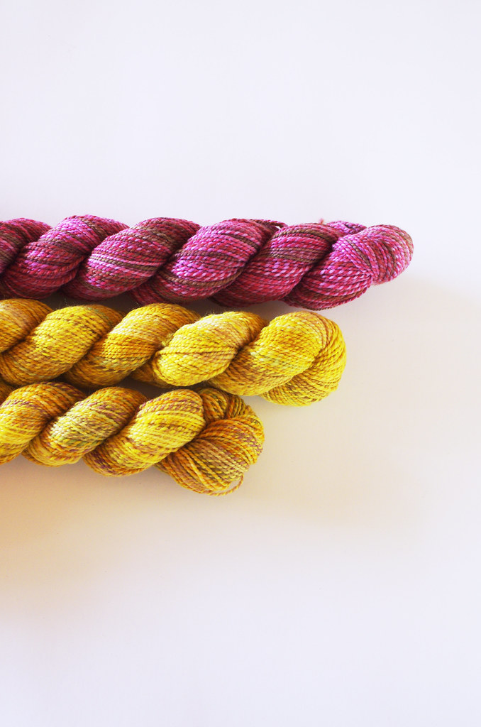
For my new Fireweed, I wanted to choose something really cheerful and fun. I adore color, and my current favorite way to dress is to start with a neutral base layer, and give it texture and light with a colorful accessory or two. Since my original Fireweed is pretty toned-down, I wanted to go in the opposite direction and choose something really bright.
I ended up choosing Narcissus (yellow) and Venus In Furs (pink) - although I was shying away from using one of the same colors again (my other Fireweed is Venus In Furs & Robin's Egg), in the end, my pink-loving self won out. And because each skein of Dyed in the Wool is unique, I was able to find a skein that complemented my two skeins of Narcissus perfectly, without looking exactly the same as my original color choice.
For this color pairing, I was really inspired by two colors that you see in nature together pretty often: gold and pink. Both of my chosen colorways have undertones of brown, even though the overall color is very bright. I loved the contrast of the pink and the yellow, and the saturation of the colors pair very well together.
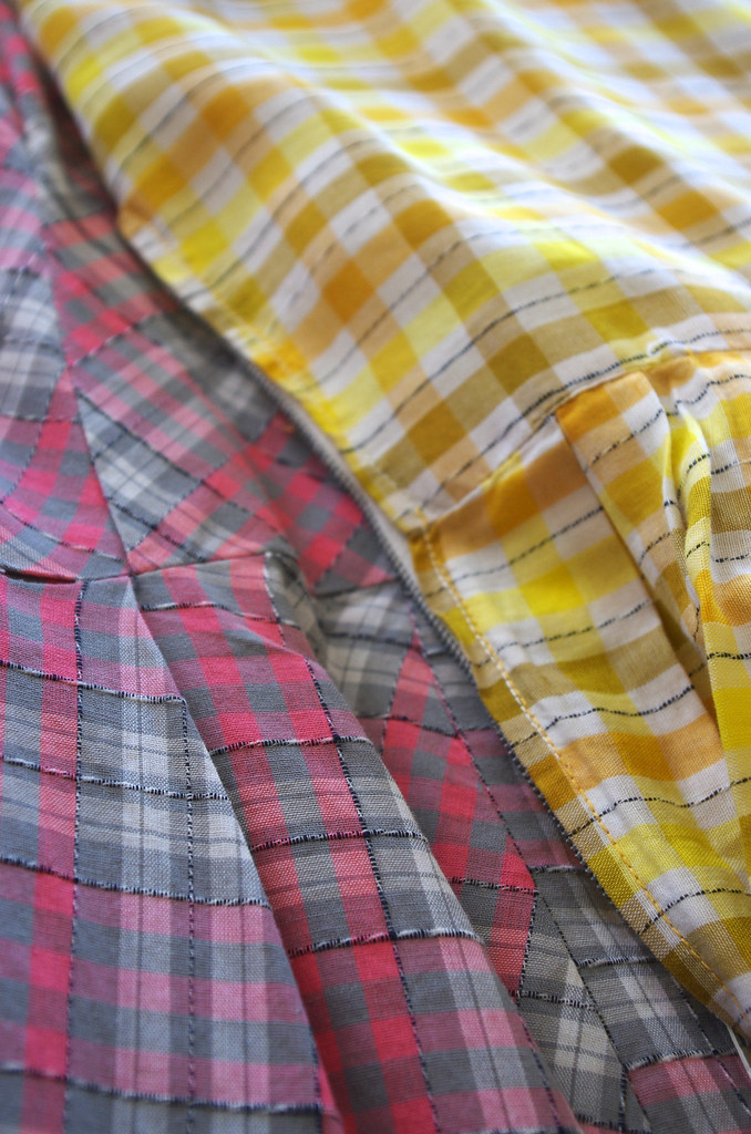
Not sure how to choose your colors? Here's a couple of things that I like to think about when I'm picking colors to use together:
Similar saturation levels. There are definitely exceptions to this, but in general, I like to have similar levels of brightness and saturation in the colors that I choose. It's okay (and even preferable) for them to have different values - for one color to read darker than the other, which you can check by viewing the colors in black-and-white. Or, you can turn it on its head by pairing a bold color and a lighter color together, which lets that bold color really shine!
Complementary colors. Some color pairings are tried-and-true favorites, and they work especially well because of their complementary relationship on the color wheel. Orange and blue! Yellow and violet! Red and green! It can be fun to explore these color relationships by playing with their tints (color + white) or shades (color + black) as well.
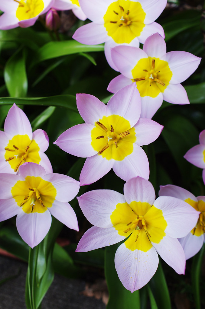
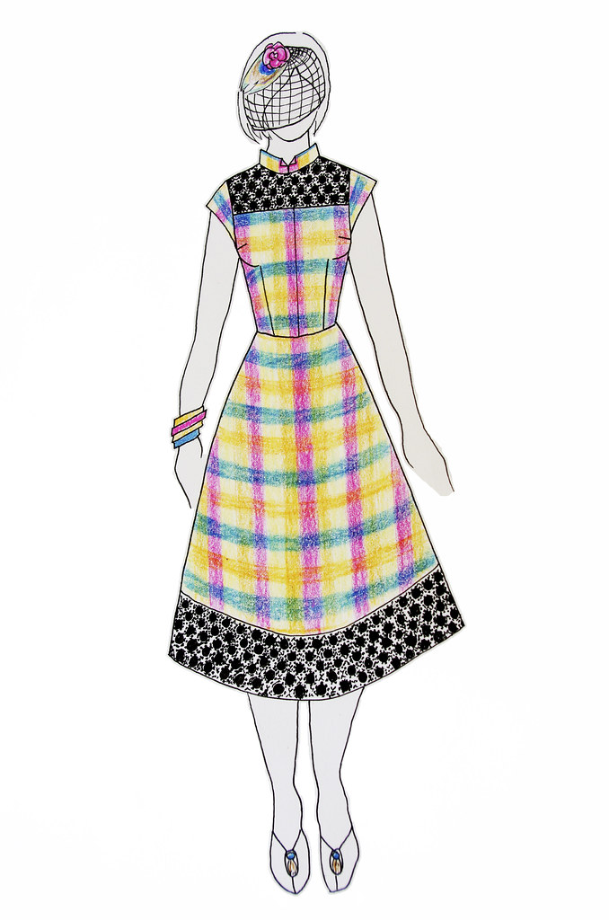
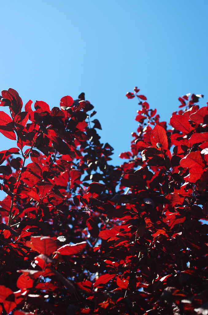
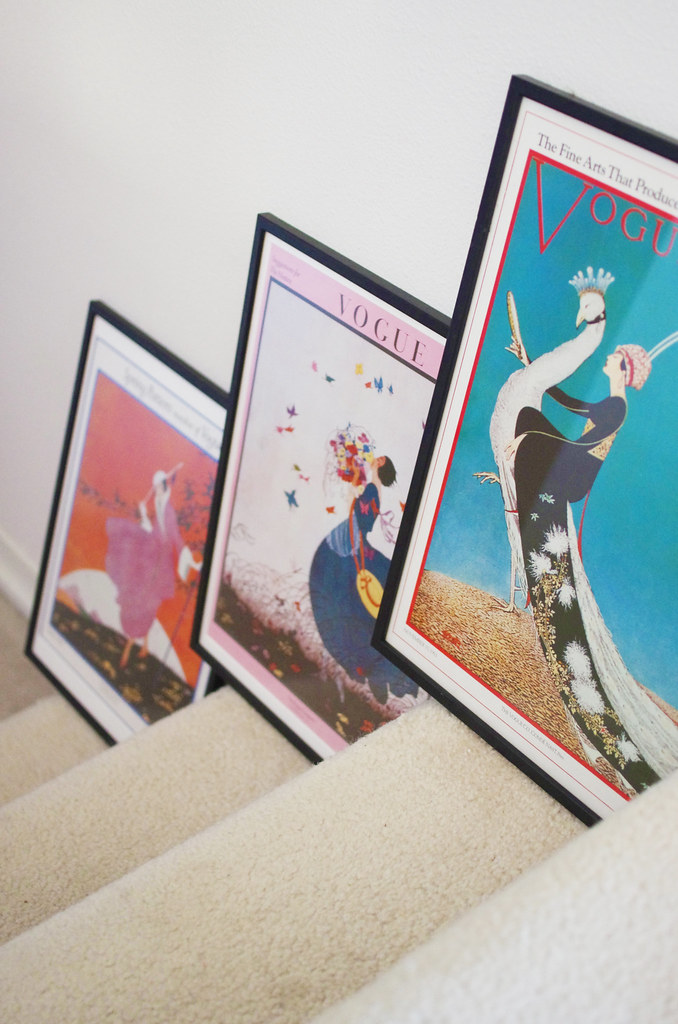
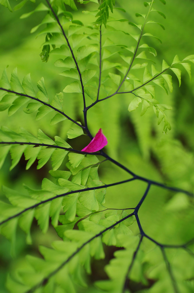
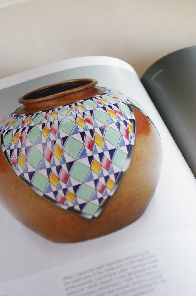
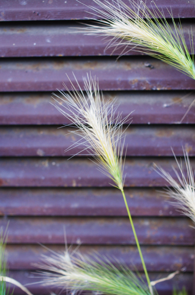
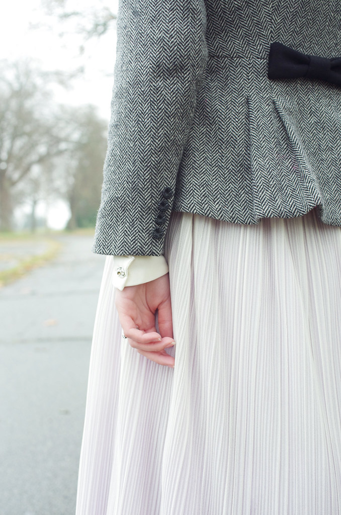
Color inspiration from nature, art, and photography. I really like Knitsonik's approach to color inspiration: the world around you! If you have a favorite piece of visual inspiration - be it a painting, houseplant, or dog breed - you can definitely use it to help you find a direction for your color pairings. Color is such a personal experience, and I know that I always find it most satisfying to work with colors that make my heart sing!
Here I've taken a few photos and pulled color ideas from them, then matched them up with their representative Spincycle colorways. Of course, each skein is different, so these pairings may work beautifully with some skeins but not as well with others, but they could definitely be a jumping-off point if you're not sure which direction to go in! I tried to include super-bright color combinations and more subtle ones, too.
1 / Red & Blue / Devilish Grin & Tangled Up In Blue
2 / Dark Orange & Dark Blue / Rusted Rainbow & Overpasses
3 / Green & Warm Purple / July, July! and Nostalgia
4 / Orange & Mint / End of Summer & Deep Bump
5 / Cool Purple-Grey & Yellow / Pick Your Poison & Narcissus
I've already seen some great color pairings in your Fireweed KAL projects on Ravelry & Instagram! I'm delighted that a bunch of folks from Art of Yarn in Kelowna, BC will be joining us on our KAL adventure as well. (Hi friends!)
You have until next Friday, September 25th at 11:59 pm to post on the Ravelry thread, or to Instagram with #fireweedkal, for a chance to win a copy of Lupine - but don't fret, you're welcome to join the KAL even if you don't make it in time for the giveaway!
Hope you all have a very happy Friday!
<3
Cory

2 comments:
Looking forward to the KAL in Kelowna!!
The sample I saw made up at Serial Knitters was just soooo beautiful - and now I see this KAL!!! You created the perfect synergy between a pattern and yarn with this!
Post a Comment