
For the second post in the Stitchjones Design Challenge series with Ariel and Noriko, we're all taking on the subject of styling brights. Color tends to have strong personal resonance with folks, and bright color in particular can be tricky to style. I'm always delighted when I see customers at the shop wearing bright, funky frames or colorful outfits, but I've also noticed that bright color can be a bit intimidating for those who'd like to try it, but aren't sure how to jump in.
My #1 piece of unsolicited advice for those folks is: if you open your heart up to color, it will love you back. It may sound silly, but I always find that open and heartfelt expression of self is radiant in any color, no matter what the rule books say about that shade of blue. Find the things that make your heart skip a beat, and wear them with joy.
But beyond that, what about actual styling? Well, for my own part, I love wearing color - the brighter the better - so I thought I'd share some of my favorite ways to bring color into an outfit. These are just a few things that have worked for me, so if you have any brilliant color matching secrets, please feel free to let me know in the comments!
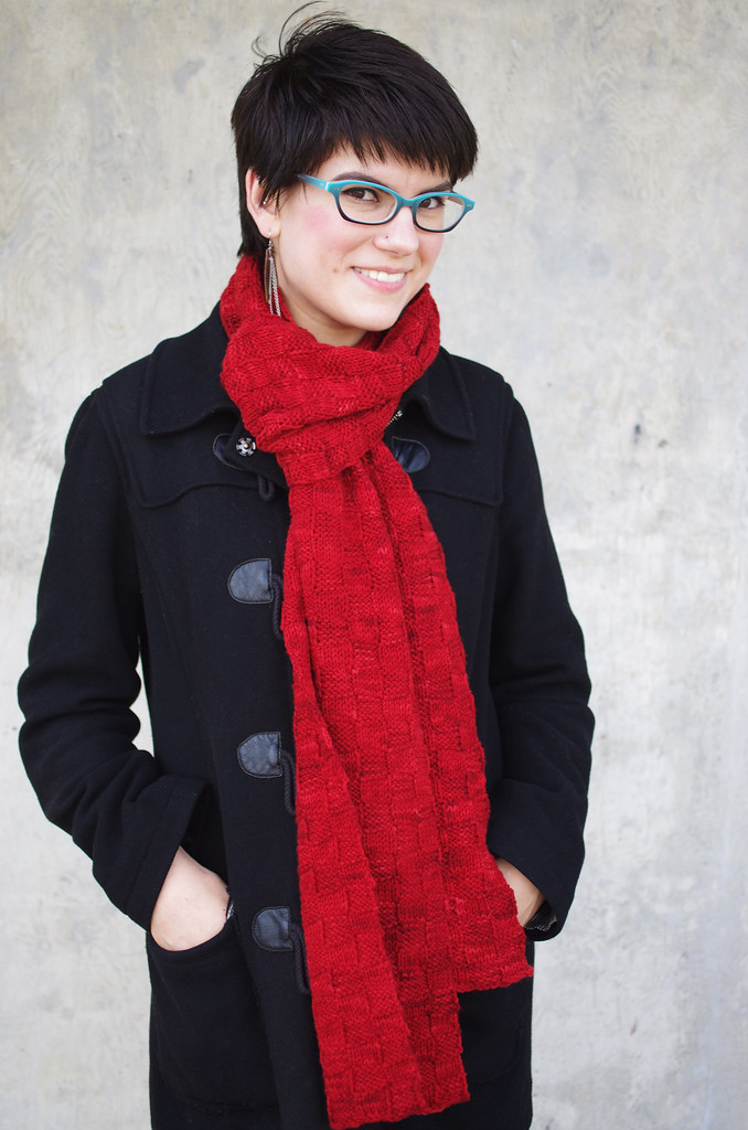
Accent: Choose a neutral outfit and let strongly colored accessories be a focal point.
As I've streamlined my closet over the last six months, I've started noticing a major feature that was pretty surprising, considering my love of color: I wear a lot of black, white, and grey! Once I thought about it, though, it makes a ton of sense. When I start with a layer of neutral, it brings a bright accessory into focus without so much visual competition.
This method can be quite striking while still feeling sophisticated - I always feel so fancy when I wear all-black! - and it's super easy to do, since you don't have to coordinate your accessory with another color in the outfit.
Your neutral doesn't have to be black or grey, either, you can definitely do this with warmer browns and beiges, but the overall look may feel a bit softer.
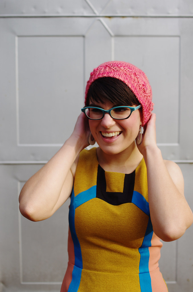
Echo: Pick up a coordinating color within a print using accessories or layers.
I'm a sucker for prints, especially when they use a variety of different colors. This opens up all sorts of opportunities to play with more color in accessories and layers, since you can coordinate with a main color, or pick up on some of the subtler colors in the print. On the left, I coordinated with the coral in the side panels; on the right, with the teeny little dots of forest green in the bodice. Magic!
In general, I find this to be a great starting point for coordinating colors; if you liked the print enough to bring it into your closet, that means the designer did a good job putting those colors together, and that means you can and should totally bogart their color sense. You can also file away one of those color combinations for a future outfit.
Or, y'know, put that color next to your face and rock the shit out of it anyways.
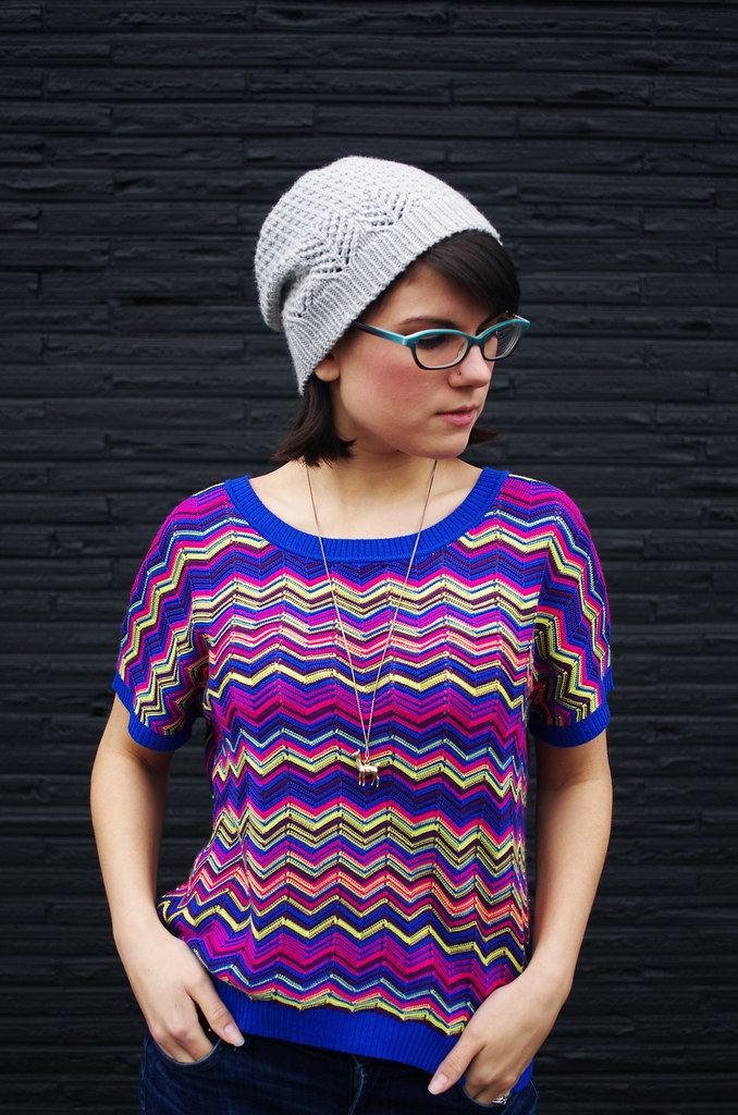
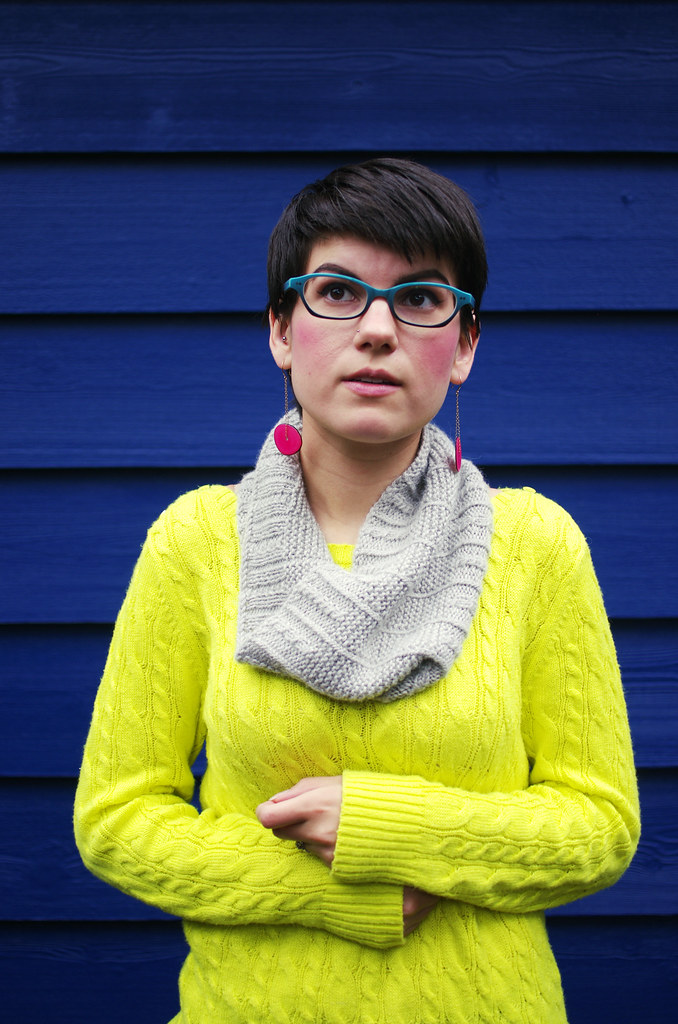
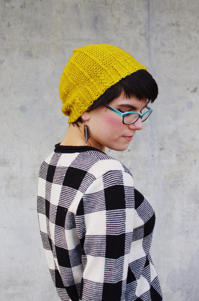
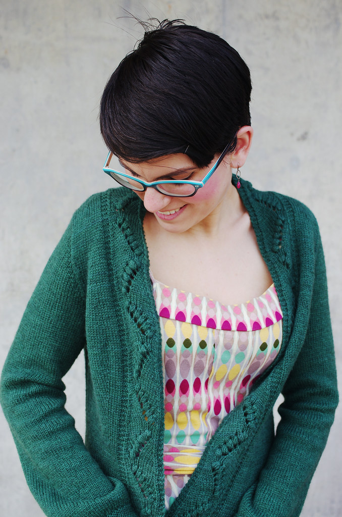
Soften: Add neutral accessories to balance color impact.
Sometimes your outfit is bold and bright on its own, and you want to complement it without going overboard. This is where neutral accessories come in for me - they're like little palate cleansers that you can add to balance out a strong color, unusual cut, or wild print.
To me, the beauty of a bold design element is not just in the thing itself, but also in its relationship with the world around it. In my photography style, that often means high-contrast color or juxtaposition of subject matter - a light color against a dark wall, or a structurally interesting piece against a soft, natural background - and in styling outfits, the same ideas apply, but you have the added element of texture to play with as well.
You can balance a fabric with a jagged print with a cashmere hat; a tailored dress with a light, voluminous mohair wrap; a chunky hat with a delicate lace blouse. All of them contain a relationship of contrast, which allows the eye to focus on the beauty of each element without getting overwhelmed by similarity.
-----------
Thanks for reading, friends! Ariel and Noriko's posts are listed below under Part II, and I hope you'll pop over and check them out.
Stitchjones Design Challenge
Part I: Interviews with Stitchjones
Part II: Styling Brights
1 comment:
These are such great ideas - many of which I have never considered. Thanks!
Post a Comment