
As I've talked about a bit before, color is an incredibly important part of my design process. Different combinations of colors evoke specific feelings and images to me, which are often paired with a textural or graphic detail. I feel most satisfied with the design process when a material gently suggests its form to me - in contrast to a forced effort on my part to make design elements play together - and coming to this design was rather effortless in that respect.
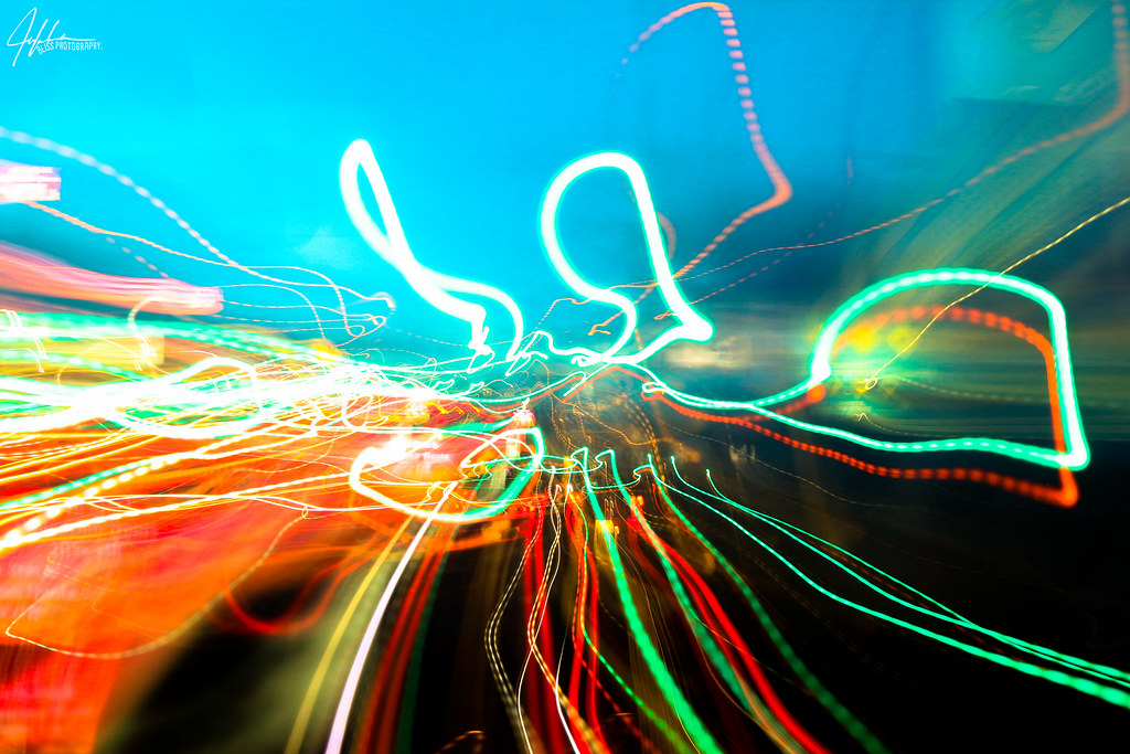
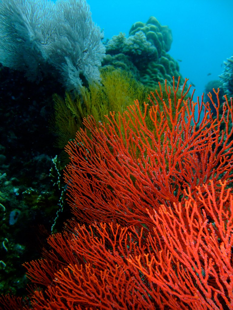
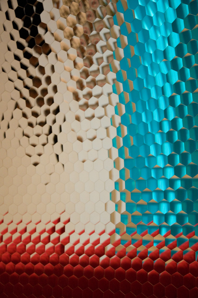
When I saw my two colors together, they immediately made me think of Nusa Penida, the island off the coast of Bali where I did a Winter Term project during my junior year of college. In reality, the colors I chose are not truly the colors I saw on Nusa; rather, they are a representation of the memory of color. When I look back at photographs, the blue is never as bright as the feeling of it was. In remembered color, there is only the essence of the thing: the blue water, nearly seamless with the sky; the outriggers of the boat we took from Nusa back to Bali, painted red, skating along the water's surface. The feeling of the sun on my neck, the island receding into the horizon.
And that essence was exactly what I wanted to feel when I looked at the design. Using the Creative Commons search filter on Flickr, I was able to find some beautiful photos with the color palette and character I wanted, which you can click through above. Though they're not all pictures of coral and sky, they're true to the feeling that I want to convey.
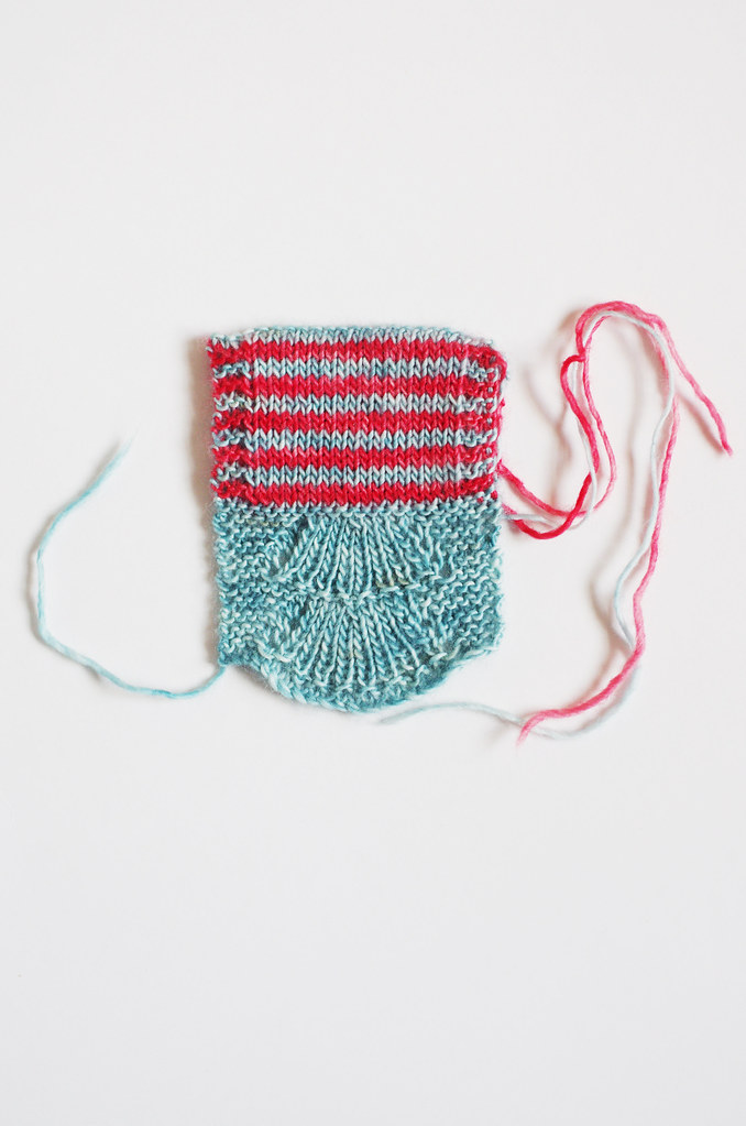
And this is the part where the process gets cool, I think: I took those colors and put them together with a stitch pattern that felt right with the design, and ended up with something that is more than the sum of its parts. When I look at this swatch, I see all sorts of other threads that I never intended to include: the Bear Tracks pattern echoes the shape of a fan of coral; the thin red stripe those outriggers I mentioned; the stockinette a placid ocean, fringed by waves of garter stitch.
So even though I make color choices by instinct pretty early on - often without a specific image in mind! - they subconsciously guide many other aspects of the design process. Pretty neat!
You can read Ariel's post about color inspiration here.
Three Fates Design Challenge
Part I: Swatching
Cory
Ariel
* all images were collected from Flickr and each are used with permission under a Creative Commons license. These images have not been altered in any way, and copyright belongs to the original authors linked above. Information about the specific Creative Commons licenses for these photos can be found here and here.
When I saw my two colors together, they immediately made me think of Nusa Penida, the island off the coast of Bali where I did a Winter Term project during my junior year of college. In reality, the colors I chose are not truly the colors I saw on Nusa; rather, they are a representation of the memory of color. When I look back at photographs, the blue is never as bright as the feeling of it was. In remembered color, there is only the essence of the thing: the blue water, nearly seamless with the sky; the outriggers of the boat we took from Nusa back to Bali, painted red, skating along the water's surface. The feeling of the sun on my neck, the island receding into the horizon.
And that essence was exactly what I wanted to feel when I looked at the design. Using the Creative Commons search filter on Flickr, I was able to find some beautiful photos with the color palette and character I wanted, which you can click through above. Though they're not all pictures of coral and sky, they're true to the feeling that I want to convey.
And this is the part where the process gets cool, I think: I took those colors and put them together with a stitch pattern that felt right with the design, and ended up with something that is more than the sum of its parts. When I look at this swatch, I see all sorts of other threads that I never intended to include: the Bear Tracks pattern echoes the shape of a fan of coral; the thin red stripe those outriggers I mentioned; the stockinette a placid ocean, fringed by waves of garter stitch.
So even though I make color choices by instinct pretty early on - often without a specific image in mind! - they subconsciously guide many other aspects of the design process. Pretty neat!
You can read Ariel's post about color inspiration here.
Part I: Swatching
Cory
Ariel
* all images were collected from Flickr and each are used with permission under a Creative Commons license. These images have not been altered in any way, and copyright belongs to the original authors linked above. Information about the specific Creative Commons licenses for these photos can be found here and here.
No comments:
Post a Comment