Showing posts with label design challenge. Show all posts

Wednesday, July 27, 2016

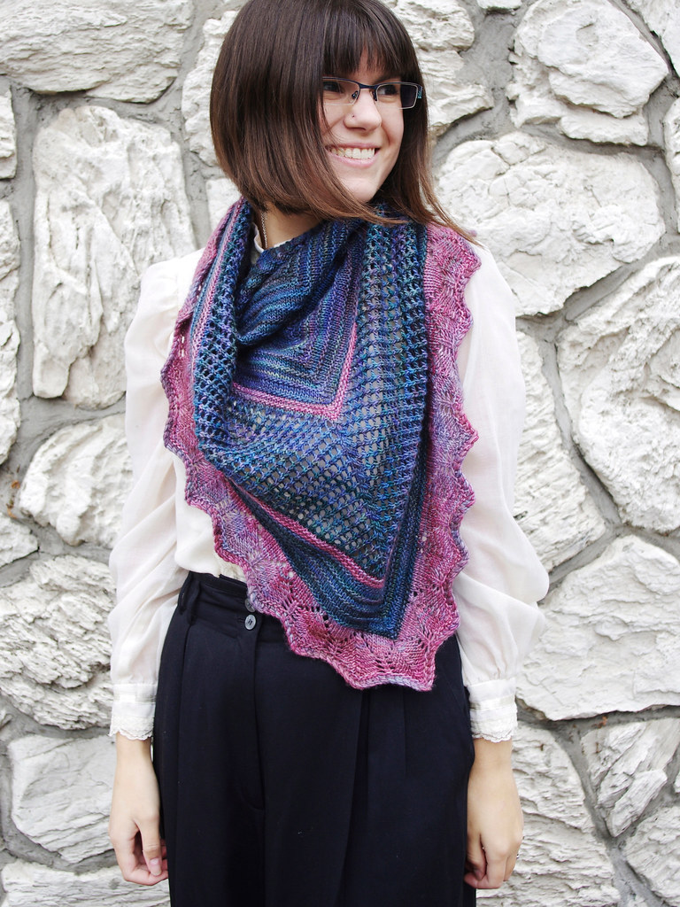
Stitchjones Design Challenge Pattern Release: Pow!

pow5 pow2pow pow3

Aside from a moment in college when I wore slacks and plain t-shirts every day, I've noticed that I choose things based on a deep, irrational pull that I've felt towards them, even - or maybe especially? - if they're the weirdest thing I've ever seen. Glittery trapeze dress? Yes. Pants in a neon tropical fish print? Yesss. This boxy rayon dress with pockets and a checkerboard/rose/watercolor design on it? Yessssss!!!!

And thinking back on it, I had these kinds of clothes as a kid, too: a turquoise t-shirt with frolicking dolphins on it, a white crocheted dress, a pair of hot pink jelly shoes. I couldn't describe why I loved these things, only that I did.

More and more, I've grown to trust that intuition - to design based on what I feel pulled towards, like a weirdo plant leaning towards the sun.

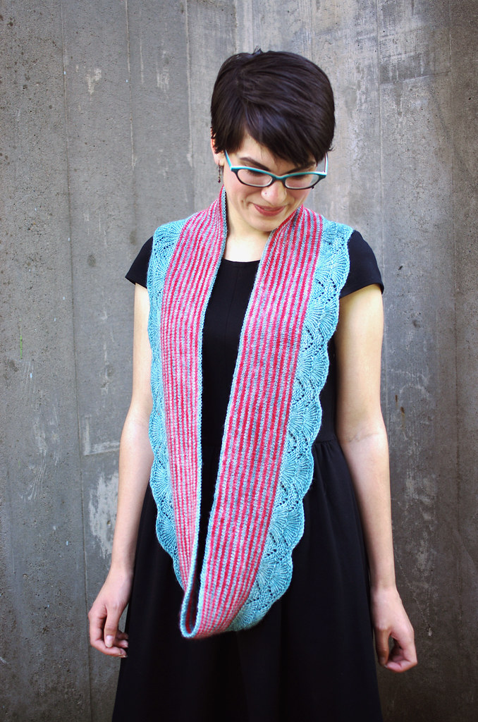
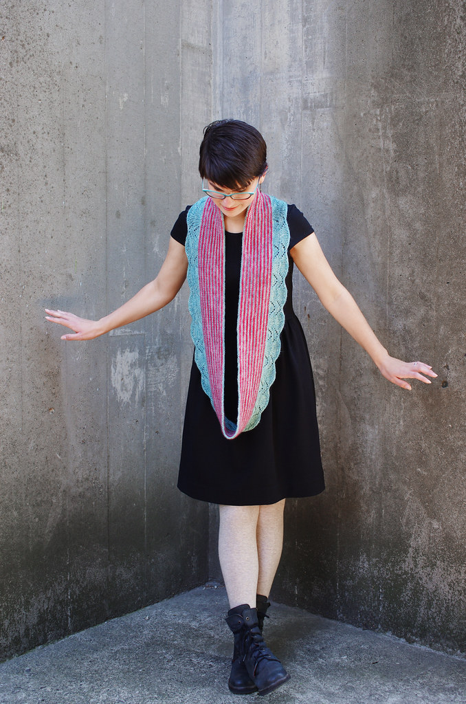
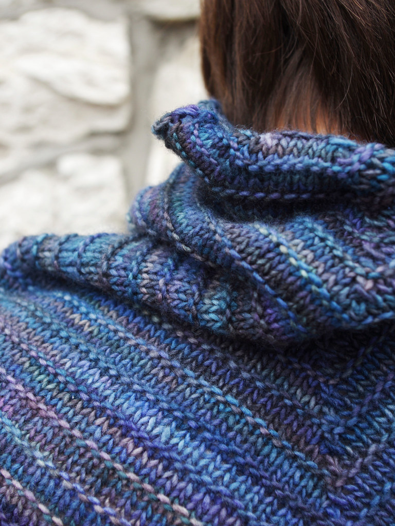
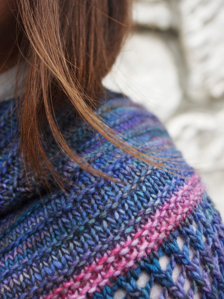
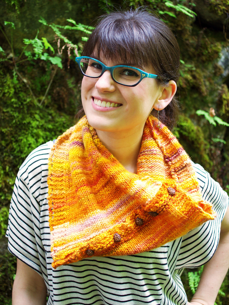
And so, in honor of that: here's Pow! It came to me as a feeling: a sense of joy and playfulness, a picture drawn in comic-book dots - and for an extra bit of fun, Sharon from Stitchjones and I chatted and decided to name the colorway Jelly Shoes. :D

I hope you like it as much as I do!

It's available for download for $6.00, or you can check out the details on Ravelry on the Pow! pattern page.


Happy Wednesday, friends - and if you haven't already, don't forget to check out the other Stitchjones Design Challenge posts below, including the link to Noriko's awesome mitt pattern, Torrance!

<3
Cory

Stitchjones Design Challenge

Part I: Interviews with Stitchjones

Part II: Styling Brights
Noriko
Cory

Part III: Patterns!
Noriko - Torrance mitts (Ravelry)

Wednesday, January 20, 2016

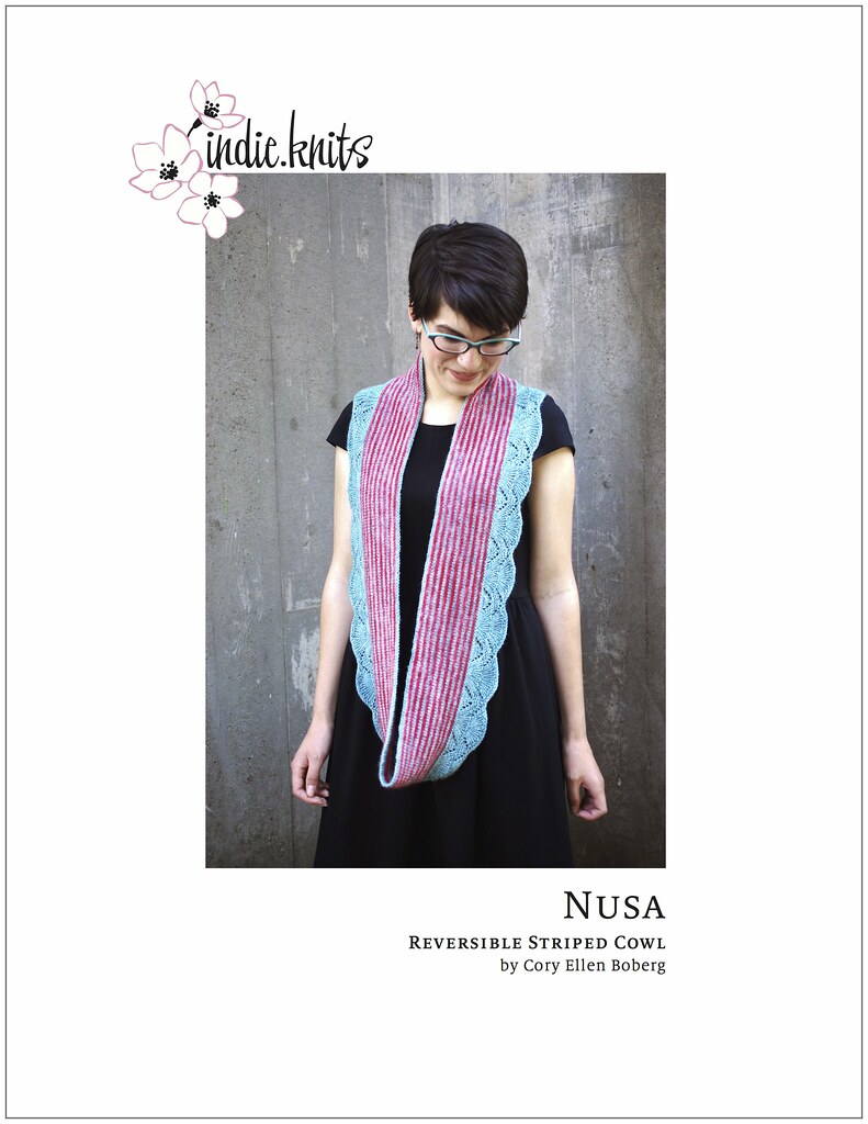
Pattern Release: Nusa

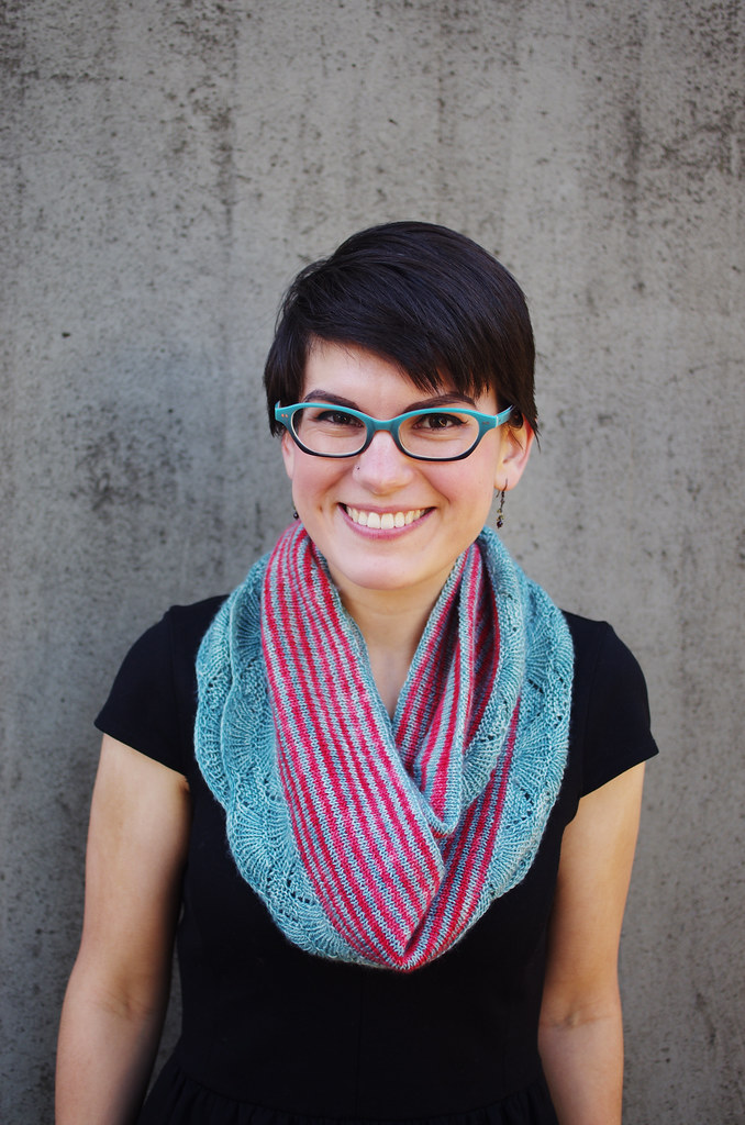
Nusa (Release Front)

Seven years ago this month, I spent three weeks on an island off the coast of Bali, a place called Nusa Penida. In my time there, I helped chop a jackfruit; rode on the back of a motor bike down to the market to buy oil and shallots; ate stale sweet crackers on the front porch with an older woman who taught me to spin thread from slivers of cotton and giggled when I made mistakes, which was often. I listened to Junior Wells on a dying iPod and took naps on the couch while the rain rolled over the hills to the sea.

It remains one of the most beautiful and formative experiences of my life, one whose meaning I can barely touch with words. But what has stayed with me are the memories of heat and taste and color: the glint of the big silver diving platform in the harbor; the air so thick with moisture you could feel its weight on your skin like a cat; greens heavy with spices that made my whole chest ache with heat for hours afterward.

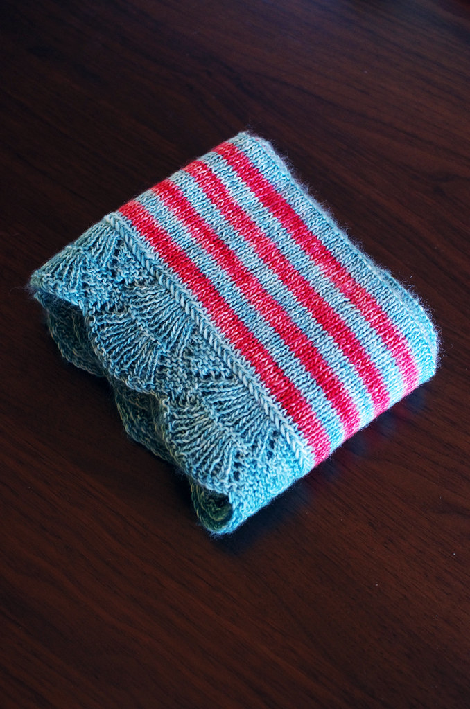
In the shorthand of my memory, Nusa Penida is turquoise and red and gold, a continue loop of land and water meeting - and so it seems fitting that my woolen Nusa should be composed of the same stuff. I hope it brings you a bit of sunlight too.

nusashoot7Nusa (Release Back)

The pattern is available for download for $6.00, or you can check out the details on Ravelry on the Nusa pattern page.


Huge thanks to my test knitters, whose thoughtful feedback and gorgeous projects make my job a million times prettier and more fun. <3

Happy Wednesday, friends!
Cory

Friday, October 30, 2015

Stitchjones Design Challenge Part I: Q&A with Sharon of Stitchjones

stitchjonesinterview stitchjones2

I'm excited to announce a third collaboration with Ariel of Stariel Knits - and this time our friend Noriko of Norichan Knits is also joining the fun!

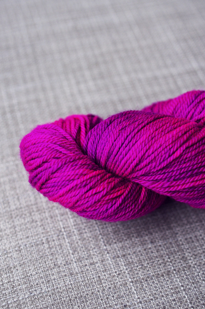
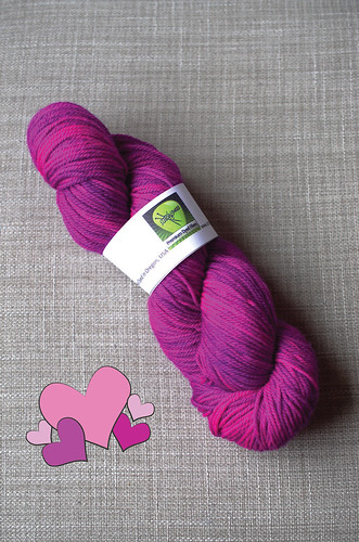
We're delighted to welcome Sharon of Stitchjones as our featured dyer, and with her help, we've cooked up a series of custom, Lisa-Franktastic colors to design with! We're working with her Merino Sock, a squooshy, fingering weight superwash merino base. And - who's surprised? - my custom colorway is fluorescent pink.

For our first post, Sharon has graciously agreed to answer a set of questions from each of us. Since I adore color and all of the stories behind it, I asked Sharon a little bit about her relationship with color and dyeing. Without further ado, here's the interview:

Cory: I love how bright and fun your colors are! If you could describe your color sense in three words, what would they be?

Sharon: (Thank you!) Happy, Vibrant, Childlike.

For this project, Ariel, Noriko, and I were really inspired by the fluorescent colors of Lisa Frank illustrations, which were all the rage with school kids in the 1990s. Where do you usually draw your color inspiration from?

Primarily from music and nature, although inspiration also comes to me from international culture, pop culture and fashion. 

Often, artists and makers practice in several different media before they find their favorite - I started with cross stitch and drawing as a kid, then made the leap to knitting right before college. What did your path to dyeing look like, and what was the moment that you realized that it was your thing?

I didn't become an indie dyer until I was in my 50's, but I loved yarn even before learning to knit, and I did some embroidery as a child. Once my daughter was in school I became very serious about knitting. I fell in love with natural fibers and hand dyed yarns. After some experimenting with acid dyes, I became hooked very quickly! A wonderful LYS in Portland (Twisted) began selling my yarns on consignment, and Stitchjones progressed from there. I began eight years ago, what an amazing ride it's been. 

Print

I always have a new color I'm excited about - right now it's lavender-grey - but at the end of the day, pink is my first love. What's your favorite color at the moment, and are there any other colors that stick with you?

So hard to pick just one color! I'd have to say that right now, it's turquoise. I'm finding so much fascination with nailing the right concentration of turquoise dye that looks stunning by itself and also sets off the other colors around it. Pink is a perennial favorite too, I love all shades of pink, and never get tired of seeing how many different pinks I can mix up.

Thank you so much for participating in the collaboration, Sharon! I'm super excited to start the design process with my amazing pink yarn!

Thanks, Cory!

And there you have it - huge thanks to Sharon, fellow pink-lover and dyer extraordinaire! You can check out her pretties on the internet over here:


And the other interviews over here:


Happy Friday, friends!

<3
Cory

Friday, October 9, 2015

Three Fates Design Challenge Part IV: Testing, Testing!

nusashoot1 nusashoot7nusashoot4 nusashoot

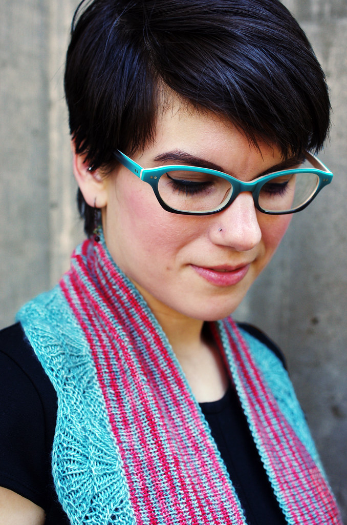
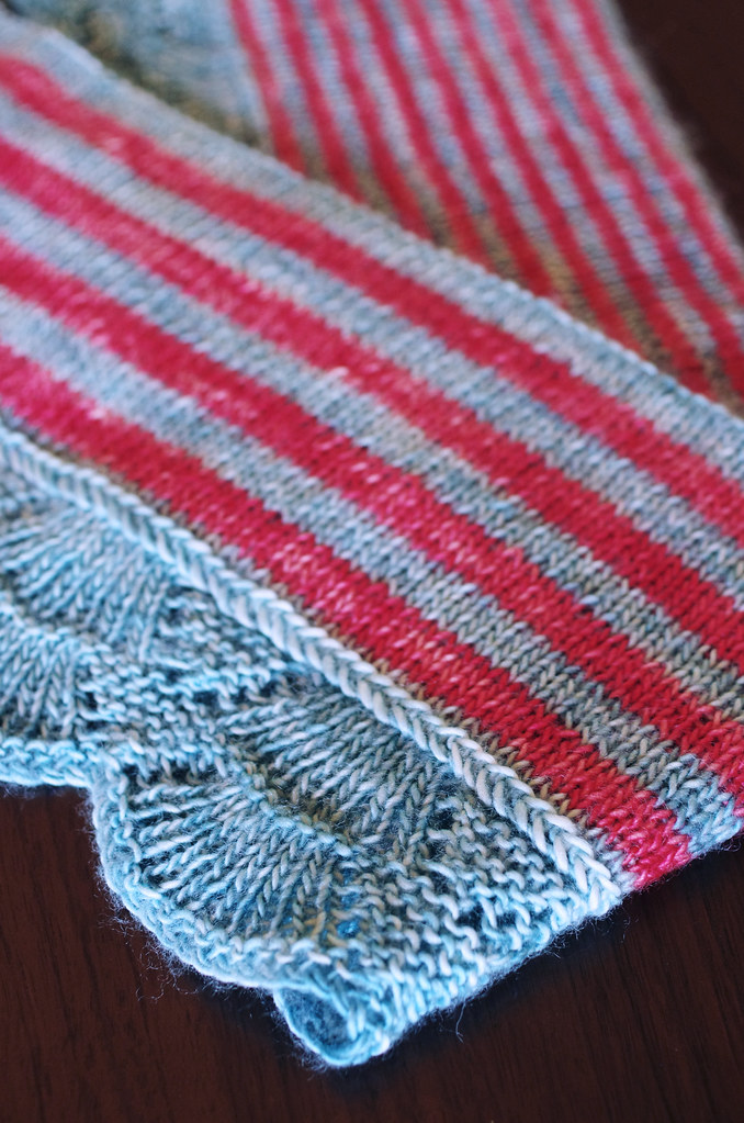
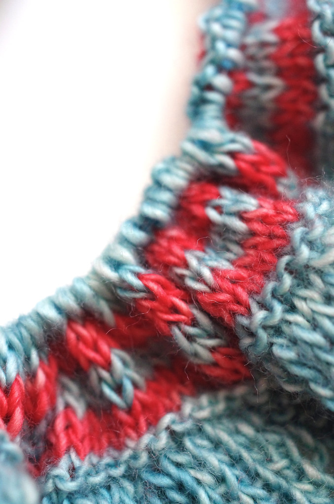
At long last, the Nusa cowl is ready for testing! As you may have noticed, in the end I decided that the reversible feature of the cowl was too cool (and too functional) not to do - it creates a fabric that is substantial but not bulky, and makes both sides tidy and beautiful. Plus, there's two different stripe combinations, so you can choose your own adventure when getting dressed in the morning! There's a bit of sewing involved, but it's all outlined in the pattern.

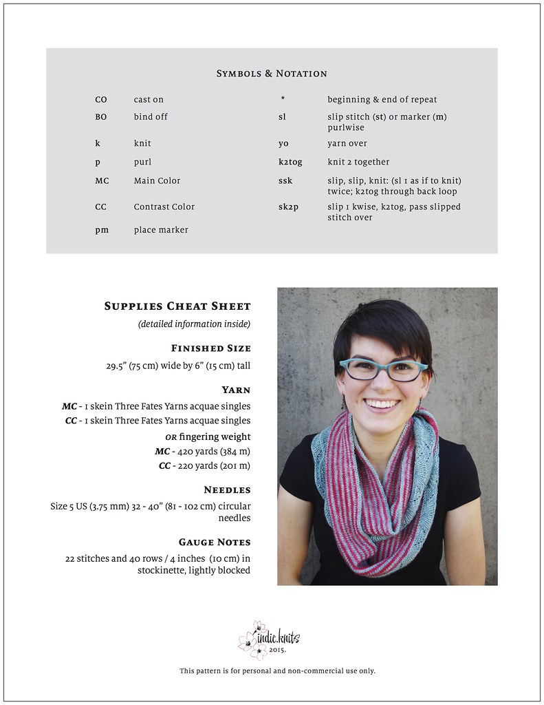
Interested in test knitting? I'd love to have ya! I used one skein each of Three Fates Yarns aquae fingering in colorways Mt St Helens and Netarts, or you can substitute another fingering weight - about 420 yards of the Main Color and 220 yards of the Contrast Color.

Feel free to drop me a line at cory at indieknits dot com if you're interested in test knitting.

Ariel's pattern is also ready for testing, and you can take a look at her post over here.

Happy Friday, friends!
<3
c.

Friday, October 2, 2015

Sneak Peek: Nusa

 nusafo3 nusafo2

Woohoo, the Nusa cowl sample is finished! Now, it just needs some photography and pattern editing before it's ready for test knitters. And of course, I'm already thinking about knitting a second one. I have a funny habit of knitting all of my designs at least twice - usually I'm so harebrained during the first sample that it's nice to slow down and make it as a knitter, not as a designer, for the second. I already have some yarn wound up for it and everything. With a big, deadlined sample on the needles right now, I'll probably be daydreaming about it all weekend.

Happy Friday, friends!
Cory

Monday, July 13, 2015

Three Fates Design Challenge Part III: Photography & Aesthetic

   Hi friends! As I start thinking about styling and shooting photos of the Nusa cowl - my contribution to the Three Fates Design Challenge with Ariel - I wanted to talk a little bit about the photography and overall aesthetic of my work. Whenever I begin to approach the task of visually representing a design, these are always the avenues that I explore first.
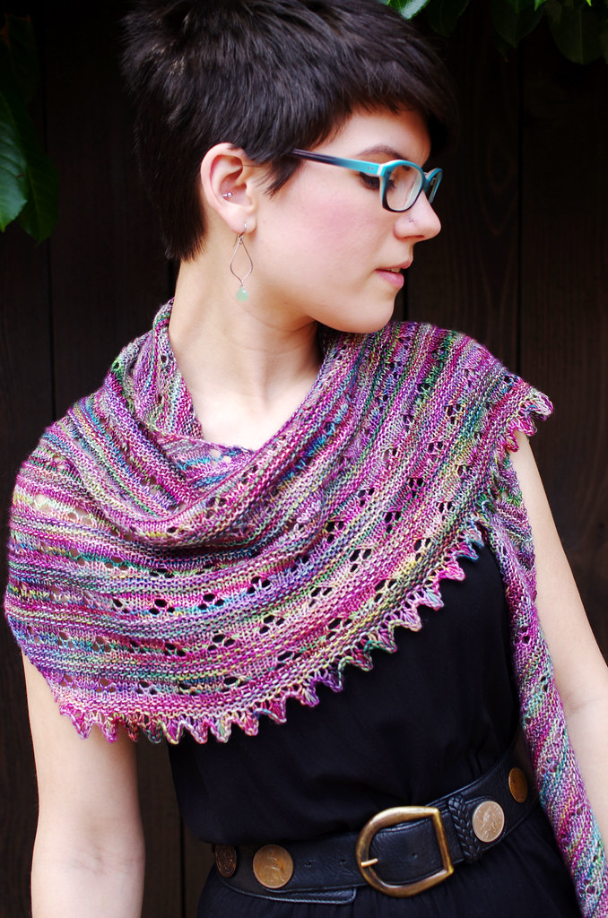
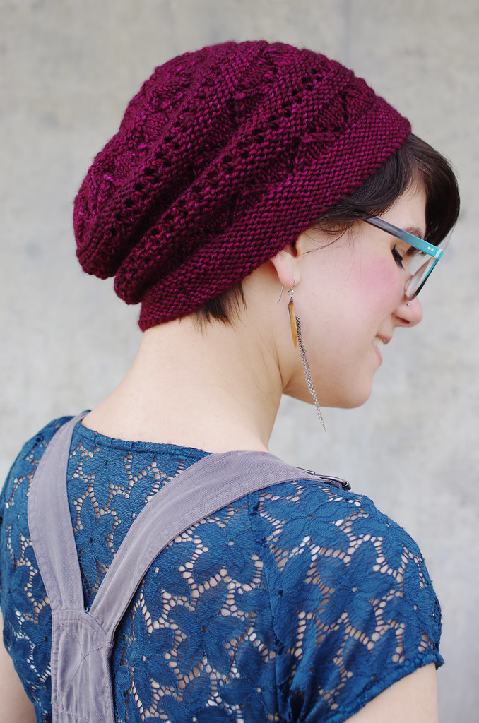
lupinefo4 Untitled

Styling

I want people to be able to look at my patterns and recognize a sense of both character and aesthetic context, based solely on visual information. For me, a huge part of that is in styling. In each shoot, I think about garment type, silhouette, proportion, color, drape, and fit, all working together with the designed garment to frame it in the best possible light. Currently I release most of my designs independently, which means that I either model or shoot almost everything I release - and that gives me final say on the image and presentation of my work, which is a great position to be in as a designer!

It's important to me that the styling of my designs is bright and dynamic, with colors and proportions that complement and showcase each piece. I also want to give a sense of my own personal style, so I tend to choose outfits that I would actually wear. One of my biggest goals as a designer is to create things that are not only fun to knit, but are also essentially functional, so I try to express that easiness and wearability in the styling as much as possible.
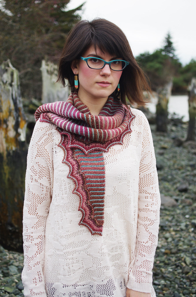

fireweedFO2 talusshoot2

Photography

As much as I love writing (and oh, I do, I really do!) I've found more and more that I would rather create the narrative of a design through a really great photograph.

A single photograph is an incredibly efficient method of conveying information: it can tell the viewer about color, fit, construction, ease, wearability, style, and mood, and all in a few seconds! It would take a lot more words to do the same job, and probably only half as well. To me, well-executed photography is an awesome, and surprisingly natural, way to fling open the door and invite the viewer to experience the world of your imagining.

And as far as actually getting that image that I want, I've found four things to be very important:
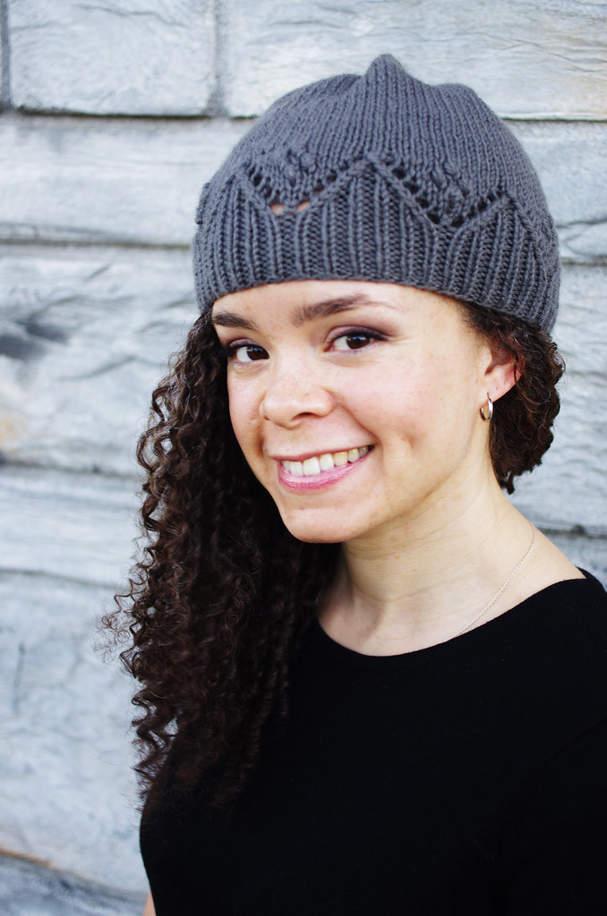
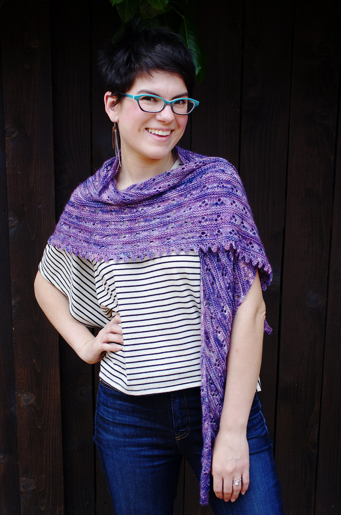
nicolepip violetlupine4

1) The model & photographer are on good terms, with a high level of mutual respect and excellent communication skills. Modeling and photography are both physically - and sometimes emotionally - demanding activities. My best shoots are always between friends or kindred collaborators, and it makes the whole thing so much more fun when you can pull a silly face every now and again. And in-the-moment joy really does come through in photographs, I think!

2) Good, natural lighting. I've seen this advice a lot of other places, but I've found it to be so true: diffuse natural light is where it's at. Cloudy or lightly shaded conditions have always given me the cleanest images, best colors, and easiest post-processing. I think natural lighting tends to be especially well-suited to knitwear photography because it gives photos a soft, approachable look and feeling.
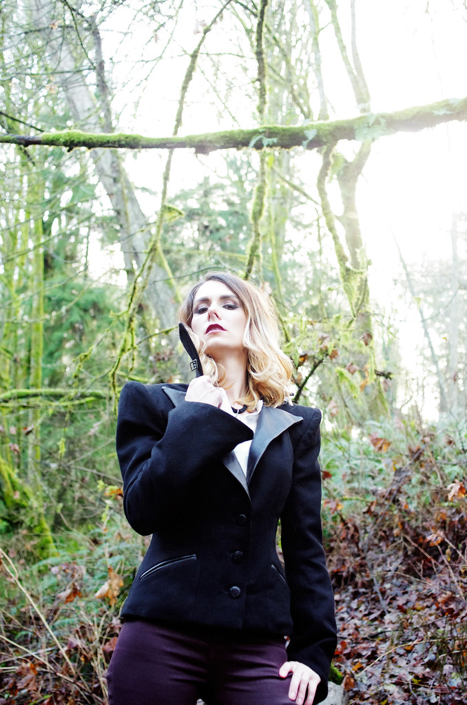
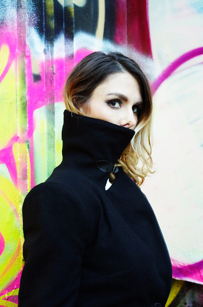
marisajacket5 marisajacket3

3) Appropriate background. I try to choose backgrounds that give a good amount of contrast with the outfit; that set a scene but don't unnecessarily distract the eye. I avoid having signs, people, objects, or other extraneous elements in my backdrops - that is, unless they are just way too cool not to include. Personally, I'm a sucker for industrial & urban spaces, bright colors, and natural (especially water-oriented) backgrounds.

4) If you have a stray cat hair or weird folded-up hem, fix it as soon as you see it. Photoshop is a powerful tool, but it's a lot more work to fix something in post-processing than it is to lint-roll a sweater.
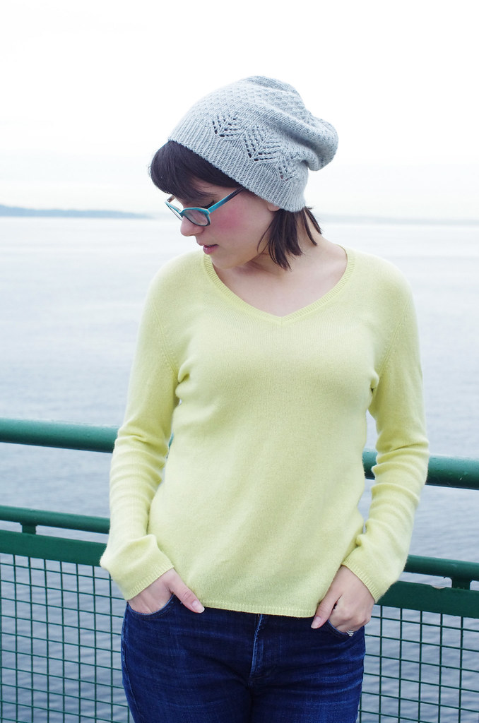
talusFO terrafirma3 - Version 2

Editing

The last - and perhaps most important - element of this whole thing is the editing process. Although for the most part, I want to show my work in the best possible light, I also want to be transparent about the fact that I have bad ideas, and I make bad things, and that is part of the process too. For every ten ideas I have, maybe one is a good one. I've had to learn how to recognize the bad ones for their badness, but also, for their potential goodness; over time, I've found that there's almost always a lesson in bad design. I've also had to learn how to cultivate the good ones after I've found them: to give them plenty of food and light and water, to help them become what they need to be.

Those two photos above are an example of what you haven't seen - what I've edited away - and the reasons are pretty simple. The first photo, on the left, is from one of my failed Talus shoots. This photo just doesn't work! I like the pose and the railing, but the colors are washed out, the hat isn't particularly visible, and the image isn't representative of me or my design aesthetic. It's visual oatmeal.

The second photo doesn't work on two levels: first, the background is too busy, and the combination of sunlight and forest canopy gave a green cast to the photo that I couldn't color correct without killing the lovely color of the cowl. Second, this is a design that just doesn't quite make it: it's knit in one of my favorite yarns, but the size I made is weird, and it's hard to wear, which means that it's a no-go. I had it test-knit and everything, but after a bit of consideration, I decided not to release it. In the end, integrity of vision is important, and it's better to be fearless and fail at it than to be too afraid to try something amazing.

And cutting the chaff, so that only I see the truly spectacular failures? That is why I love editing.

---------------------------------------

Whew! Thanks for reading! Ariel has her own post on the subject over here, and the links to the previous posts are below.

Three Fates Design Challenge

Part I: Swatching
Cory
Ariel

Part 2: Color Inspiration
Cory
Ariel

Friday, June 26, 2015

WIP: Nusa

nusawip2 nusawip

Woomph! It's been a busy couple of weeks here at the Rat Castle. Unpacking, doing laundry, deep-cleaning the old place... blech. Luckily, we're getting close to being done with our old apartment, which means we can start focusing on the new place. We're already learning the quirks of our little house - the slightly tilted floors, the deadbolt that locks a certain way, the basement door that can't quite accommodate a full-sized couch through it - but even so, there's something really nice about caring for a place that we actually own. The other night after dinner, I cut down a thatch of blackberry canes underneath a bush in the front yard, and as dusk settled, I looked back at my work and felt a sort of pride for this lopsided piece of earth that I had coaxed into order. It's a new feeling, that pride, and one that I'm beginning to really enjoy.

(Edited to add: Speaking of Pride, the Supreme Court of the US ruled on Marriage Equality today, which nicely coincides with Pride weekend. I'm so happy and proud for my country, and so happy and proud for my LGBTQ dear ones, I hardly have words. So much love today!)

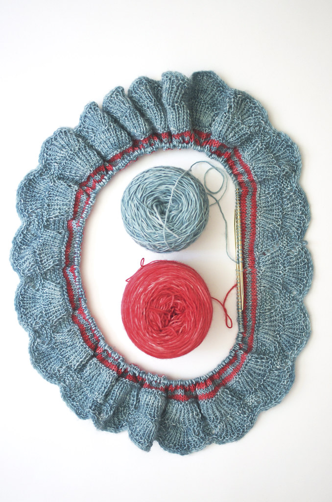
In between all of that, though, I've been working on the Nusa cowl sample - my contribution to the Three Fates Design Challenge - which I started sometime last week and have been steadily humming away on since. I've had to rip it back about 4 million times, specifically at that pesky color join, but now it's on its way! Now I have miles of striped stockinette to knit before I have to think again, thank goodness...

Happy Friday, and happy Pride, friends!
<3
Cory

Monday, June 8, 2015

Three Fates Design Challenge Part II: Color Inspiration

City Lights
Colourful Corals at Maripipi _DSC0526


As I've talked about a bit before, color is an incredibly important part of my design process. Different combinations of colors evoke specific feelings and images to me, which are often paired with a textural or graphic detail. I feel most satisfied with the design process when a material gently suggests its form to me - in contrast to a forced effort on my part to make design elements play together - and coming to this design was rather effortless in that respect.

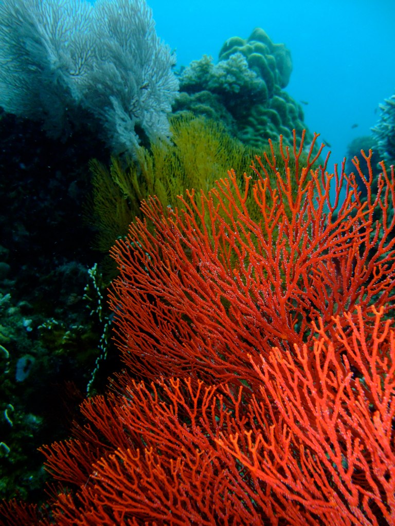
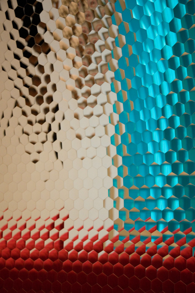
When I saw my two colors together, they immediately made me think of Nusa Penida, the island off the coast of Bali where I did a Winter Term project during my junior year of college. In reality, the colors I chose are not truly the colors I saw on Nusa; rather, they are a representation of the memory of color. When I look back at photographs, the blue is never as bright as the feeling of it was. In remembered color, there is only the essence of the thing: the blue water, nearly seamless with the sky; the outriggers of the boat we took from Nusa back to Bali, painted red, skating along the water's surface. The feeling of the sun on my neck, the island receding into the horizon.

And that essence was exactly what I wanted to feel when I looked at the design. Using the Creative Commons search filter on Flickr, I was able to find some beautiful photos with the color palette and character I wanted, which you can click through above. Though they're not all pictures of coral and sky, they're true to the feeling that I want to convey.

Untitled

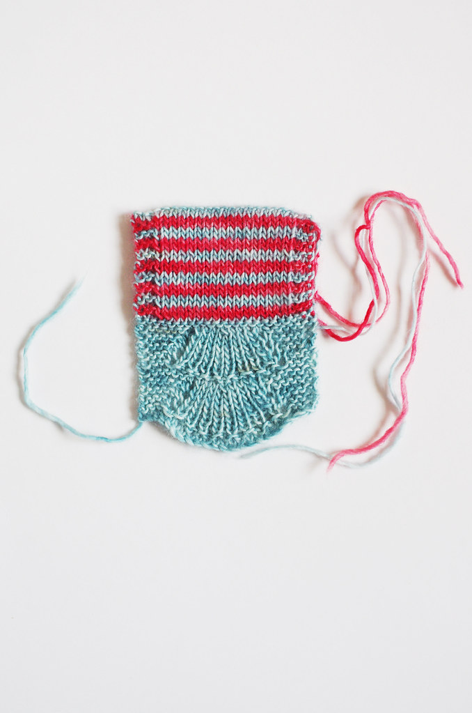
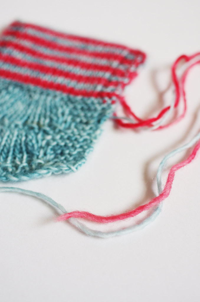
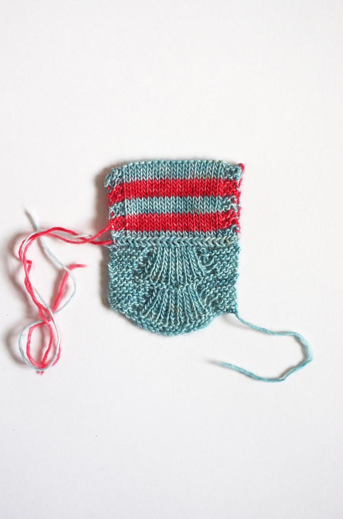
And this is the part where the process gets cool, I think: I took those colors and put them together with a stitch pattern that felt right with the design, and ended up with something that is more than the sum of its parts. When I look at this swatch, I see all sorts of other threads that I never intended to include: the Bear Tracks pattern echoes the shape of a fan of coral; the thin red stripe those outriggers I mentioned; the stockinette a placid ocean, fringed by waves of garter stitch.

So even though I make color choices by instinct pretty early on  - often without a specific image in mind! - they subconsciously guide many other aspects of the design process. Pretty neat!

You can read Ariel's post about color inspiration here.

Three Fates Design Challenge

Part I: Swatching
Cory
Ariel
* all images were collected from Flickr and each are used with permission under a Creative Commons license. These images have not been altered in any way, and copyright belongs to the original authors linked above. Information about the specific Creative Commons licenses for these photos can be found here and here.

Monday, May 11, 2015

Three Fates Design Challenge Part I: Swatching

projects8

What ho, friends! Is it time for another Design Challenge with the lovely Stariel, knitter, designer, and sock knitter extraordinaire? I do believe it is!

A while ago, we chatted about the idea of doing a similar design project to our Rastita Design Challenge, and although it got waylaid by ballgowns and the usual life stuff, we connected recently and made a game plan for the new challenge.

I really enjoy Ariel's work as a designer, and she's such a fun, inspiring and engaging collaborator! It was really interesting to see our processes in parallel throughout the Rastita challenge; although we both started with similar materials, our creative brains and resulting workflows are very different, which takes us each down different and wonderful paths. I'm really excited to start working on this new project!

Untitled projects7

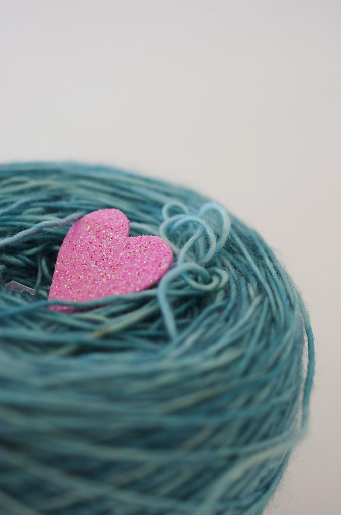
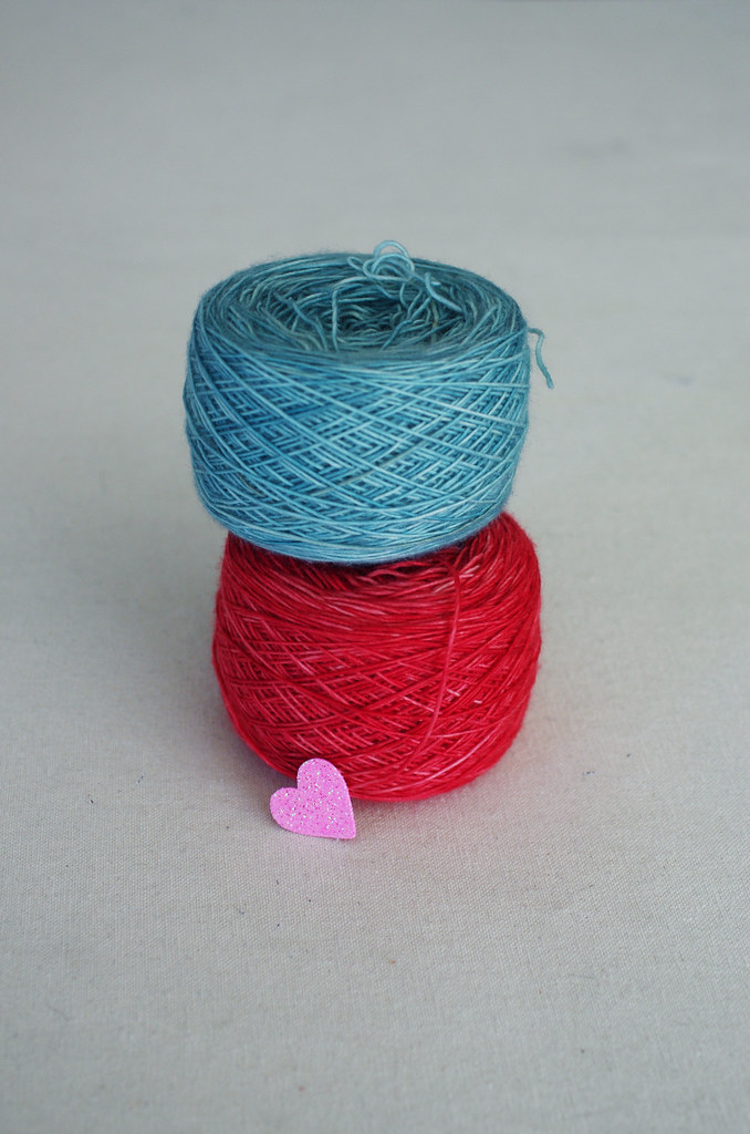
For this challenge, we'll be working with Aquae Fingering, a luminous single-ply with amazing yardage, dyed by Stephania of Three Fates Yarns - who is not only a talented fiber artist, but also an Oberlin alum and friend. I'm using the colorways Netarts (turquoise) and Mt St Helens (coral), a bright and summery combination that cheers me up every time I look at it.

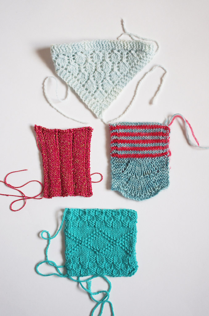
So for the first post of the new challenge, we wanted to change it up a bit from last time. I've already covered my conceptualization process - which includes both concept development and sketching - so instead I wanted to talk a little bit about swatching and its role in my design process.

(I can practically hear the chorus of groans and sighs from here, but it will be fun, I swear!)

Untitled

It's a funny thing, because as a knitter, I'm not much of a swatcher. I've come to realize that I am a lazy, lazy maker, which often makes me resistant to swatching for my usual projects; however, this is an advantage as a designer, as I'm always looking for simple, elegant solutions to complex problems - and I'd rather do it on a tiny swatch than on a whole project, because, y'know, lazy.

As a homeschooled kid, I learned how to be fastidious in this kind of process from my mom, a mathematician and teacher; from my dad the engineer, I learned how to make an educated guess, then glue stuff to other stuff and see what stuck. Both practices are extremely useful in swatching (and design in general): through fastidiousness, I'm able to focus on and change small details that can really kick a design up a notch; through educated guesses coupled with seat-of-the-pants experimentation, I'm able to create a yarn 'sketch', then let the materials express themselves as I work.

Because of this, sometimes my swatches end up... well... really, really ugly. And that's something I've had to work very hard to embrace. As a perfectionist, it's easy to become paralyzed by imperfections right at the beginning of your process, and to judge work before it's fully realized. And so, I've had to learn how to not only push through the imperfect part of the process, but also to really sit with it: to reach through the anxiety and discomfort of creating something objectively bad, to listen instead for the things that the work is trying to teach me.

It's a constant challenge, and one that I'm only just starting to get a firm hold on.

Untitled Untitled

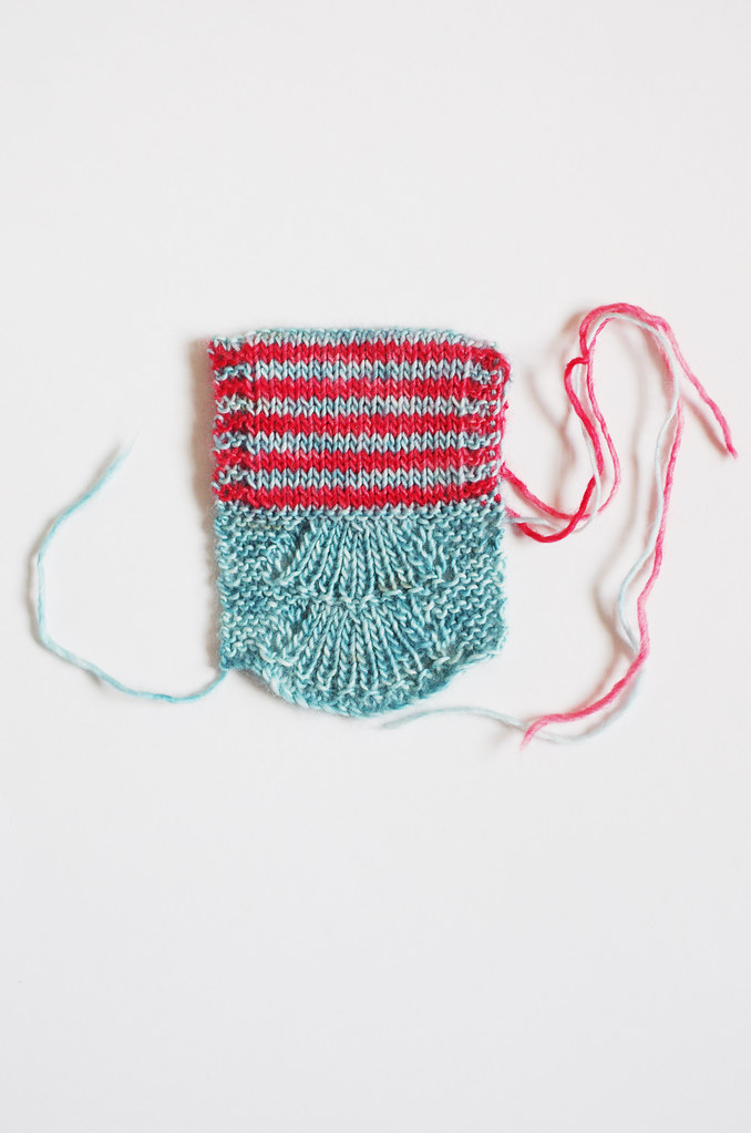
So what of this design? Well, this swatch was actually surprisingly easy to execute, and done a pretty long time ago. I was originally planning to have this piece - a lace-edged, striped cowl - be completely reversible, with different stripe combinations on the right and wrong sides of the cowl. The lace edge pattern is almost perfectly reversible by virtue of its construction, and I thought it was a cool element to take advantage of.

And although I still love this idea and might explore it later, I realized after working this swatch that the doubled fabric would not give the piece the lightness and fluidity that I wanted so much - even though it does look cool. It's a prime example of swatching as a rich source of information, as well as the importance of understanding the character of your materials.

And so, with slightly less muttering and cursing under my breath than usual, I swatch on.

For Ariel's take on swatching, take a gander at her post on the subject over here. And stay tuned: we will be posting about this challenge again in a few weeks, and there is the sweet, sweet promise of a giveaway at the end.

Happy Monday, friends... and happy swatching!
<3
Cory

Monday, March 3, 2014

Rastita Design Challenge Giveaway: Results!

Rastita Design Challenge Cover

Thanks to everyone for entering the Rastita Design Challenge Giveaway - comments are now closed for entry, and winners have been selected! Drumroll please...

Our first prize winner of 3 skeins of Malabrigo Rastita to make Folded Lotus and a free download of the Rastita Design Challenge ebook is:

ecmstar7587 on Ravelry! Congratulations, Emily!

Emily will be receiving the Curiosity colorway of Rastita to make Folded Lotus: 2 skeins of Peacock, and 1 skein of Lotus. Hooray!


Our second prize winner of a free download of the Rastita Design Challenge ebook is:

alilou78 on Ravelry! Congratulations, Alison!

We will be in touch with the winners on Ravelry - thanks again for participating, and happy Monday! <3

Transparency time! I used random.org's list randomizer service with entrants' Ravelry IDs, eliminating any duplicate entries without deleting comments. I then chose the top two IDs from the randomized list, awarding Prize #1 to the first and Prize #2 to the second. For the number nerds out there. :)

Monday, February 24, 2014

Folded Lotus: Pattern Release and Giveaway!

Comments are now closed for the giveaway! Thanks, everybody, for entering!

foldedlotus1 foldedlotus2foldedlotus4 foldedlotus3

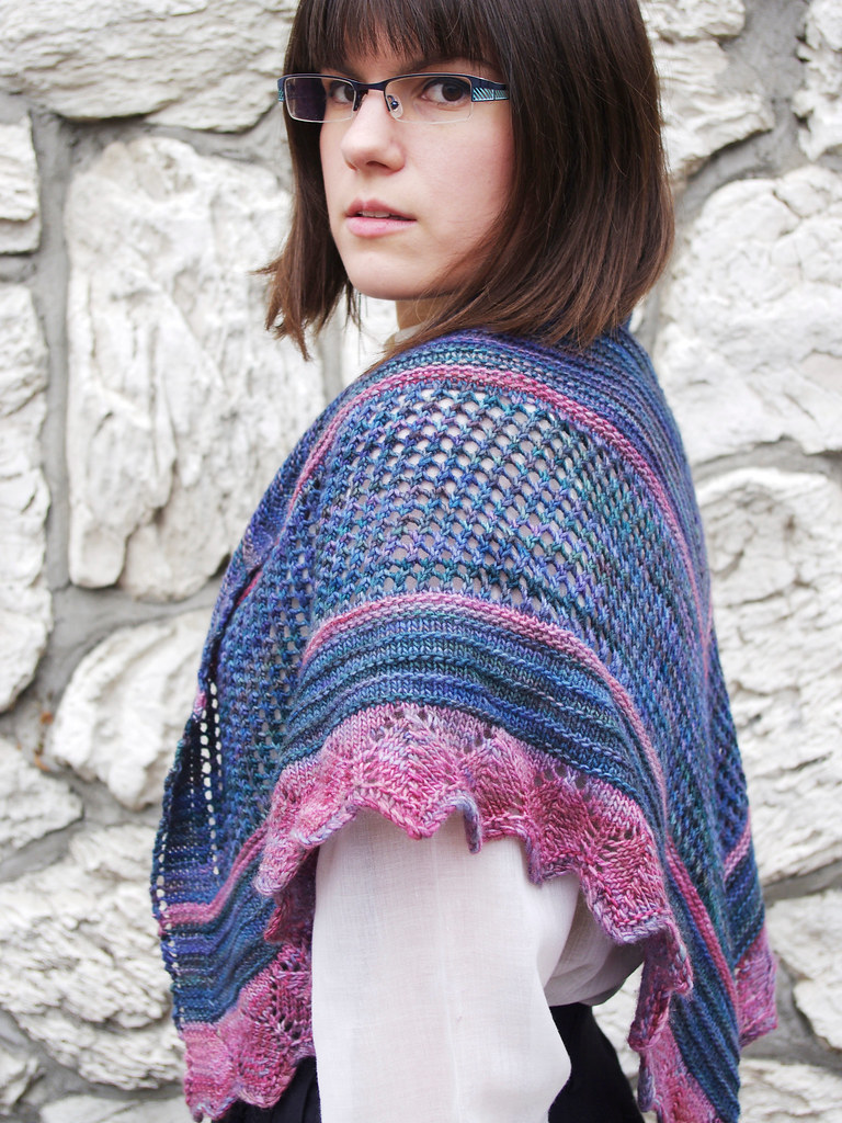
Hooray! Hooray! The patterns from the Rastita Design Challenge, Ariel's and my Lab Rat Knits collaboration, are now available for purchase via Ravelry! You can purchase them individually or as an ebook. I loved every step of creating this shawl, and I'm so excited to share it with you. Big thanks to Ariel, Lumberjack, Sparklepants and all of my awesome test knitters for your feedback, photography, and support. It couldn't have happened without you!

You can check out the Rastita Design Challenge ebook on Ravelry here,

or click here to buy Folded Lotus individually:


To celebrate, Stariel & indie.knits are hosting a little giveaway!
I will be giving away two prizes:

    • the big one: a free download of the Rastita Design Challenge ebook and 3 skeins of Rastita to to make a Folded Lotus
    • the runner-up prize: a free download of the ebook

You can pop on over and enter Ariel's giveaway post too! To spread the love and keep things fair, we will be limiting prizes to one per person in the overall contest.

In order to enter, leave a comment on this post with:

1. Your favorite of the 3 color combinations (April, Retro, or Curiosity), and why you like it.
2. Your Ravelry name - this important, since this is how we will contact you!

Submit your comment by this Sunday, March 2nd, 2014, by 11:59 pm, and we will choose a winner via random number generator to be announced next Monday, March 3rd.

You can also check out our brand spankin' new Lab Rat Knits group on Ravelry!

So without further ado, here are your color choices:

*******************

April


2 skeins Sabiduria (violet) & 1 skein Chircas (olive green)

*******************

Retro


2 skeins Solis (turquoise) & 1 skein Cereza (red)

*******************

Curiosity


2 skeins Peacock (grey-blue) & 1 skein Lotus (pale pink) - sample shown in Curiosity

*******************

Happy Monday!