Showing posts with label process. Show all posts

Wednesday, May 18, 2016

Design Notebook: Lelia Hat

 leliahat4 leliahat2leliahat leliahat3

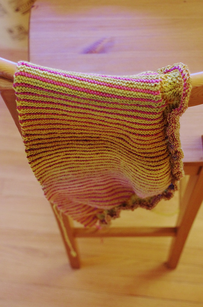
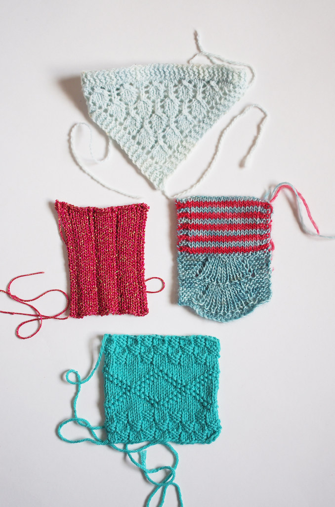
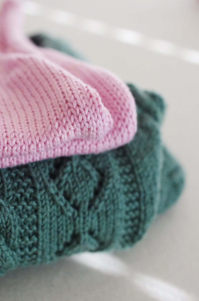
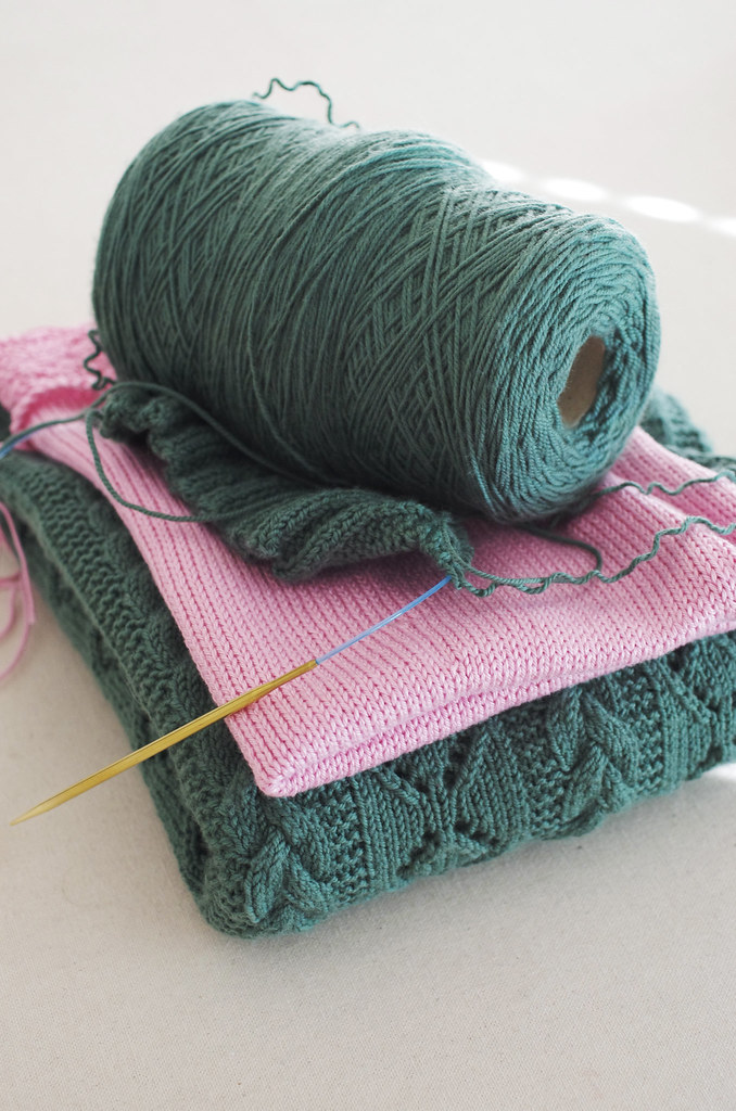
I've had the idea for a companion hat to the Lelia Mitts since the very beginning, but have been super sidetracked recently with work deadlines, classes, and various family stuff. I finally cast on for the sample last week, but after working the colorwork band and a few stripes, I tried it on and found out that it had some problems - too big in the ribbing, and maybe too big in the body too. Either way, not what I wanted.

So today I grabbed some turquoise and green stash yarn in the right weight, and cast on for a second hat to give myself a sanity check, by comparing the two hats without ripping out the first one. I knew that I should try that ever since I started last week, but was feeling disheartened by how far off the sample looked from my vision of it.

Of course, the answer was right there all along: go down a needle size. Chop off a pattern repeat. And suddenly, the thing that looked so sad to me this morning has regained its possibility, that it could have that thing that makes it feel special and right. I was fighting it, because it takes a certain amount of work to admit defeat and try again - but it almost always seems to be worth it in the end.

Harumph.

happychar

In other news, our little Corglet has officially completed her first class at doggie school! She's already way more attentive and happy than she was when we started, and we're finally starting to feel like we're communicating properly with each other - even though we still have a lot of work to do.

And Corglet happiness is positively contagious! (Just look at that face... sheesh, dog, you're the frigging cutest.)

Happy Wednesday, friends!
<3
Cory

Wednesday, November 25, 2015

Back to Reality

IMG_20151115_093445 IMG_20151115_170515

Oomph - it's been a while, friends! Last I saw you, I was in the throes of pattern releases and preparations for vending my first show, both of which had been eating my brain cells and all of my free time for the last three months. And after all of that hard work, a whole weekend vending at Knit Fit was the perfect way to finish it all off! Of course I forgot to bring my camera, but I managed to get a couple of dorky pictures with my booth setup and vendor badge.

I've waxed poetic about the wonderfulness of this show before, and this year was even more magical (if that's possible??) Although I've worked shows as an employee before, this was my first show as a vendor for indie.knits, and I felt so welcomed and supported by every person I met: the entire Knit Fit crew, the other vendors, the attendees. I had a great time chatting with tons of knitters, and the vendor selection was top-notch, and I learned so, so much from the whole experience. A big thank you to everyone who stopped by to say hello, and a monumental thank you to Sasa and the other behind-the-scenes folks who made this great event happen.

thanksgivingweek4 thanksgivingweekthanksgivingweek2 thanksgivingweek3

And because of course I did, I woke up the day after Knit Fit with a desperately ill rattie and a cold. Wah-wahhhhhh. After taking Mr. Pooper to the vet and getting him on a nebulizer treatment (he's doing much better!), I spent the rest of last week flopped on the couch, watching Jane the Virgin and attempting to send work emails in between Theraflu-induced naps. The second I started to recover, I started to tend to my sadly neglected house by doing boring adult things like dishes and vacuuming and taking out the trash. (Of course, it's not until you have at terrible cold, a dishwasher full of dirty spoons, and overflowing recycling bin full of soup cans that you realize how frequent and necessary such tasks truly are.)

After I finished all of that stuff, I turned my attention to the tub full of handwashing and the heaps of paper and knitting needles and clothes and half-finished projects all over my studio. Yikes! So yesterday I completely rearranged and cleaned my studio, which, unsurprisingly, made me feel loads better. The blocking queue is back up and running - including my finished Fireweed for the Fireweed With Me KAL! Yayyy! - and all the flat spaces are now ready for me to explode ideas and sketches and swatches all over them.

Because what are clean spaces for, except to facilitate creative clutter and coffee-drinking? Nothing, that's what.

Happy Wednesday, friends!
<3
Cory

Monday, July 13, 2015

Three Fates Design Challenge Part III: Photography & Aesthetic

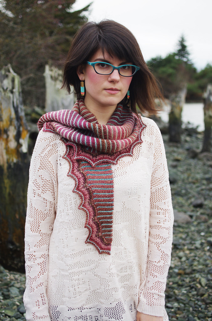
   Hi friends! As I start thinking about styling and shooting photos of the Nusa cowl - my contribution to the Three Fates Design Challenge with Ariel - I wanted to talk a little bit about the photography and overall aesthetic of my work. Whenever I begin to approach the task of visually representing a design, these are always the avenues that I explore first.
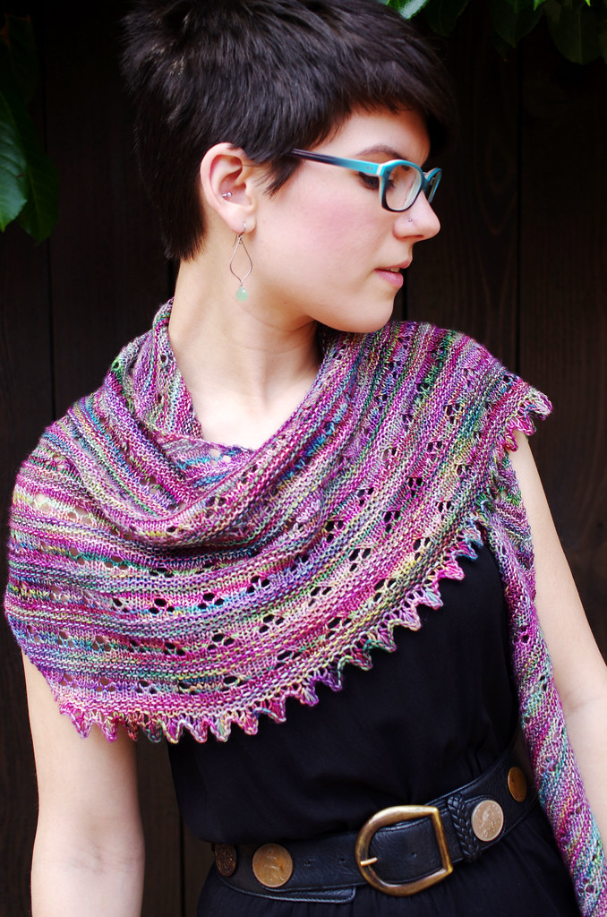
lupinefo4 Untitled

Styling

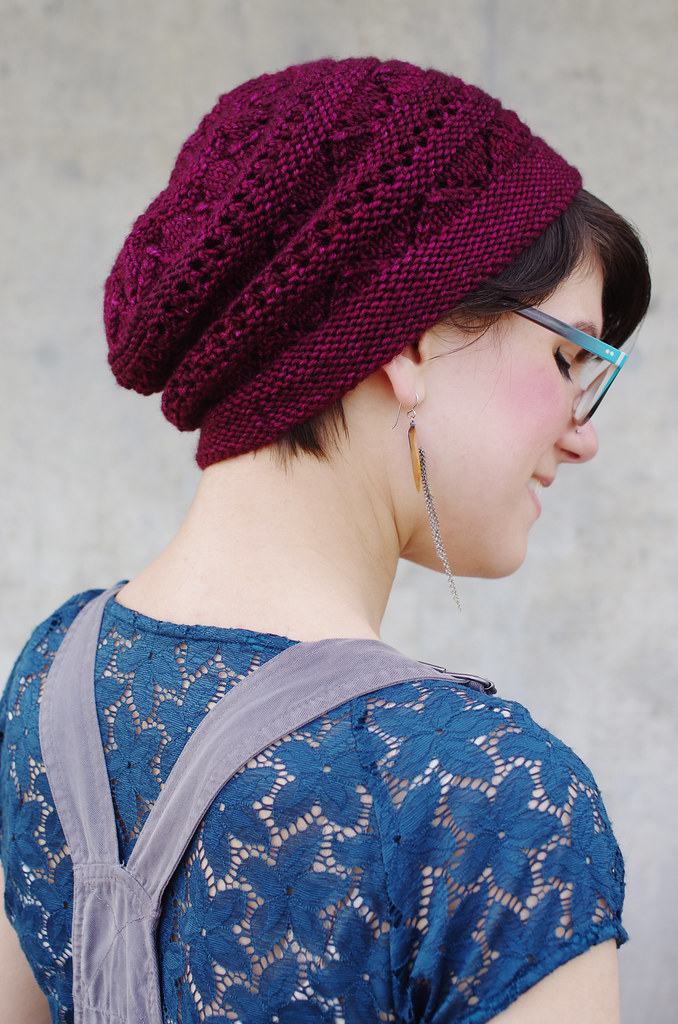
I want people to be able to look at my patterns and recognize a sense of both character and aesthetic context, based solely on visual information. For me, a huge part of that is in styling. In each shoot, I think about garment type, silhouette, proportion, color, drape, and fit, all working together with the designed garment to frame it in the best possible light. Currently I release most of my designs independently, which means that I either model or shoot almost everything I release - and that gives me final say on the image and presentation of my work, which is a great position to be in as a designer!

It's important to me that the styling of my designs is bright and dynamic, with colors and proportions that complement and showcase each piece. I also want to give a sense of my own personal style, so I tend to choose outfits that I would actually wear. One of my biggest goals as a designer is to create things that are not only fun to knit, but are also essentially functional, so I try to express that easiness and wearability in the styling as much as possible.

fireweedFO2 talusshoot2

Photography

As much as I love writing (and oh, I do, I really do!) I've found more and more that I would rather create the narrative of a design through a really great photograph.

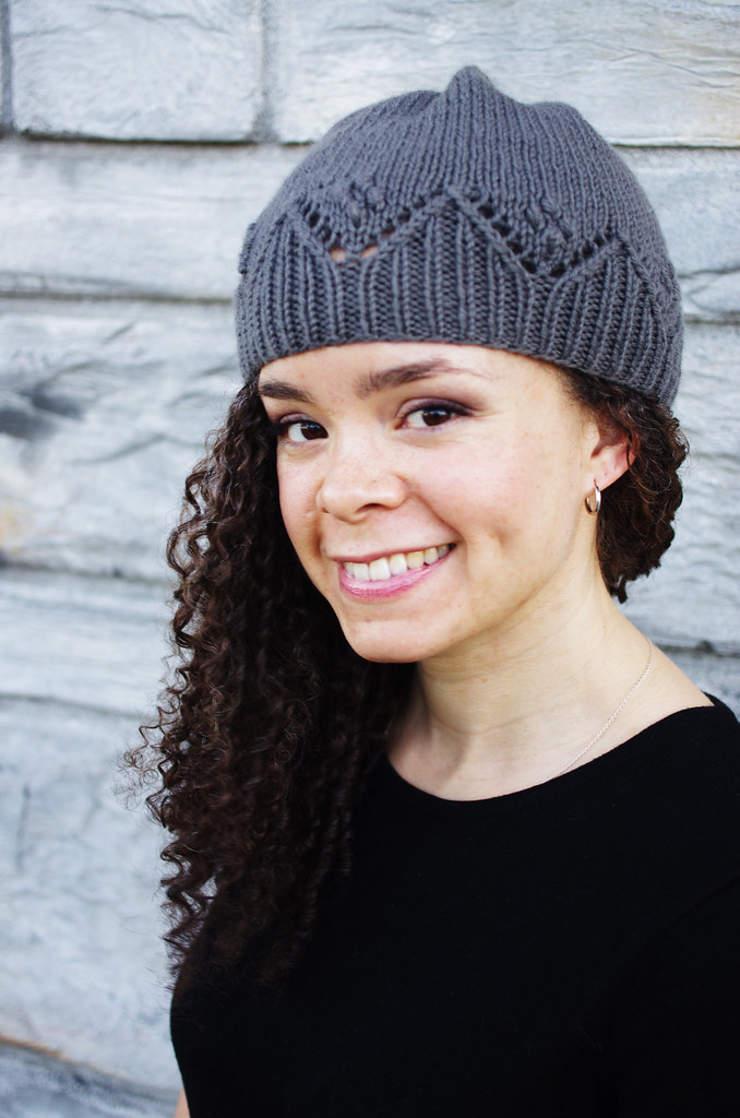
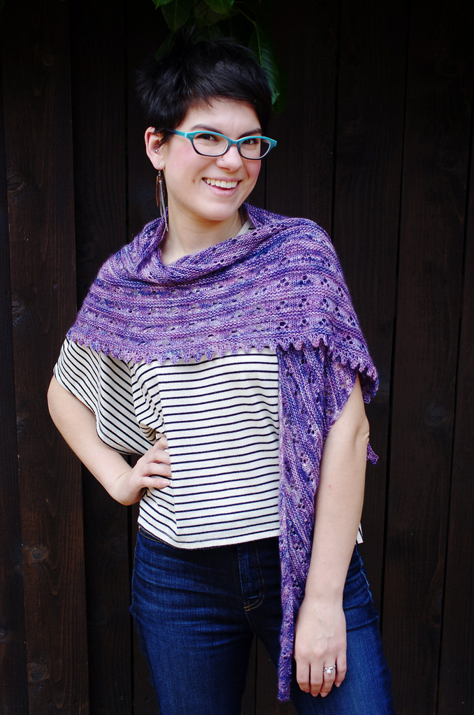
A single photograph is an incredibly efficient method of conveying information: it can tell the viewer about color, fit, construction, ease, wearability, style, and mood, and all in a few seconds! It would take a lot more words to do the same job, and probably only half as well. To me, well-executed photography is an awesome, and surprisingly natural, way to fling open the door and invite the viewer to experience the world of your imagining.

And as far as actually getting that image that I want, I've found four things to be very important:
nicolepip violetlupine4

1) The model & photographer are on good terms, with a high level of mutual respect and excellent communication skills. Modeling and photography are both physically - and sometimes emotionally - demanding activities. My best shoots are always between friends or kindred collaborators, and it makes the whole thing so much more fun when you can pull a silly face every now and again. And in-the-moment joy really does come through in photographs, I think!

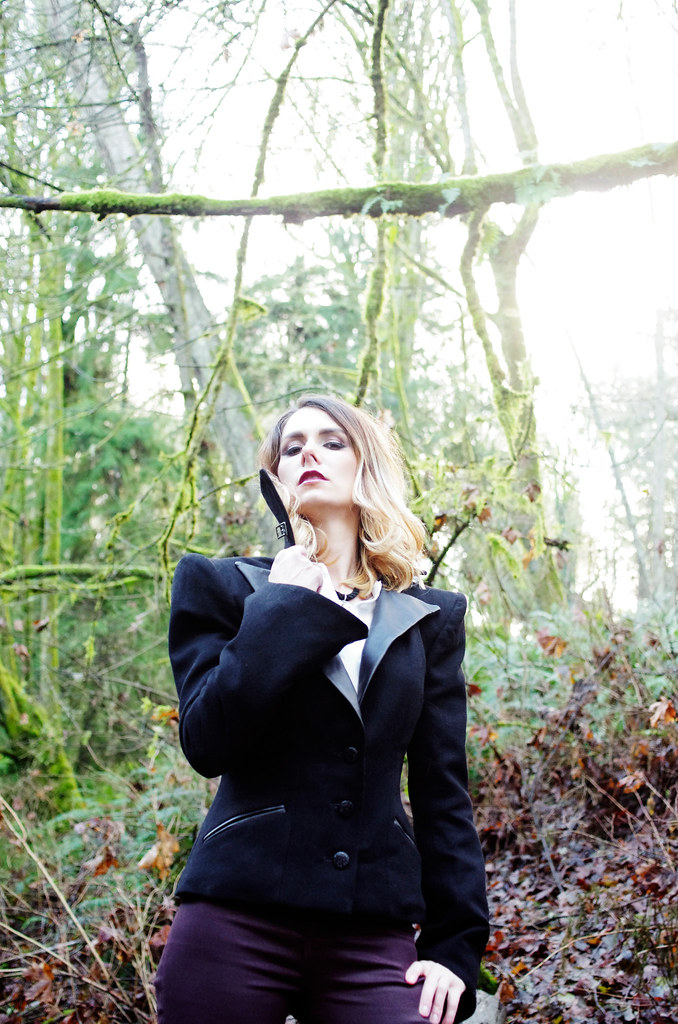
2) Good, natural lighting. I've seen this advice a lot of other places, but I've found it to be so true: diffuse natural light is where it's at. Cloudy or lightly shaded conditions have always given me the cleanest images, best colors, and easiest post-processing. I think natural lighting tends to be especially well-suited to knitwear photography because it gives photos a soft, approachable look and feeling.
marisajacket5 marisajacket3

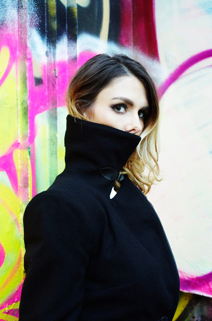
3) Appropriate background. I try to choose backgrounds that give a good amount of contrast with the outfit; that set a scene but don't unnecessarily distract the eye. I avoid having signs, people, objects, or other extraneous elements in my backdrops - that is, unless they are just way too cool not to include. Personally, I'm a sucker for industrial & urban spaces, bright colors, and natural (especially water-oriented) backgrounds.

4) If you have a stray cat hair or weird folded-up hem, fix it as soon as you see it. Photoshop is a powerful tool, but it's a lot more work to fix something in post-processing than it is to lint-roll a sweater.
talusFO terrafirma3 - Version 2

Editing

The last - and perhaps most important - element of this whole thing is the editing process. Although for the most part, I want to show my work in the best possible light, I also want to be transparent about the fact that I have bad ideas, and I make bad things, and that is part of the process too. For every ten ideas I have, maybe one is a good one. I've had to learn how to recognize the bad ones for their badness, but also, for their potential goodness; over time, I've found that there's almost always a lesson in bad design. I've also had to learn how to cultivate the good ones after I've found them: to give them plenty of food and light and water, to help them become what they need to be.

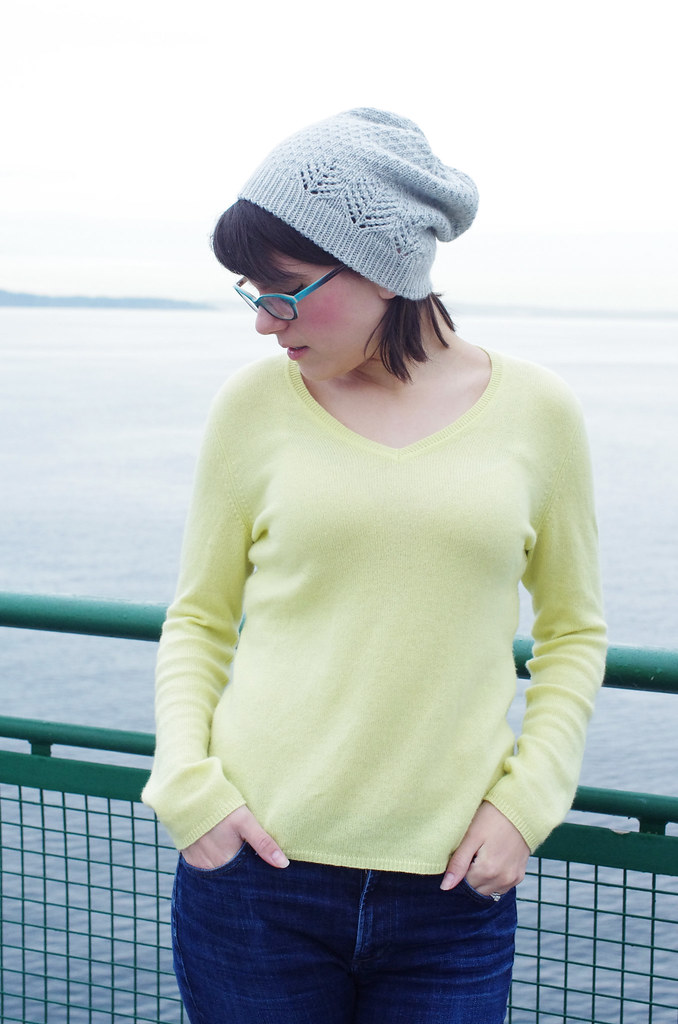
Those two photos above are an example of what you haven't seen - what I've edited away - and the reasons are pretty simple. The first photo, on the left, is from one of my failed Talus shoots. This photo just doesn't work! I like the pose and the railing, but the colors are washed out, the hat isn't particularly visible, and the image isn't representative of me or my design aesthetic. It's visual oatmeal.

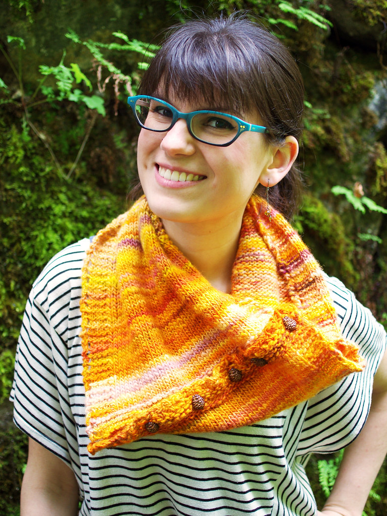
The second photo doesn't work on two levels: first, the background is too busy, and the combination of sunlight and forest canopy gave a green cast to the photo that I couldn't color correct without killing the lovely color of the cowl. Second, this is a design that just doesn't quite make it: it's knit in one of my favorite yarns, but the size I made is weird, and it's hard to wear, which means that it's a no-go. I had it test-knit and everything, but after a bit of consideration, I decided not to release it. In the end, integrity of vision is important, and it's better to be fearless and fail at it than to be too afraid to try something amazing.

And cutting the chaff, so that only I see the truly spectacular failures? That is why I love editing.

---------------------------------------

Whew! Thanks for reading! Ariel has her own post on the subject over here, and the links to the previous posts are below.

Three Fates Design Challenge

Part I: Swatching
Cory
Ariel

Part 2: Color Inspiration
Cory
Ariel

Monday, June 8, 2015

Three Fates Design Challenge Part II: Color Inspiration

City Lights
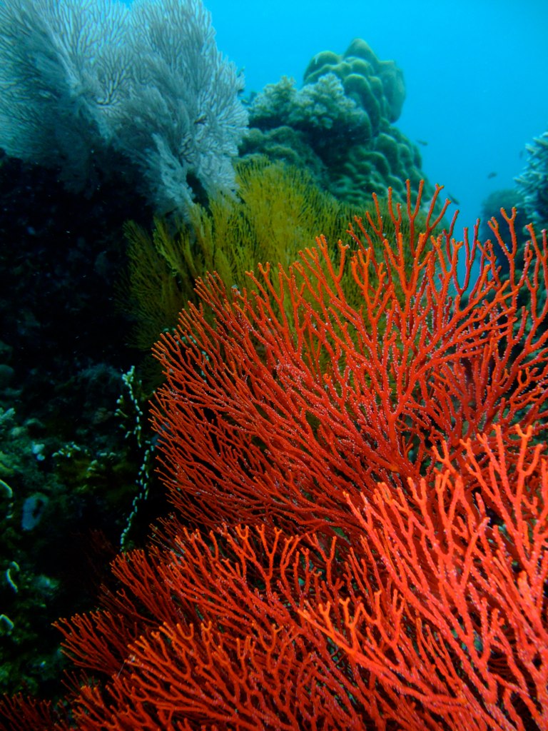
Colourful Corals at Maripipi _DSC0526


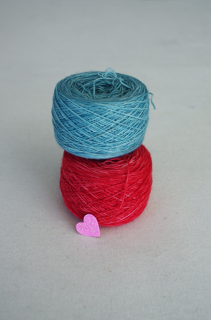
As I've talked about a bit before, color is an incredibly important part of my design process. Different combinations of colors evoke specific feelings and images to me, which are often paired with a textural or graphic detail. I feel most satisfied with the design process when a material gently suggests its form to me - in contrast to a forced effort on my part to make design elements play together - and coming to this design was rather effortless in that respect.

When I saw my two colors together, they immediately made me think of Nusa Penida, the island off the coast of Bali where I did a Winter Term project during my junior year of college. In reality, the colors I chose are not truly the colors I saw on Nusa; rather, they are a representation of the memory of color. When I look back at photographs, the blue is never as bright as the feeling of it was. In remembered color, there is only the essence of the thing: the blue water, nearly seamless with the sky; the outriggers of the boat we took from Nusa back to Bali, painted red, skating along the water's surface. The feeling of the sun on my neck, the island receding into the horizon.

And that essence was exactly what I wanted to feel when I looked at the design. Using the Creative Commons search filter on Flickr, I was able to find some beautiful photos with the color palette and character I wanted, which you can click through above. Though they're not all pictures of coral and sky, they're true to the feeling that I want to convey.

Untitled

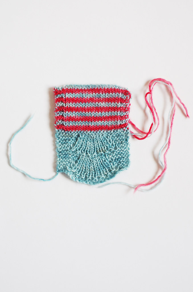
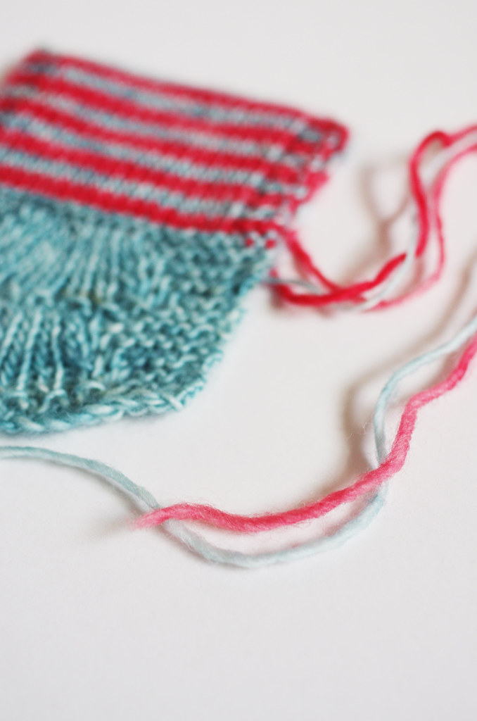
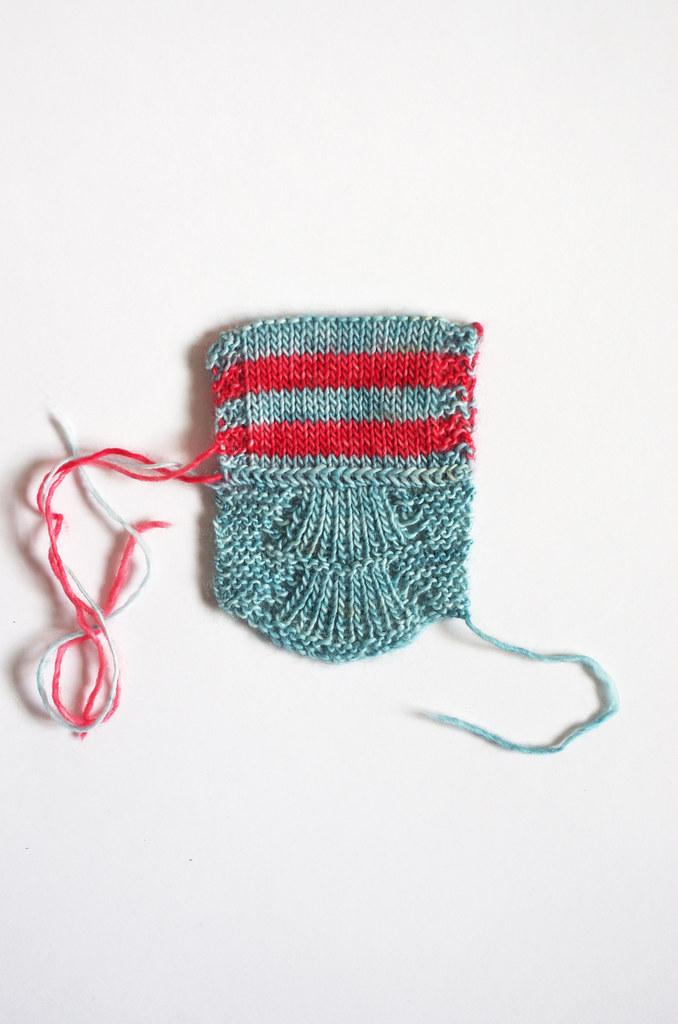
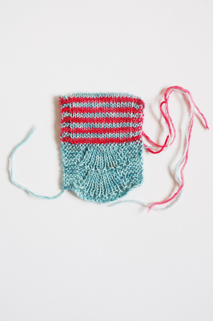
And this is the part where the process gets cool, I think: I took those colors and put them together with a stitch pattern that felt right with the design, and ended up with something that is more than the sum of its parts. When I look at this swatch, I see all sorts of other threads that I never intended to include: the Bear Tracks pattern echoes the shape of a fan of coral; the thin red stripe those outriggers I mentioned; the stockinette a placid ocean, fringed by waves of garter stitch.

So even though I make color choices by instinct pretty early on  - often without a specific image in mind! - they subconsciously guide many other aspects of the design process. Pretty neat!

You can read Ariel's post about color inspiration here.

Three Fates Design Challenge

Part I: Swatching
Cory
Ariel
* all images were collected from Flickr and each are used with permission under a Creative Commons license. These images have not been altered in any way, and copyright belongs to the original authors linked above. Information about the specific Creative Commons licenses for these photos can be found here and here.

Monday, May 11, 2015

Three Fates Design Challenge Part I: Swatching

projects8

What ho, friends! Is it time for another Design Challenge with the lovely Stariel, knitter, designer, and sock knitter extraordinaire? I do believe it is!

A while ago, we chatted about the idea of doing a similar design project to our Rastita Design Challenge, and although it got waylaid by ballgowns and the usual life stuff, we connected recently and made a game plan for the new challenge.

I really enjoy Ariel's work as a designer, and she's such a fun, inspiring and engaging collaborator! It was really interesting to see our processes in parallel throughout the Rastita challenge; although we both started with similar materials, our creative brains and resulting workflows are very different, which takes us each down different and wonderful paths. I'm really excited to start working on this new project!
Untitled projects7

For this challenge, we'll be working with Aquae Fingering, a luminous single-ply with amazing yardage, dyed by Stephania of Three Fates Yarns - who is not only a talented fiber artist, but also an Oberlin alum and friend. I'm using the colorways Netarts (turquoise) and Mt St Helens (coral), a bright and summery combination that cheers me up every time I look at it.

So for the first post of the new challenge, we wanted to change it up a bit from last time. I've already covered my conceptualization process - which includes both concept development and sketching - so instead I wanted to talk a little bit about swatching and its role in my design process.

(I can practically hear the chorus of groans and sighs from here, but it will be fun, I swear!)

Untitled

It's a funny thing, because as a knitter, I'm not much of a swatcher. I've come to realize that I am a lazy, lazy maker, which often makes me resistant to swatching for my usual projects; however, this is an advantage as a designer, as I'm always looking for simple, elegant solutions to complex problems - and I'd rather do it on a tiny swatch than on a whole project, because, y'know, lazy.

As a homeschooled kid, I learned how to be fastidious in this kind of process from my mom, a mathematician and teacher; from my dad the engineer, I learned how to make an educated guess, then glue stuff to other stuff and see what stuck. Both practices are extremely useful in swatching (and design in general): through fastidiousness, I'm able to focus on and change small details that can really kick a design up a notch; through educated guesses coupled with seat-of-the-pants experimentation, I'm able to create a yarn 'sketch', then let the materials express themselves as I work.

Because of this, sometimes my swatches end up... well... really, really ugly. And that's something I've had to work very hard to embrace. As a perfectionist, it's easy to become paralyzed by imperfections right at the beginning of your process, and to judge work before it's fully realized. And so, I've had to learn how to not only push through the imperfect part of the process, but also to really sit with it: to reach through the anxiety and discomfort of creating something objectively bad, to listen instead for the things that the work is trying to teach me.

It's a constant challenge, and one that I'm only just starting to get a firm hold on.

Untitled Untitled

So what of this design? Well, this swatch was actually surprisingly easy to execute, and done a pretty long time ago. I was originally planning to have this piece - a lace-edged, striped cowl - be completely reversible, with different stripe combinations on the right and wrong sides of the cowl. The lace edge pattern is almost perfectly reversible by virtue of its construction, and I thought it was a cool element to take advantage of.

And although I still love this idea and might explore it later, I realized after working this swatch that the doubled fabric would not give the piece the lightness and fluidity that I wanted so much - even though it does look cool. It's a prime example of swatching as a rich source of information, as well as the importance of understanding the character of your materials.

And so, with slightly less muttering and cursing under my breath than usual, I swatch on.

For Ariel's take on swatching, take a gander at her post on the subject over here. And stay tuned: we will be posting about this challenge again in a few weeks, and there is the sweet, sweet promise of a giveaway at the end.

Happy Monday, friends... and happy swatching!
<3
Cory

Wednesday, March 11, 2015

UFO Pile: Or, This Sweater Thing is Getting Ridiculous

wipsweater2 wipsweater

In the past, I've tried not to be too precious about my shameful finishing issues. I am fully aware that as a knitter and maker, I live two separate but parallel existences: the wildly creative and productive fantasy life in my brain, and the actual one where I finish a few things and shove a few more in the bottom of my knitting basket to ignore.

Of course there are always reasons: I get the odd bout of tendinitis in my wrists and can't work with cotton until it improves; I can't find my pattern notes; I need to rip back and fix a mistake before continuing. But at some point these reasons resolve themselves, and I really don't have any excuse at all besides I don't wanna.

wipsweater3 customfit3

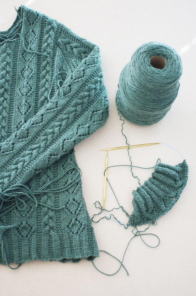
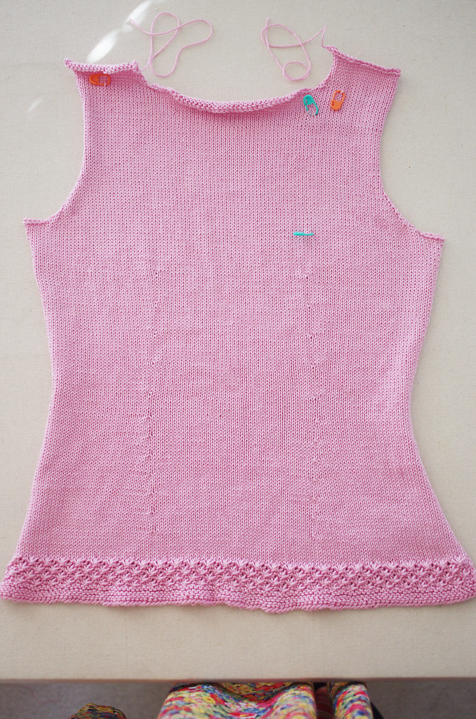
So last week, I did some of that knitterly housekeeping that is a necessary pain in the butt: I figured out where I was in my Custom Fit sweater and finished the back, and I ripped back the sleeve to my Ondrea Cardigan - which, by the way, is finished except for the second sleeve and button band. (Seriously??? Seriously. This is so dumb I can't even.)

At this point, I am so over knitting both of these garments, but I have to admit that I'm pretty excited to own and wear them, which makes me think that I need to rethink this whole process-knitter identity of mine. Perhaps instead of all process, I need to get a little more motivated to work towards the product as an enjoyable part of the experience.

Food for thought as I hold my breath and try to bust these suckers out.

Happy Wednesday!
<3
Cory

Friday, March 6, 2015

Design Notebook: Frilly Things

modcollar2 modcollar4modcollar5 modcollar3

As I've grown older, sometimes I find myself shying away from some of the parts of fashion and design that drew me to it in the first place - pink, sparkly, ornate or frilly things in particular - for fear of engaging in this strangely infantilized/sexualized and strictly gender normative vision of femininity that, in my opinion, is relied on way too heavily in both fashion and culture.

At the same time, the sparkly stuff was my fashion gateway: I have strong tactile memories of my favorite pink nightgown as a little kid; the fluffy tulle skirts we wore for ballet class; the seductive glitter of my grandma's costume jewelry drawer. The substance of those memories make me quite fond of the materials that shaped them.

And as much as I gravitate to the experience of unusual shapes, bold color pairings, or contemporary fashion and art, the classic and the pretty will always be my north star. Occasionally, as I find myself thinking a lot about avant-garde fashion, or feeling really inspired by a contemporary artist, I wonder where and how Classic Pretty can possibly fit in with everything else in any sort of logical and genuine way.

What I'm slowly coming to find is that it doesn't have to; that maybe it's actually the duality of our nature that is endlessly fascinating and inspiring. And so, maybe it's time to party down with my badass frilly self.

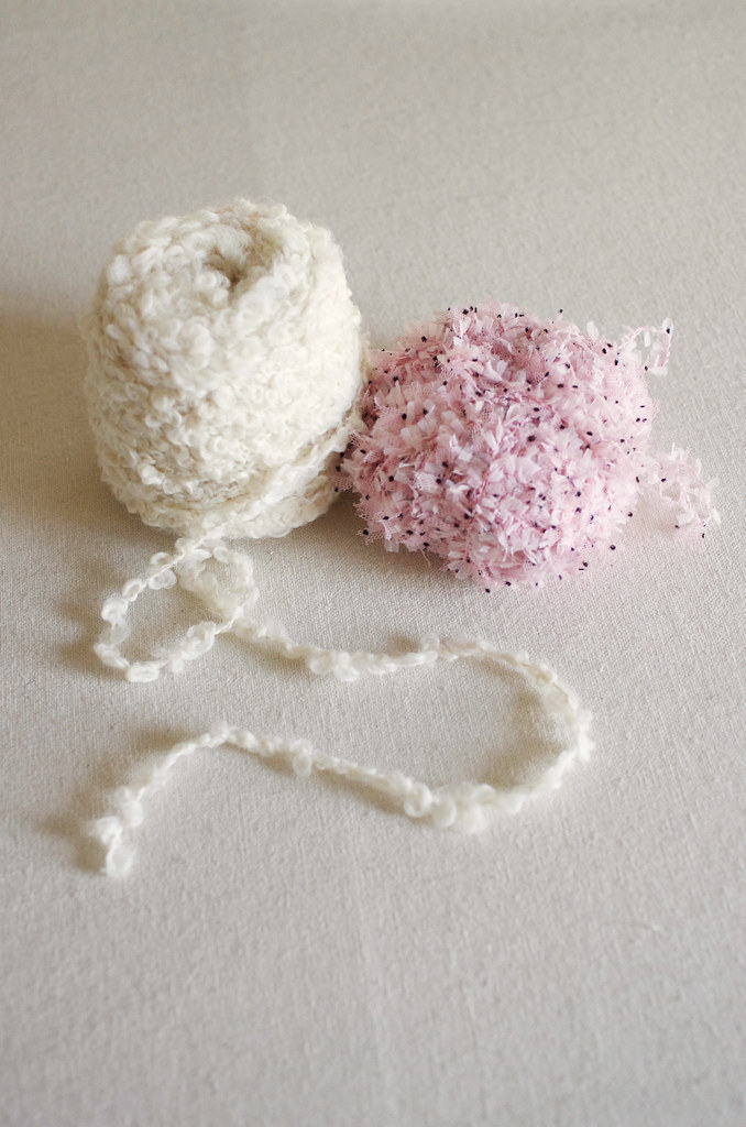
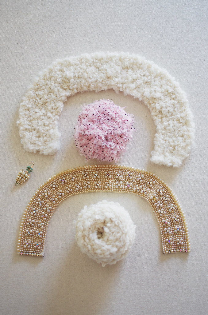
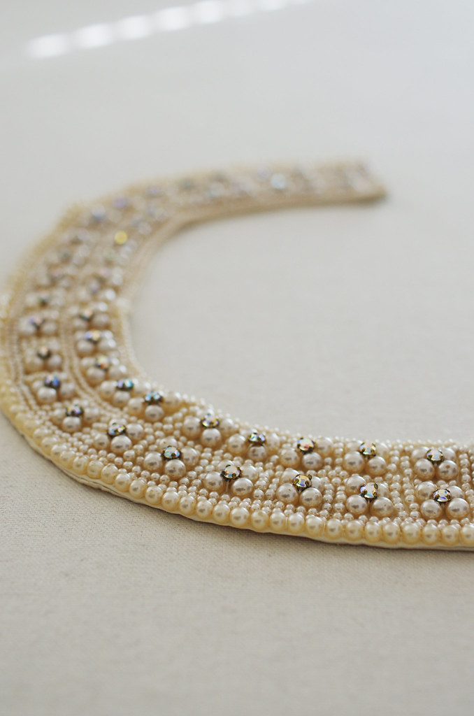
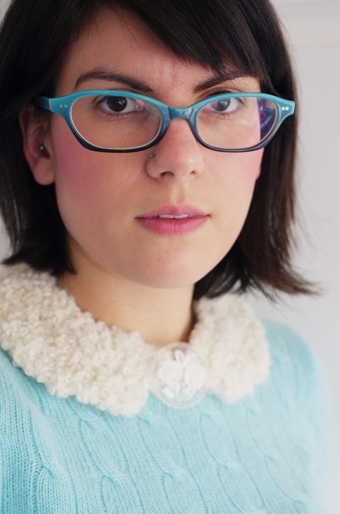
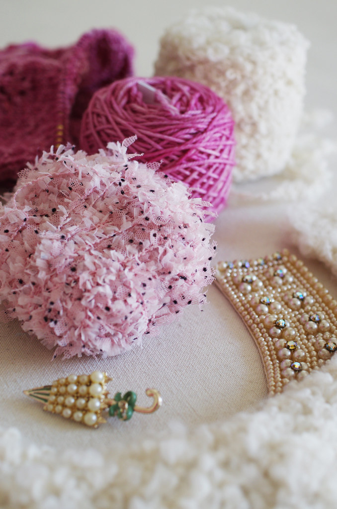
So with this in mind, I grabbed some some special vintage pieces from my closet, some pink polka-dotty novelty stuff, and a bit of alpaca boucle yarn for inspiration, and set out to make a fluffy, girly, absolutely ridiculous Peter Pan collar to spiff up some of my plain sweaters.

modcollar

And your know what? I think I'm onto something.

Happy Friday.
<3
Cory

Wednesday, November 26, 2014

Design Notebook: Talus Hat

talus talus2talus3 talus4

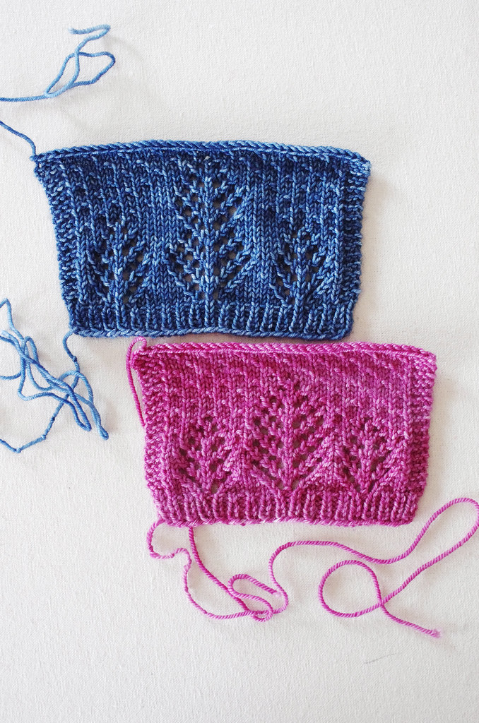
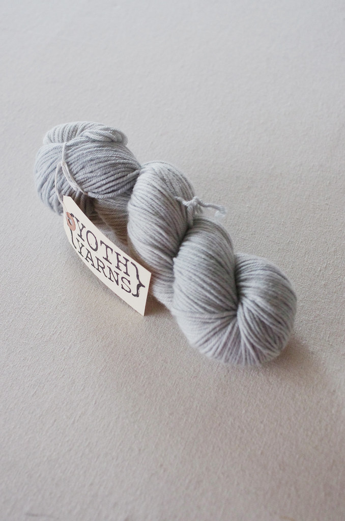
I picked up just a few special skeins at Knit Fit this year, including this gorgeous skein of YOTH Big Sister in the colorway Oyster. I had been on the search for a light neutral dk weight for a hat design that has been kicking around my head for a bit, and this misted grey hit all the right notes.

So the other day, I pulled out my stitch dictionaries, fired up my Excel charts, and grabbed a few leftovers to swatch.

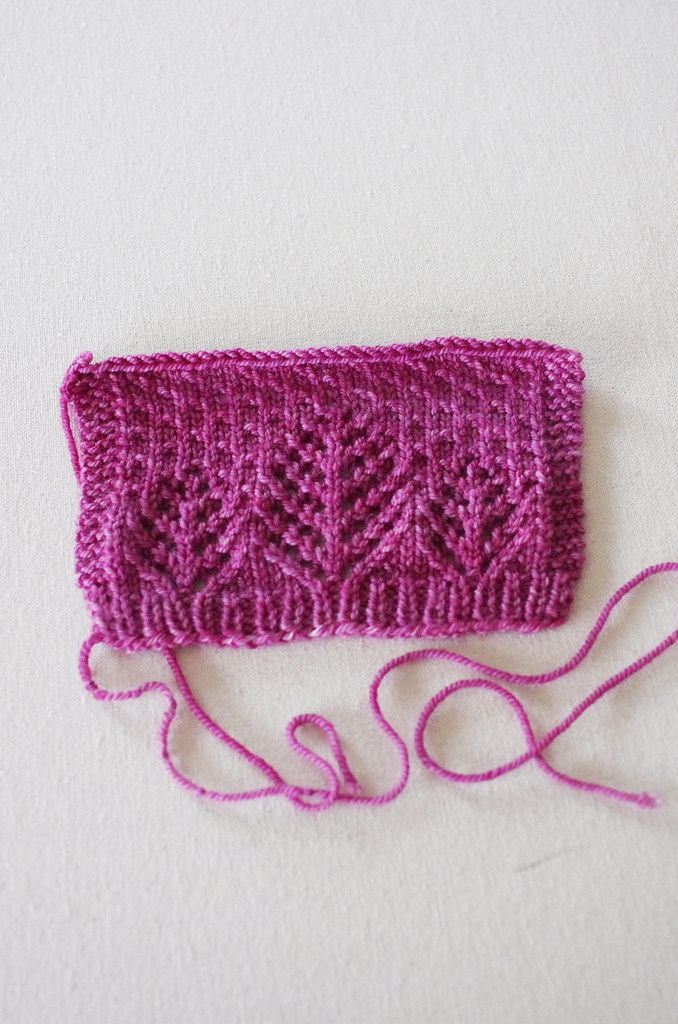
My first swatch - the blue - was in leftover Hazel Knits Lively DK, and I started off with the Christmas Trees motif from Barbara Walker's A Treasury of Knitting Patterns (page 202-03, in case you want to take a peek). The stitch pattern as I charted it was huge, the ribbing didn't flow into the pattern, and I wasn't happy with the proportions of the center tree to the little trees. But the swatch gave me enough information to see what I wanted to change.

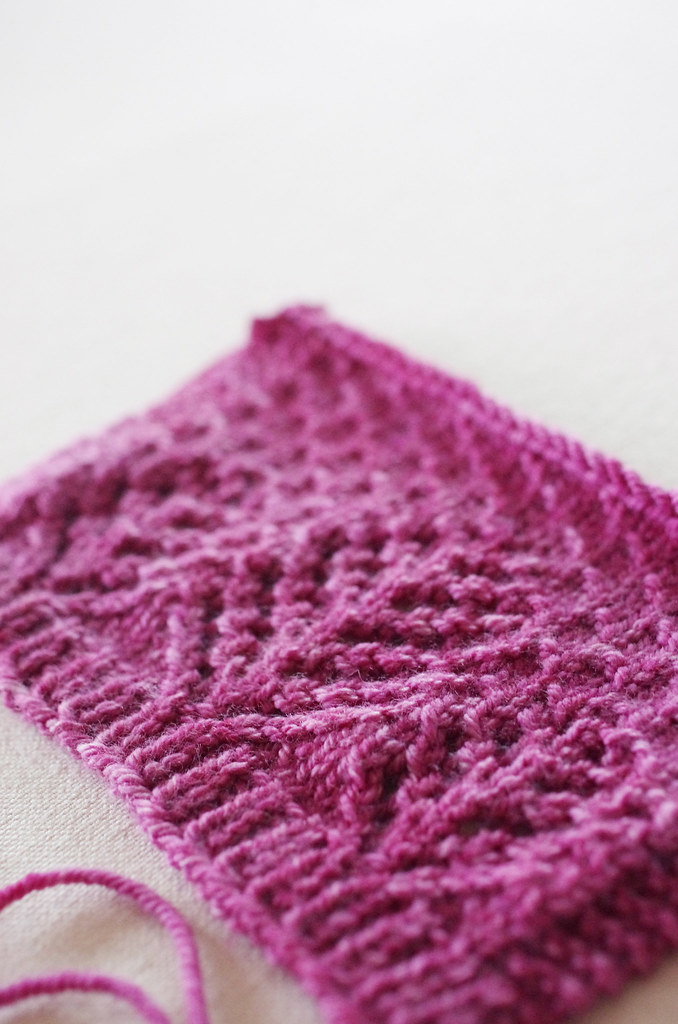
So, I tinkered with the chart, moved the trees together, shifted the ribbing, and voila! The second swatch - the pinkish purple - was done in a bit of Anzula Cricket, and as I saw the pattern emerging, it just made sense. Which, as weird as it is, is even more gratifying than making something that looks pretty: making a thing that, when you look at it, appears to have overturned something essential and correct in our dimensional space, simply by existing. It is the greatest feeling.

And it will be a good hat, I think.

Happy Wednesday.
<3
Cory

Wednesday, October 29, 2014

Foundational Aesthetics: Color

materialsweltedmitts2terrafirmabainbridge
sheepsweater7IMGP7559projects11IMGP8634
saltcreekhat6ballgown9.3IMGP6805bra10
projects7tartcowl6 - Version 2coral - Version 2IMGP9940

As I've found out since I embraced my inner design nerd, my biggest visual driving force is color.

I've always found it hard to categorize my design sense, mostly because it's so eclectic. I love clean lines, and I also love interesting textures; I love colors and colorblocking and contemporary & classic prints; I love elements of vintage style, and I love fresh interpretations of sartorial tropes.

I hate to use such a dull word as "interesting" to describe it, but I think that might be the best one. I like things which contain interest: in color pairing or pattern; in texture or construction. But there is also a balance struck between interest and the negative space around it: it's not merely the detail that is compelling, but the foundation which allows it to be so.

No matter the overall design, color is the final and most important piece of that puzzle. When I conceptualize a garment, its color is built into its DNA: where simplification or retooling of a design element has become a natural part of my process, color choice is much more inflexible. Just as restrictive design specifications can actually encourage creativity, I find that color restrictions allow me to fully explore a design by setting visual and conceptual boundaries and letting my ideas bounce around within them.

IMGP2465

Now, if that isn't a justification for a large and lovely multicolored yarn stash, I don't know what is.

<3
Cory