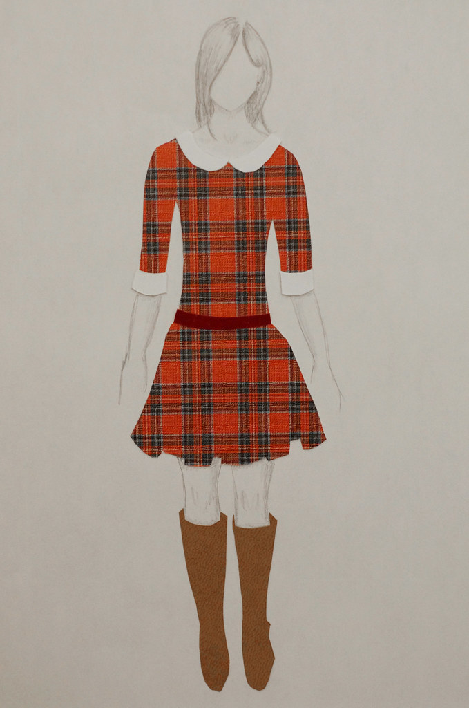
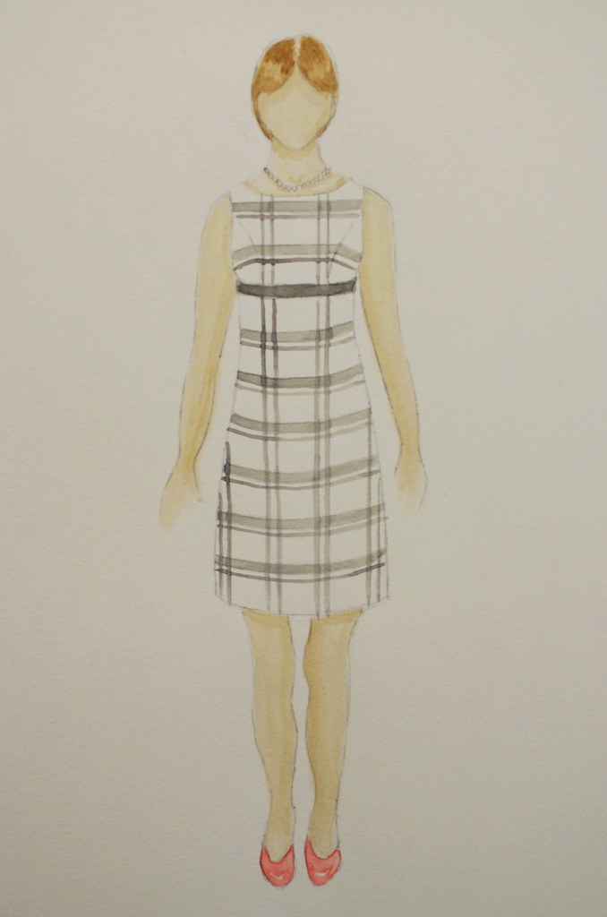
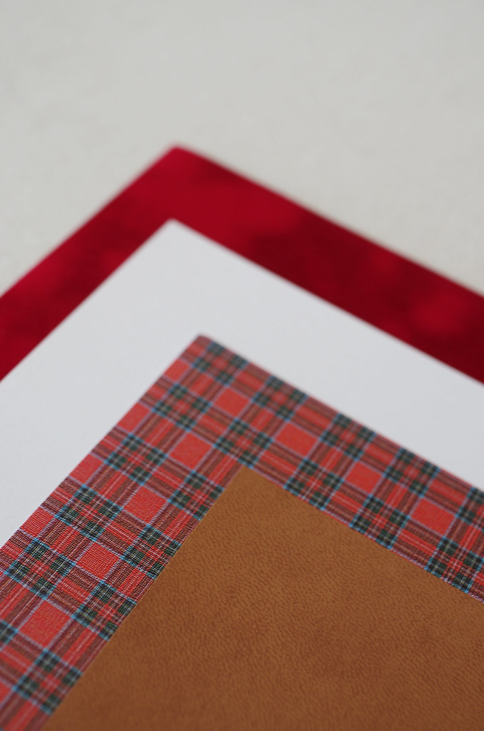
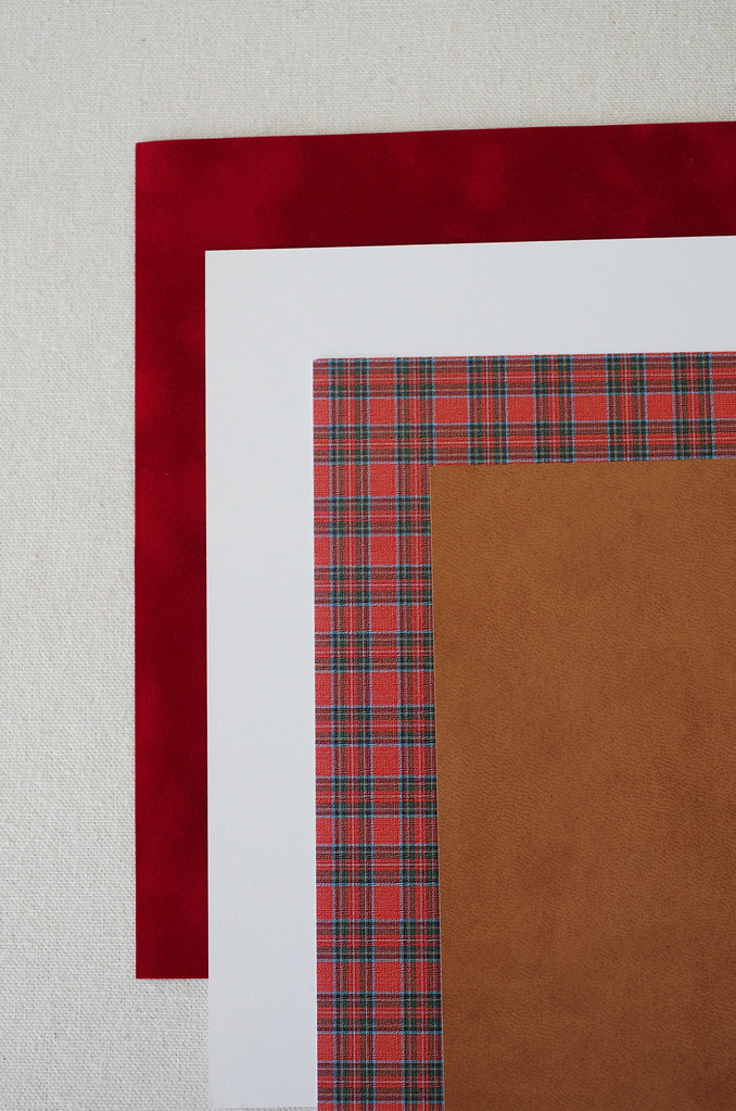
Yesterday I finished the last two designs for my Line & Proportion notebook! I used cut paper on the Town & Country illustration for the Rectangle Figure (medium/broad shoulders, small/medium bust, medium waist, medium hip), and watercolor on the Classic illustration for the Inverted Triangle Figure (medium/broad shoulders, full bust, medium/large waist, narrow hip).
For the cut paper illustration, I wanted to focus on the clothing and overall figure of the model, with other physical features - arms, legs, face and hair - fitting the aesthetic without distracting from the design. Although I wasn't sure at first that I liked the sketched body with the pops of color from the paper, it's grown on me a lot as I've sat with it - overall, I think the illustration gives the effect that I wanted.
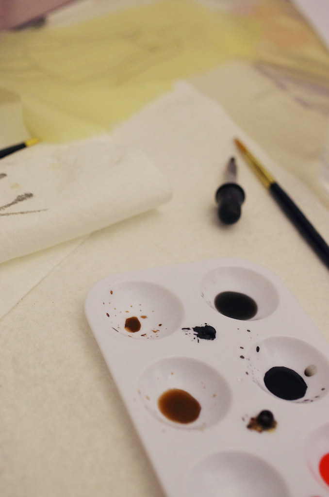
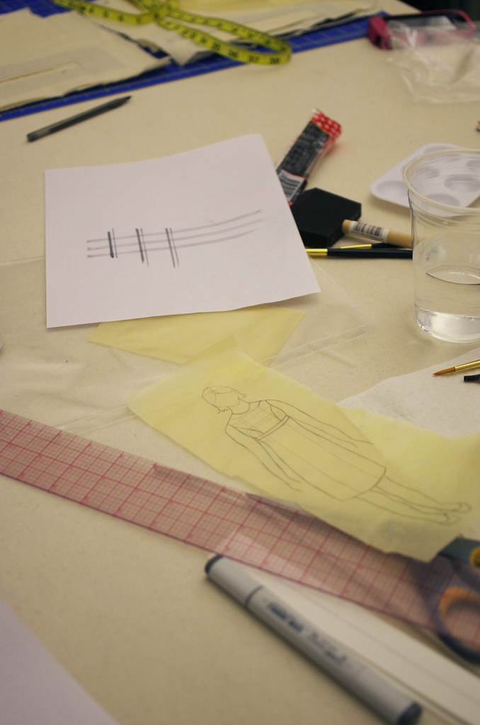
For the watercolor illustration, I played with my Copic markers to decide on the proportions of the plaid before doing them in watercolors. I knew that I wanted it to be a large-scale plaid print, to keep the lines clean and simple for our Classic lady. After a little Google Images sleuthing, I decided on this clean, modern pattern. I'm still learning my style when it comes to watercolors, but I'm really happy with how this one turned out!
It's funny, so much of this process has depended on my being super aesthetically picky, but if you asked me exactly what I wanted in each case, I couldn't tell you. I know the right thing when I see it - which is that annoying thing that people say, but it's true! I did a lot of research and preparation in this project, looking for just the right colors and proportions for all of my materials, and I really feel as though it paid off. I'll be the first to admit I'm no great shakes as an illustrator, but because of this project, I feel very confident that I can express both the vision and technical aspects of my designs in multiple mediums.
Now to finish the last details of my notebook and submit it!


.png)


