Showing posts with label illustration. Show all posts

Monday, September 22, 2014

FO: Collection Illustration for Portfolio

collection

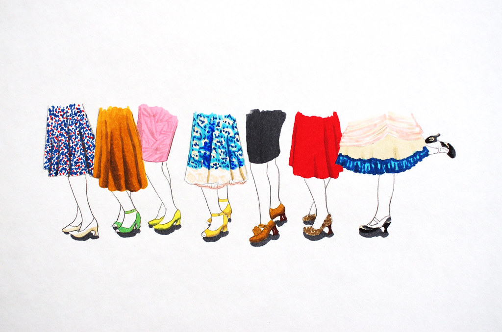
Doing this little illustration for the title page of my Collection portfolio section has been on my to-do list for a long time - almost a year, actually! Last night, I was feeling restless about all of my other projects, so I grabbed my tracing paper and Copic markers and gave it a go. I didn't actually intend to finish it last night, but it was so fun to illustrate the shoe/skirt combinations that I looked up around 1 am and it was done. It's one of the last things I need to do to finish this section of my portfolio, which is one of just three projects left before I graduate.

Oh yeah, and all the shoes are Fluevogs. Yeahhhh!

<3
Cory

Friday, June 20, 2014

WIP: Fashion Illustration Porfolio Section

illustration2 IMGP9940

For some reason, this week I was really motivated to start messing around with my portfolio again. I've been working on it off and on for the last few months, so I had a few ideas about the next step, but Wednesday I finally sat down and worked on it... and ended up finishing a draft of the Fashion Illustration section. Whee!

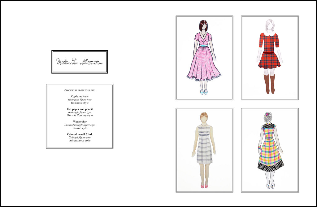
Portfolio - Illustration
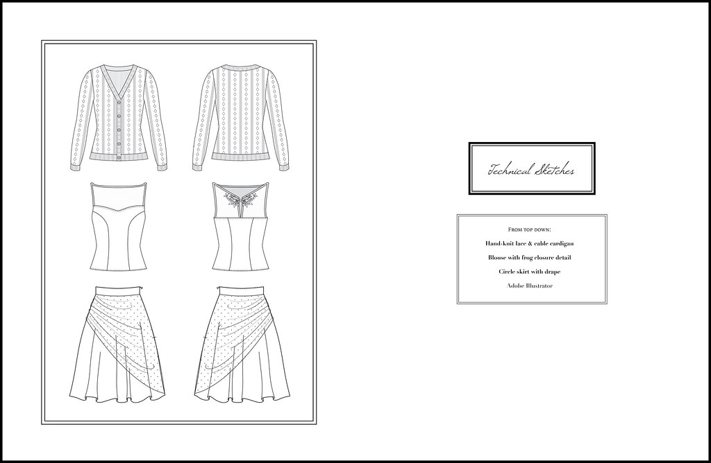
Portfolio - Illustration2
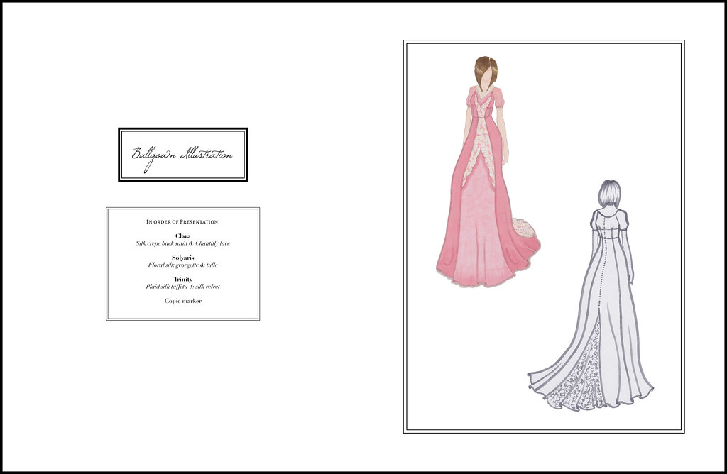
Portfolio - Illustration3

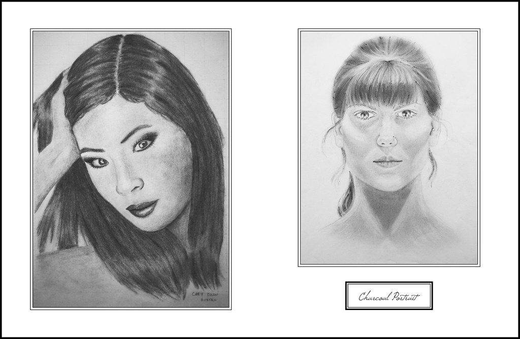
In each section, I'm doing a different layout to exercise my graphic design chops. For this section, I wanted to give a varied but specific range of examples of my illustration skills, with a pretty script balanced out by an unfussy layout and graphic borders.

Over the last three years at NYFA, I've worked with watercolors, pen, colored pencil, markers, cut paper, charcoal, and Illustrator, and I've done a lot of experimentation with different media to get a variety of effects in my illustrations. I really enjoy having the ability and freedom to illustrate garments in all these different ways, and I think it's made me a better designer and patternmaker.

Portfolio - Illustration4

So after the fun, designy illustrations, I decided to include some of my flat sketches as well. I actually love doing these type of illustrations, especially when I haven't created the garment yet; it really forces me to think about all of the functionality of a piece, because ultimately someone should be able to figure out how to make that garment based on the flat sketch alone.

It can also be a nice reference for proportion and details - there were quite a few times during the show that I would look back at a flat sketch to double-check the design lines or seam placement of a garment!

Portfolio - Illustration5
Portfolio - Illustration6

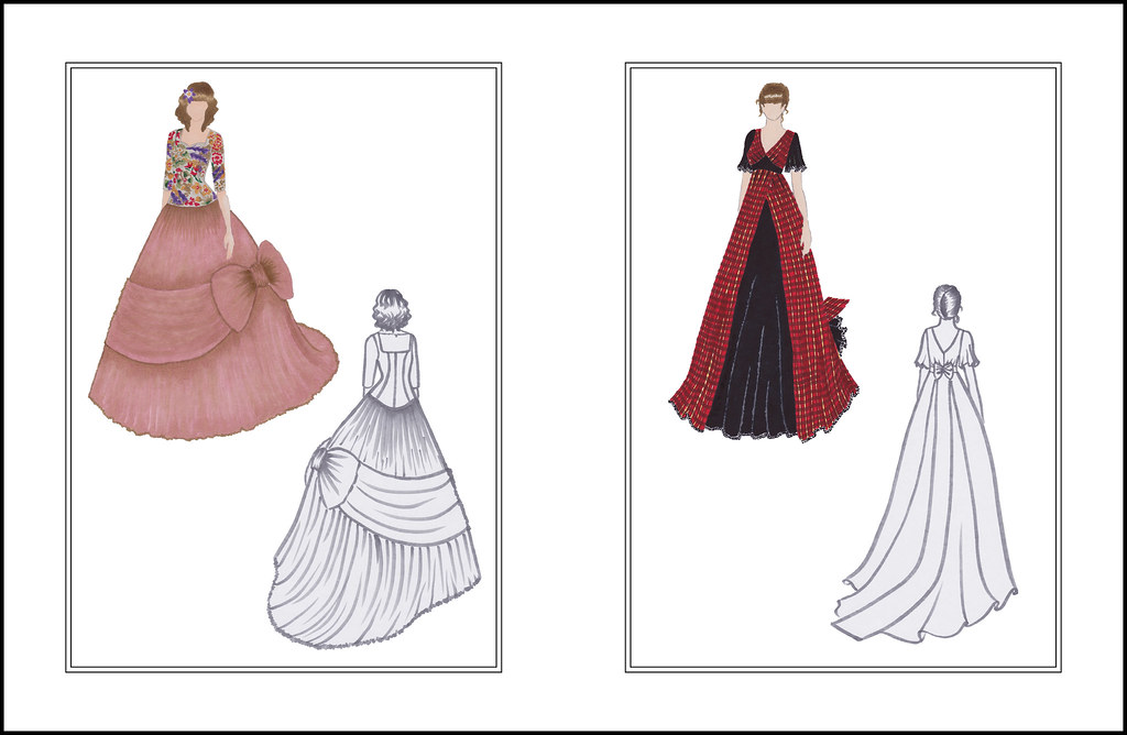
These ones are probably familiar - it seems like just yesterday that I was illustrating my ballgowns! In the process of creating the presentation, I scanned the original illustrations and spent hours editing them, so I have nice clean digital copies that I can print or use digitally as many times as I need to. Thanks, past self, for thinking of everything!

Overall, this draft was probably about 8 hours of work, and I'm really happy with the overall feel of the section. The next section will be ballgown, so that will probably happen sometime in August.

Happy Friday!

Wednesday, February 5, 2014

Fashion Illustration: Vintage-Inspired Plaid Dress #3 & 4

illustration3 illustration2illustration illustration4

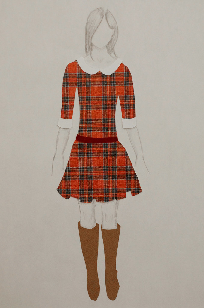
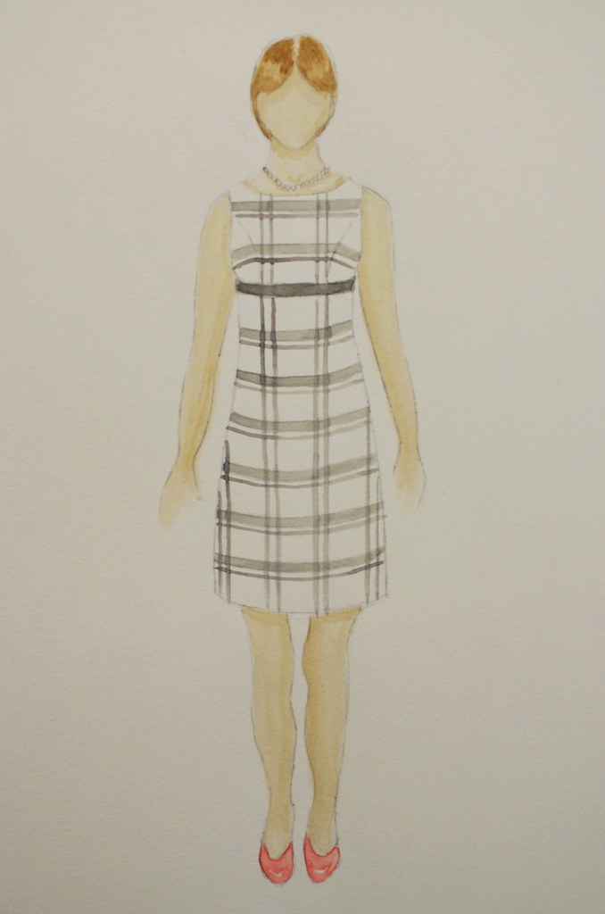
Yesterday I finished the last two designs for my Line & Proportion notebook! I used cut paper on the Town & Country illustration for the Rectangle Figure (medium/broad shoulders, small/medium bust, medium waist, medium hip), and watercolor on the Classic illustration for the Inverted Triangle Figure (medium/broad shoulders, full bust, medium/large waist, narrow hip).

For the cut paper illustration, I wanted to focus on the clothing and overall figure of the model, with other physical features - arms, legs, face and hair - fitting the aesthetic without distracting from the design. Although I wasn't sure at first that I liked the sketched body with the pops of color from the paper, it's grown on me a lot as I've sat with it - overall, I think the illustration gives the effect that I wanted.

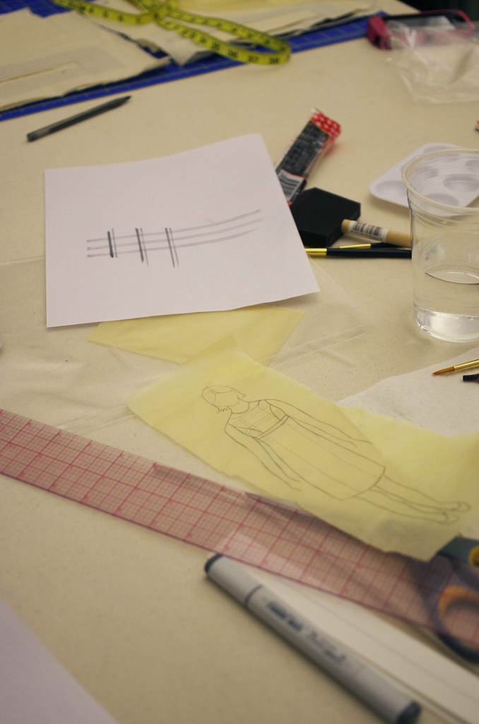
For the watercolor illustration, I played with my Copic markers to decide on the proportions of the plaid before doing them in watercolors. I knew that I wanted it to be a large-scale plaid print, to keep the lines clean and simple for our Classic lady. After a little Google Images sleuthing, I decided on this clean, modern pattern.  I'm still learning my style when it comes to watercolors, but I'm really happy with how this one turned out!

It's funny, so much of this process has depended on my being super aesthetically picky, but if you asked me exactly what I wanted in each case, I couldn't tell you. I know the right thing when I see it - which is that annoying thing that people say, but it's true! I did a lot of research and preparation in this project, looking for just the right colors and proportions for all of my materials, and I really feel as though it paid off. I'll be the first to admit I'm no great shakes as an illustrator, but because of this project, I feel very confident that I can express both the vision and technical aspects of my designs in multiple mediums.

Now to finish the last details of my notebook and submit it!

Monday, February 3, 2014

Fashion Illustration: Vintage-Inspired Plaid Dress #3

plaid2 plaid

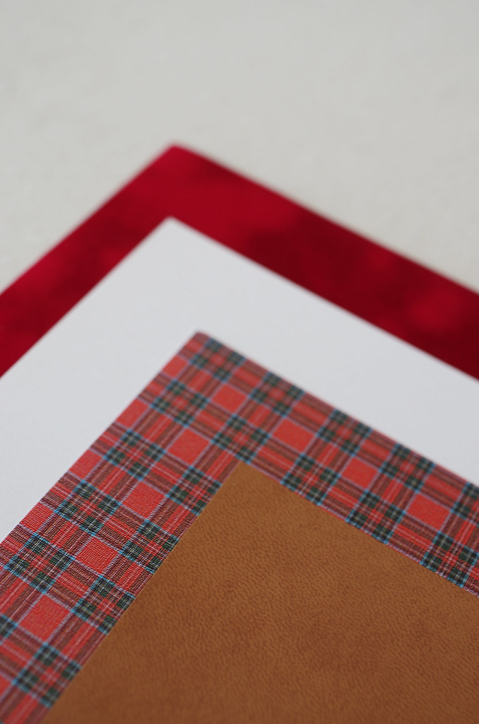
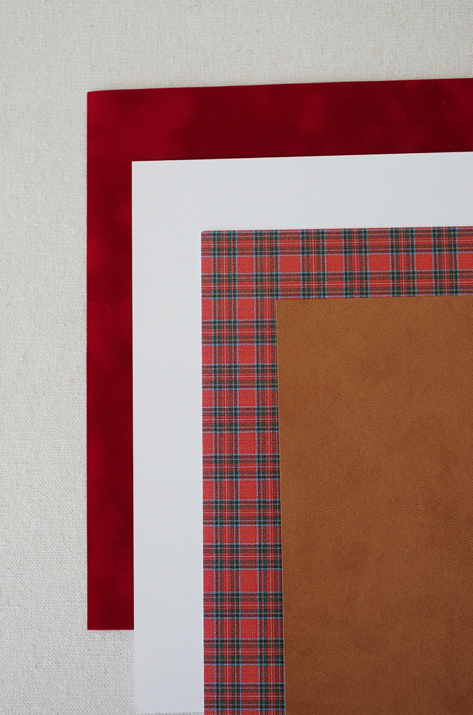
Next up on my Line & Proportion illustrations, I'm going to illustrate a design using cut paper, with Town & Country Style on a Rectangle Figure Type.  I'm going for preppy, Ralph Lauren-esque style, so I chose a classic red plaid for the dress.  It was surprisingly tricky to find the right plaid - I ended up having to special-order it from an internet scrapbooking company!  It made me realize how lucky I am that the scrapbooking and card-making hobby industry is as robust as it is: although I was pretty picky about the scale and color of the plaid, I was able to find it in the end, and had even less trouble finding leather-textured and velveteen paper.

I need to experiment a bit with it - I'm hoping that it will read as sophisticated and not third-grade-collage-y! - but I'm hopeful that I can make it work.

Friday, January 31, 2014

3 Projects

WIP2 WIP6

1.  Line & Proportion Notebook

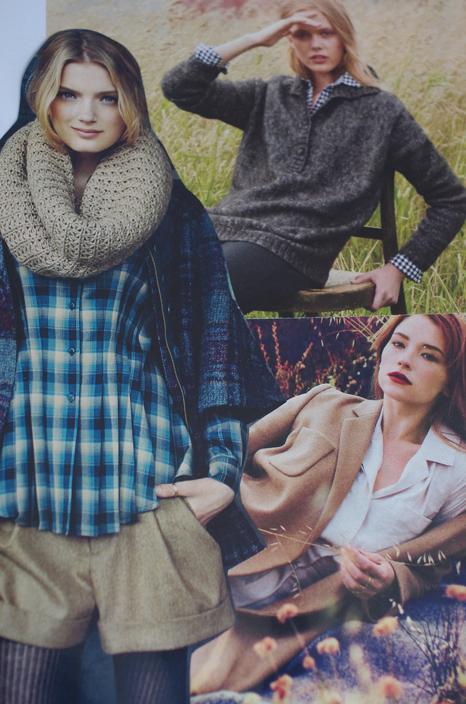
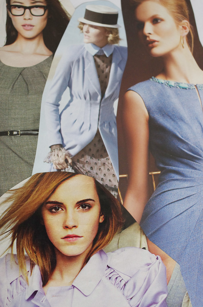
This week, I've been holed up on my couch - once until 3 am! - tearing examples of pleats, sleeve plackets, silhouettes, and colors from a pile of Vogue and Harper's Bazaar magazines. The pages above are for a Fall moodboard and a page on Tucks & Gathers, and I have approximately a billion other pages to complete.

Leafing through these magazines, mostly from 2010-now, is really interesting as a study of trends: in the past few days, I've found out that it's nearly impossible to find an example of a sailor collar on a contemporary garment, and that models Karlie Kloss and Laura Stone work a lot, and that the rest of the US must wear a lot more wool jackets and coats than we Northwest folks do, because the pages of Vogue are absolutely littered with them.

So if you stop hearing from me, it's probably because I'm lying in a pile of Vogues, page protectors, and thousands of little pieces of cut-up magazine paper on my living room floor, alternating between cackling maniacally and softly cooing at Dolce & Gabbana ads.

WIP7 WIP

2.  Tailoring Techniques

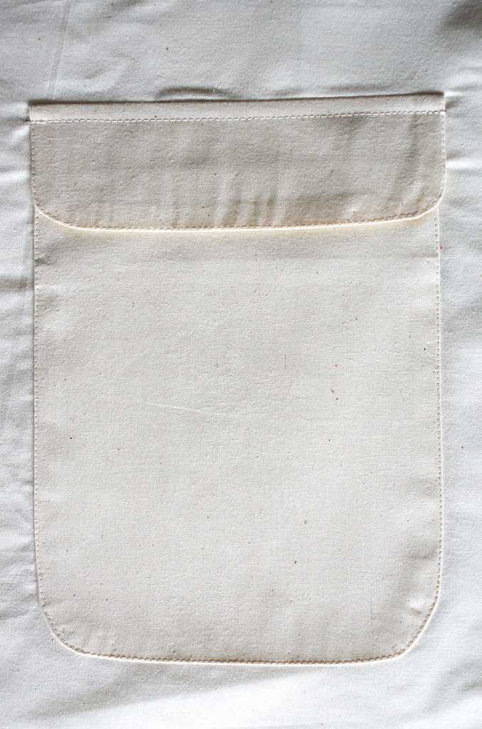
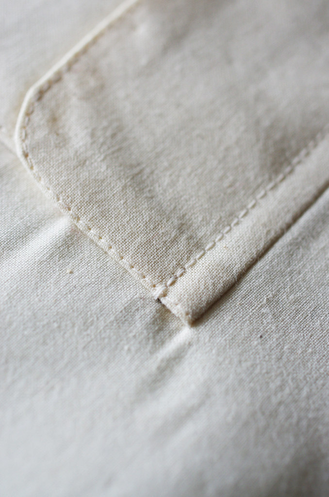
I was halfway through my Tailoring Techniques class when I started the fashion show last year, so I jumped in last night to work on one of the final techniques I need to get it signed off: a patch pocket with a flap.

There's something really wonderful about the methodical care of tailoring: pressing seams with the heat of your fingers; gently pulling a basting thread to ease a seam; topstitching just a thread over the edge of the pocket to secure it. It reminds me that it's okay - and even desirable - to take time to do things correctly, and to enjoy the process, not just the result.

WIP3 WIP4

3.  Line & Proportion Illustration: Vintage-Inspired Plaid Dress #2 

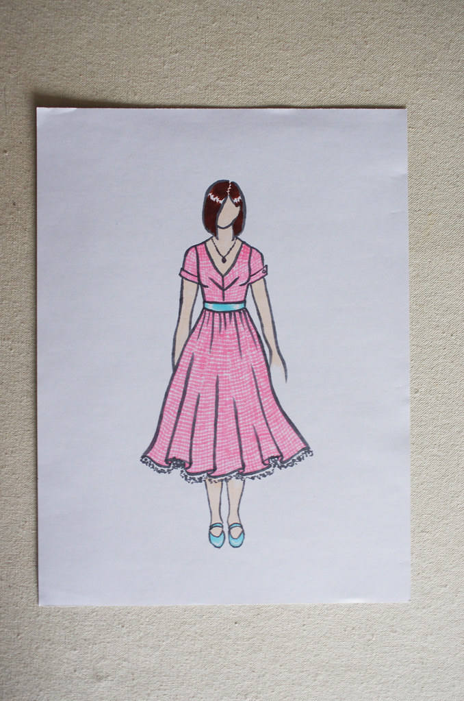
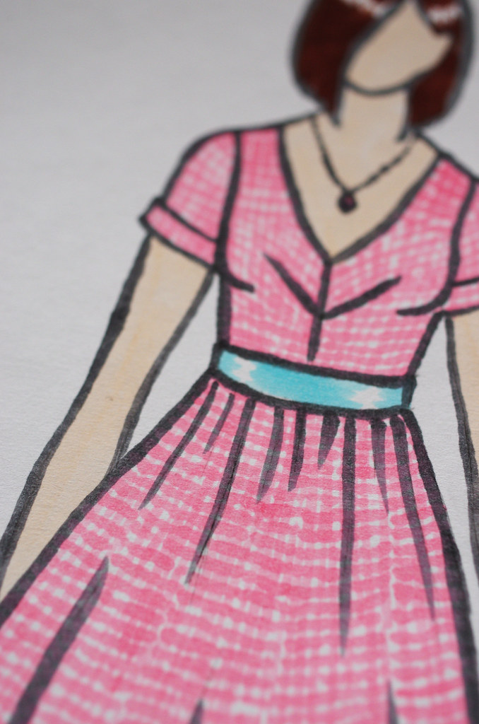
I did my first illustration for this project a while back, and decided that I wanted to try different illustration techniques for each of my designs; I started with colored pencil and ink, and planned to illustrate the other three with Copic markers, paper cutouts, and watercolors. This is the second technique, Copic markers. The fabric is a check rather than a plaid, on an Hourglass figure with a Romantic style. It took me three hours of watching Dollhouse to fill in the check pattern, but in the end I'm really happy with it. It almost has a watercolor-like look, but it feels slightly more precise.  And this is a dress that I would definitely wear if it existed, which is kinda fun!

Welcome to new readers from Untangling Knots' recent post on Seattle knitters - if you haven't read it yet, I highly recommend checking out the other bloggers she mentions, as they are super great.  Thanks for reading, and happy Friday!

Wednesday, January 22, 2014

Sick Day Recommendation List

sick day

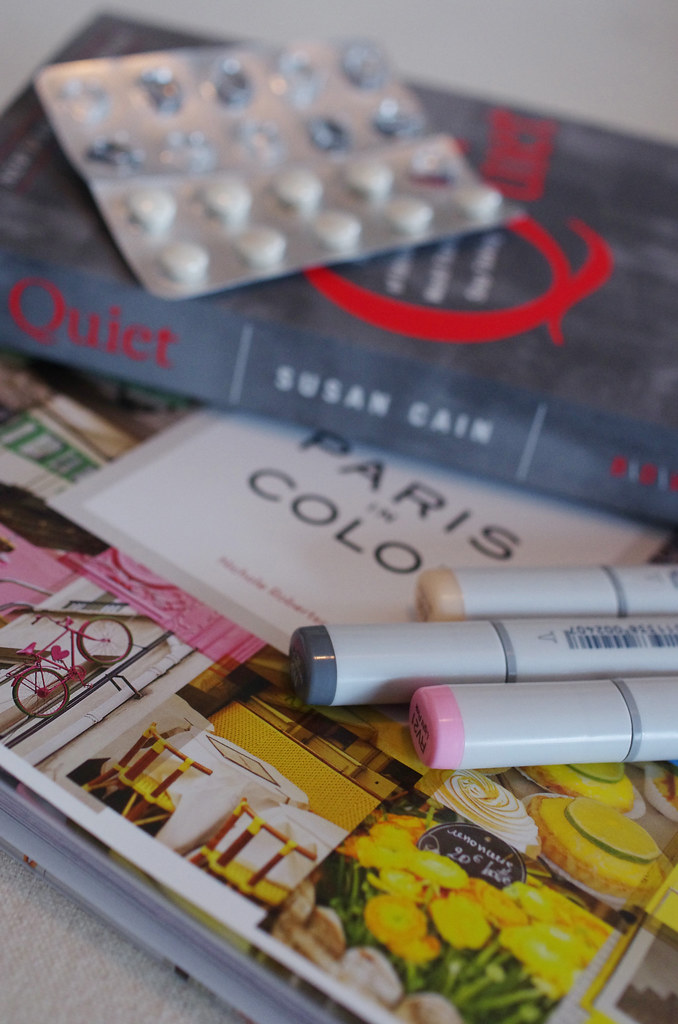
I woke up this morning with the beginnings of the same cold that Lumberjack had over the weekend, so I'm curling up on the couch with a giant cup of tea, chewing echinacea tablets like candy, and catching up on some reading.  I've also been thinking a lot about one of my illustration assignments, where I've decided to try different techniques in each one of 4 illustrations.  I've already done one in colored pencil and ink, and I think I'm going to try Copic markers, printed paper, and watercolors in the other 3.  I might do some experimentation with Copics today while I'm holed up on the couch!

Things I'm Reading & Looking At:

Paris in Color, by Nichole Robertson.  This little gem of a book is full of gorgeous photographs of Paris, grouped by color - and if you're anything like me, looking at it will make you seriously want a lemon pastry and a little mint-green motorbike!

Quiet: The Power of Introverts in a World That Can't Stop Talking, by Susan Cain.  This book is a thoughtful and thorough exploration of what it means to be an introvert, with focuses ranging from physiology to education and beyond.

The Power of Vulnerability, a TED talk by Brené Brown in which she talks about both her research and personal experience with the subject of vulnerability in a really candid, wonderful way.

Colette Patterns Zinnia.  I've fallen in love with the sheer version of this swishy skirt!

Monday, September 30, 2013

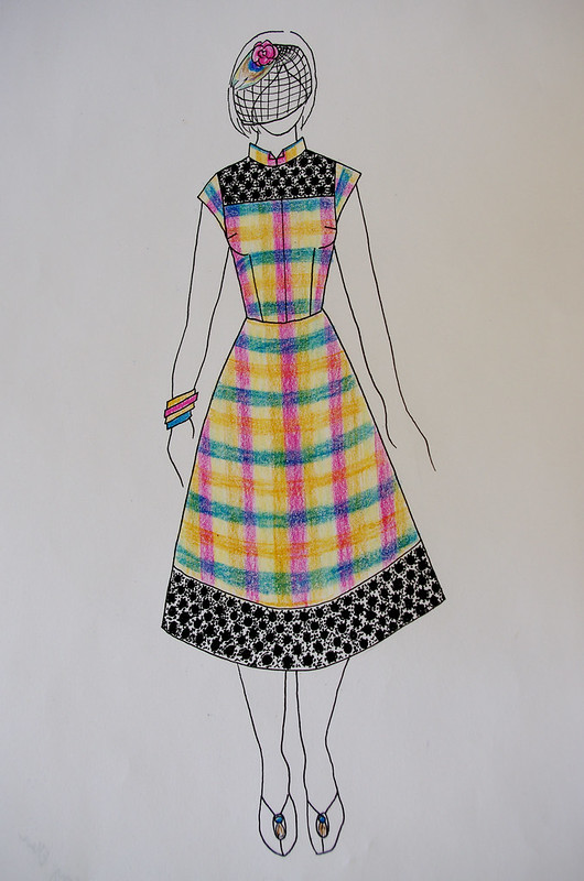
Fashion Illustration: Vintage-Inspired Plaid Dress #1

One of the projects I have left to do for my certificate program is to design and illustrate four garments to go in my Line & Proportion notebook.  Each garment has to be the same type - for example, all pantsuits, or ballgowns, or cocktail dresses.  Since I'm stuck on plaid and love vintage clothing, I decided to do little vintage-inspired plaid dresses for all of my garments.

Each drawing must be shown on a different body type*:

Rectangle:  Medium to broad shoulders, small to medium bust, medium waist, medium hip.
Triangle: Narrow shoulders, medium to small bust, small waist, full hip.
Inverted Triangle: Broad to medium shoulders, large bust, medium to large waist, narrow hip.
Hourglass: Medium shoulders, full bust, small waist, full hip.

  Lastly, each drawing should be an example of a stylistic genre**.  The four genres we were assigned, and some common design characteristics:

Exotic - jewel tones, animal prints, mixed prints
Romantic - soft colors, florals, flowy fabrics
Town & Country - neutrals, equestrian-inspired, preppy
Classic - solid colors, simple prints, very simple designs


For my first dress, I was designing for a Triangle figure type in the Exotic style.  I sketched the dress a few weeks ago and loved the idea of doing a bright plaid taffeta with black guipure lace accents, with a shape inspired by the all the fabulous cheongsams worn by Maggie Cheung in In The Mood For Love.  It was definitely interesting to think about how to design something that is inspired by another culture, but keep it from being too literal or appropriative.  I was very happy with the design I came up with; I think it echoes the inspiration without copying it wholesale.

IMGP9945 IMGP9940IMGP9943 IMGP9950

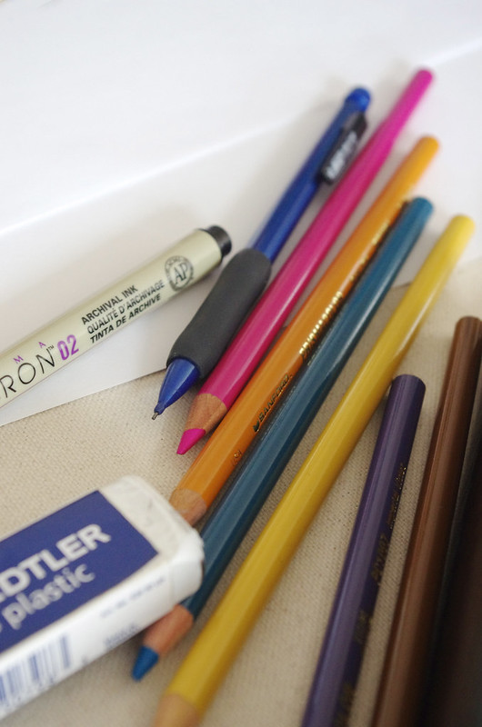
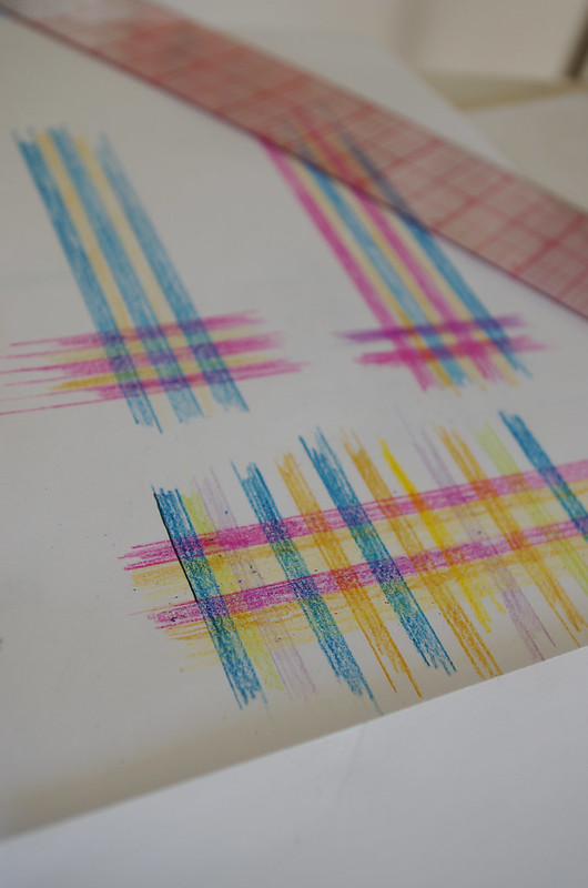
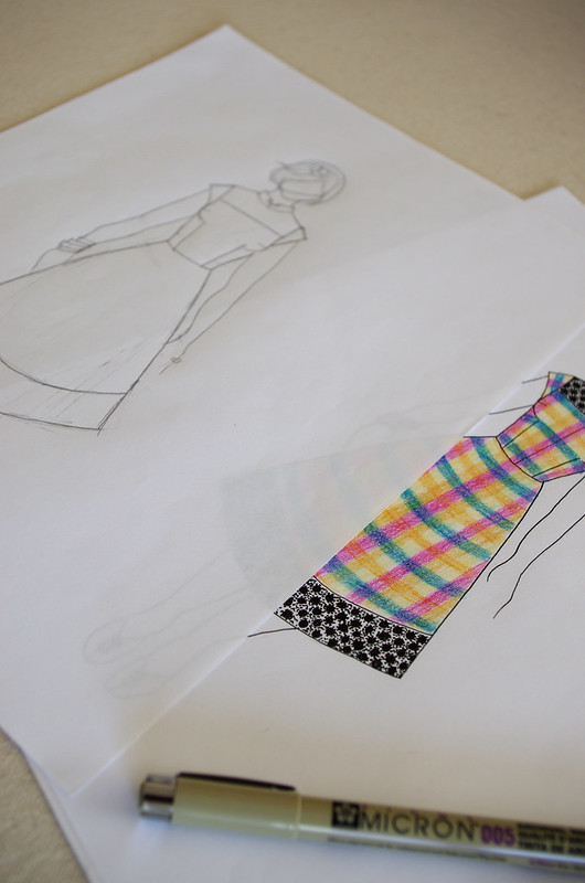
  This afternoon, I grabbed my pens and Prismacolor colored pencils, traced the pencil sketch onto another piece of paper, and inked the outline.  I had to spend an hour or so developing the plaid pattern, since I didn't have a fabric sample to work from.  I think the only thing I didn't quite capture is the texture of the fabric - crisp and rich, with a soft glow.  Then I had to think about the construction of the dress and how it would affect the plaid and seam matching.  (I've been thinking a lot about seam-matching lately, because of the plaid love affair!)

The lace was really fun to ink, but took forever, so I listened to Starjay Knits and drew zillions of circles with dots around them for a few hours!  Now my hand hurts, but I'm a quarter done with the assignment, and almost caught up the podcast.  Hooray!

*These are general guidelines - most people, including myself, are a combination of these.  For this exercise, we're supposed to design to flatter each body type using the guidelines we learned in the class.  I have some differing opinions on the subject, but I also think it's interesting and constructive to learn the "rules".

**Again, I have my own thoughts about these genres, particularly Exotic, which can be a very problematic word because of the frequent sexualization and commodification of marginalized cultures.

Thursday, August 2, 2012

Fashion Illustration: Practicing Style

IMGP4581 IMGP4584

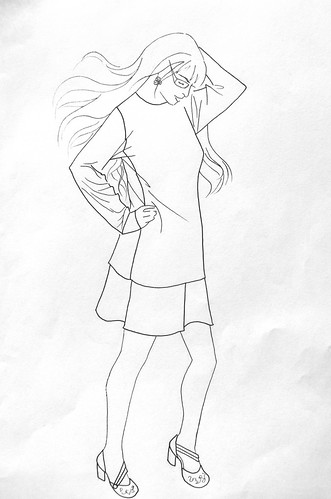
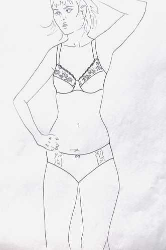
I picked up a cool book on fashion illustration the other day, called Fashion Illustrator by Bethan Morris.  It's interesting because it's not really a how-to fashion illustration book, but more of an inspirational guide on how to make your illustrations not only accurate, but stylish and interesting to look at.  I often find myself too simplistic in my design aesthetic, so it's helpful to see examples of how other people have composed things in an eye-catching way.

I finished the first chapter of the book and felt like I wanted to draw something, so I found a few pictures and went to town.  I did pencil sketches yesterday afternoon and inked two of them last night with three different pen weights, which I find really helps to draw fine details.  I also tried to be careful to merely suggest more difficult elements like the hands and facial features, instead of drawing them fully outlined, which can make them look harsh or weird.

Overall, I was pretty happy with the way these turned out!  I haven't decided yet if I'm going to try to add color.  I sort of like them the way they are.  And although I think I have much more to learn, this was a fun first step!

Monday, June 4, 2012

FO: Fashion Illustration Class

IMGP3270 IMGP3269IMGP3273 IMGP3264

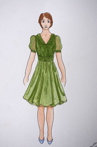
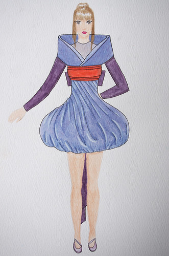
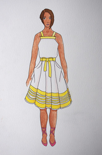
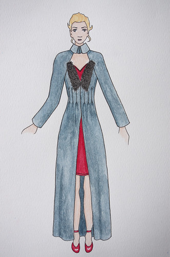
Today I went into school to finish up the requirements for my fashion illustration class.  I started these last fall, so it had been a while!  To pass the class, I had to have examples of sheer, shiny, printed, and fur fabrics done in watercolor.  I mostly worked from drawings of clothes from magazines and books, so these aren't my own designs (except for the green dress).  I did change the colors and generally simplify the designs I was painting.

It was definitely an adjustment to learn how to work with watercolors - I still haven't mastered it, but I'm thinking about getting my own set and trying it out at home.  I think the hardest part, though, was the inking - once something is done in ink, it's done, so you just have to be really careful and not make any mistakes.  I had the hardest time with long, straight lines, and fine details like the faces.  I'm only really happy with the face on the girl in the little yellow and white sundress.  Oh well - that's what practice is for!

I also think it's interesting to see the progression from my first attempts - the green dress - to the one I did today, the grey coat and red slip dress.  If I were to do them again, there's definitely quite a few things I'd change, but for now I'm glad to have them all finished.

I stayed a little past class time to finish up, and got the class signed off when I was done.  Hooray!