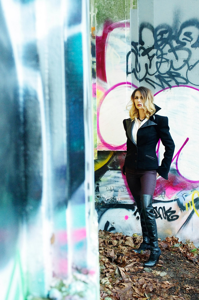
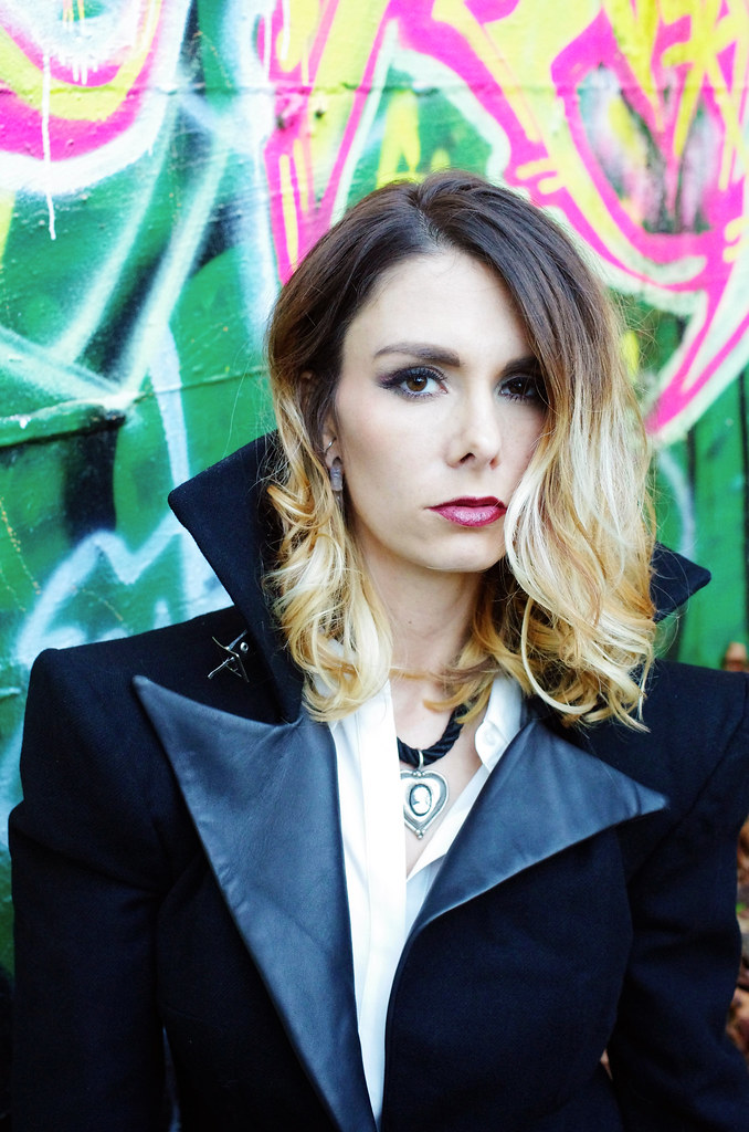
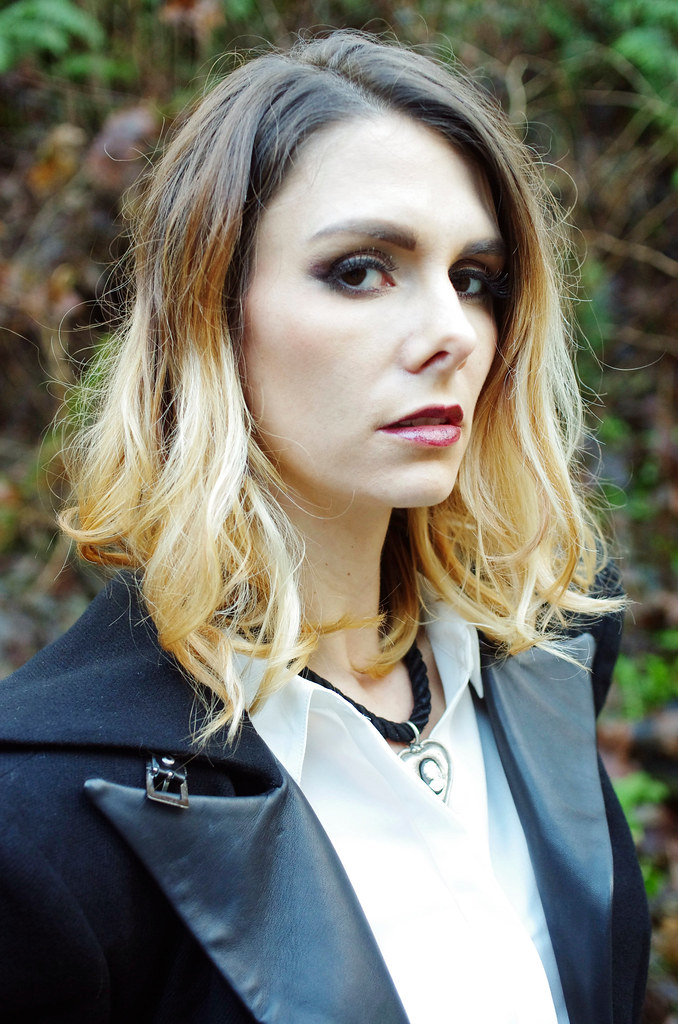
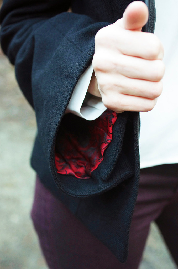
Hi friends! As I start thinking about styling and shooting photos of the Nusa cowl - my contribution to the Three Fates Design Challenge with Ariel - I wanted to talk a little bit about the photography and overall aesthetic of my work. Whenever I begin to approach the task of visually representing a design, these are always the avenues that I explore first.
Styling
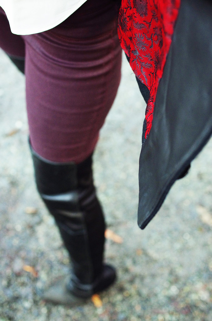
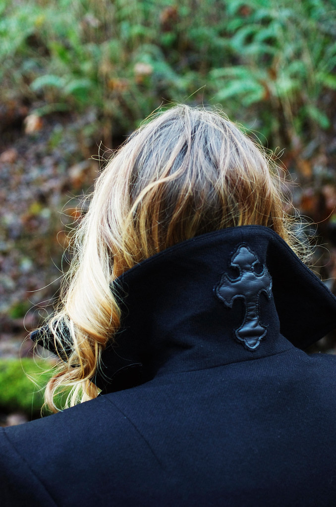
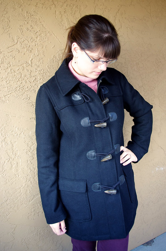
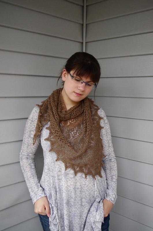
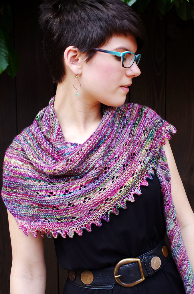
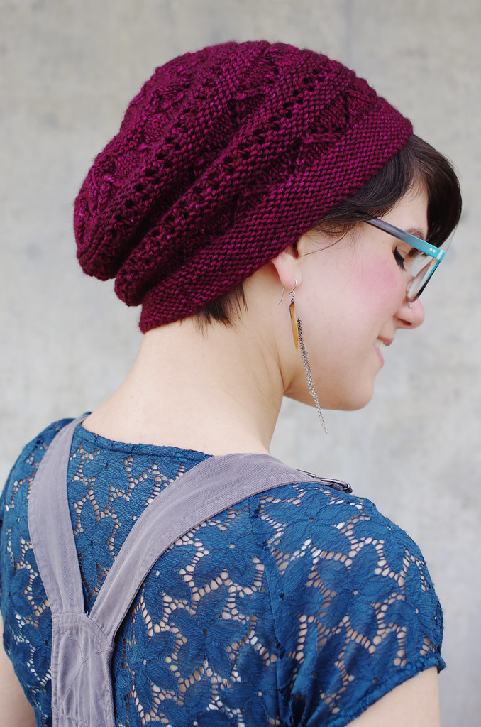
I want people to be able to look at my patterns and recognize a sense of both character and aesthetic context, based solely on visual information. For me, a huge part of that is in styling. In each shoot, I think about garment type, silhouette, proportion, color, drape, and fit, all working together with the designed garment to frame it in the best possible light. Currently I release most of my designs independently, which means that I either model or shoot almost everything I release - and that gives me final say on the image and presentation of my work, which is a great position to be in as a designer!
It's important to me that the styling of my designs is bright and dynamic, with colors and proportions that complement and showcase each piece. I also want to give a sense of my own personal style, so I tend to choose outfits that I would actually wear. One of my biggest goals as a designer is to create things that are not only fun to knit, but are also essentially functional, so I try to express that easiness and wearability in the styling as much as possible.
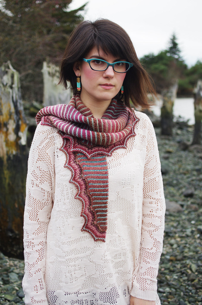

Photography
As much as I love writing (and oh, I do, I really do!) I've found more and more that I would rather create the narrative of a design through a really great photograph.
A single photograph is an incredibly efficient method of conveying information: it can tell the viewer about color, fit, construction, ease, wearability, style, and mood, and all in a few seconds! It would take a lot more words to do the same job, and probably only half as well. To me, well-executed photography is an awesome, and surprisingly natural, way to fling open the door and invite the viewer to experience the world of your imagining.
Styling
I want people to be able to look at my patterns and recognize a sense of both character and aesthetic context, based solely on visual information. For me, a huge part of that is in styling. In each shoot, I think about garment type, silhouette, proportion, color, drape, and fit, all working together with the designed garment to frame it in the best possible light. Currently I release most of my designs independently, which means that I either model or shoot almost everything I release - and that gives me final say on the image and presentation of my work, which is a great position to be in as a designer!
It's important to me that the styling of my designs is bright and dynamic, with colors and proportions that complement and showcase each piece. I also want to give a sense of my own personal style, so I tend to choose outfits that I would actually wear. One of my biggest goals as a designer is to create things that are not only fun to knit, but are also essentially functional, so I try to express that easiness and wearability in the styling as much as possible.
Photography
As much as I love writing (and oh, I do, I really do!) I've found more and more that I would rather create the narrative of a design through a really great photograph.
A single photograph is an incredibly efficient method of conveying information: it can tell the viewer about color, fit, construction, ease, wearability, style, and mood, and all in a few seconds! It would take a lot more words to do the same job, and probably only half as well. To me, well-executed photography is an awesome, and surprisingly natural, way to fling open the door and invite the viewer to experience the world of your imagining.
And as far as actually getting that image that I want, I've found four things to be very important:
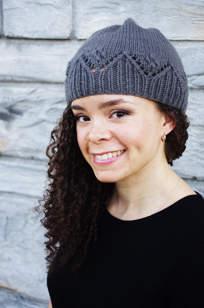
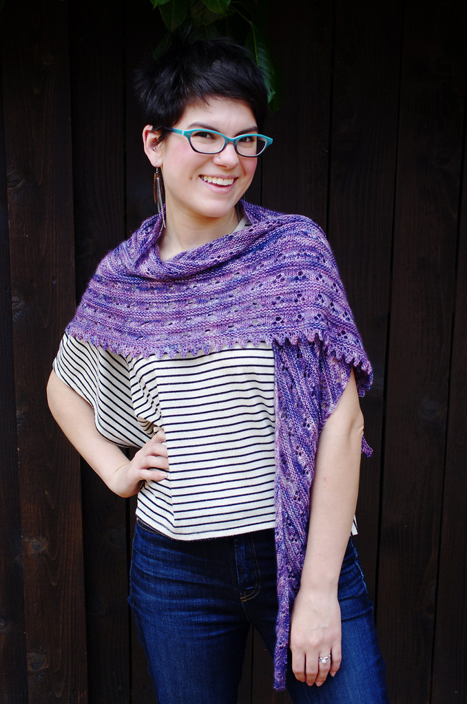
1) The model & photographer are on good terms, with a high level of mutual respect and excellent communication skills. Modeling and photography are both physically - and sometimes emotionally - demanding activities. My best shoots are always between friends or kindred collaborators, and it makes the whole thing so much more fun when you can pull a silly face every now and again. And in-the-moment joy really does come through in photographs, I think!
2) Good, natural lighting. I've seen this advice a lot of other places, but I've found it to be so true: diffuse natural light is where it's at. Cloudy or lightly shaded conditions have always given me the cleanest images, best colors, and easiest post-processing. I think natural lighting tends to be especially well-suited to knitwear photography because it gives photos a soft, approachable look and feeling.
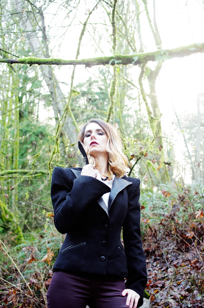
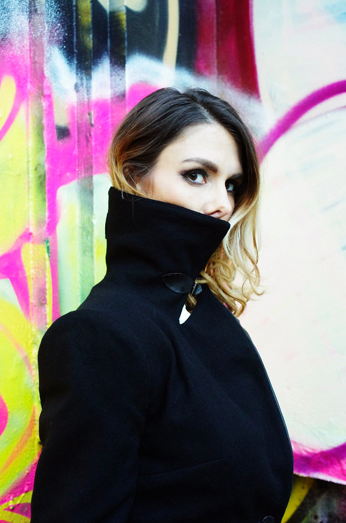
3) Appropriate background. I try to choose backgrounds that give a good amount of contrast with the outfit; that set a scene but don't unnecessarily distract the eye. I avoid having signs, people, objects, or other extraneous elements in my backdrops - that is, unless they are just way too cool not to include. Personally, I'm a sucker for industrial & urban spaces, bright colors, and natural (especially water-oriented) backgrounds.
4) If you have a stray cat hair or weird folded-up hem, fix it as soon as you see it. Photoshop is a powerful tool, but it's a lot more work to fix something in post-processing than it is to lint-roll a sweater.
Editing
The last - and perhaps most important - element of this whole thing is the editing process. Although for the most part, I want to show my work in the best possible light, I also want to be transparent about the fact that I have bad ideas, and I make bad things, and that is part of the process too. For every ten ideas I have, maybe one is a good one. I've had to learn how to recognize the bad ones for their badness, but also, for their potential goodness; over time, I've found that there's almost always a lesson in bad design. I've also had to learn how to cultivate the good ones after I've found them: to give them plenty of food and light and water, to help them become what they need to be.
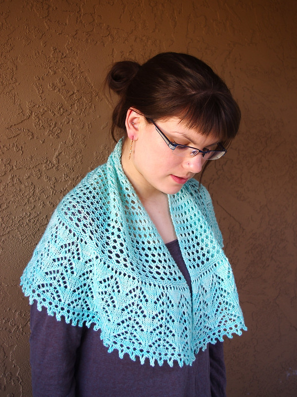
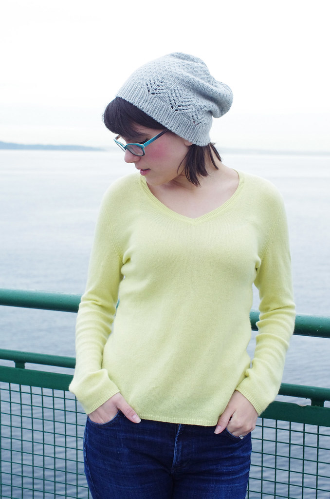
Those two photos above are an example of what you haven't seen - what I've edited away - and the reasons are pretty simple. The first photo, on the left, is from one of my failed Talus shoots. This photo just doesn't work! I like the pose and the railing, but the colors are washed out, the hat isn't particularly visible, and the image isn't representative of me or my design aesthetic. It's visual oatmeal.
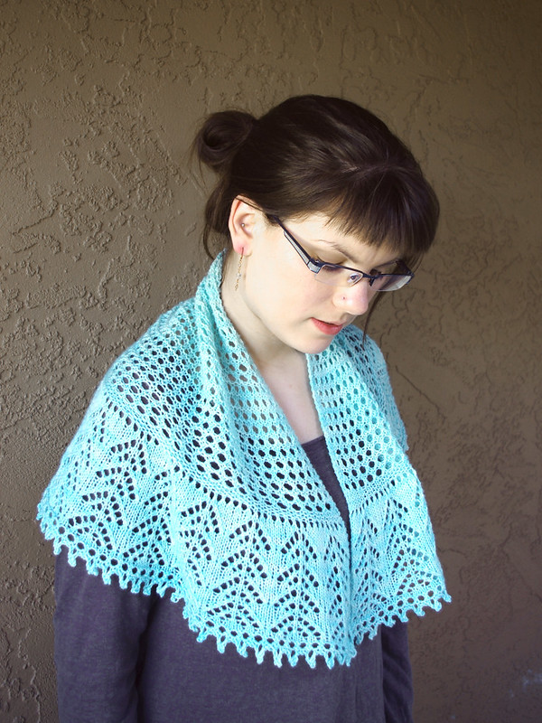
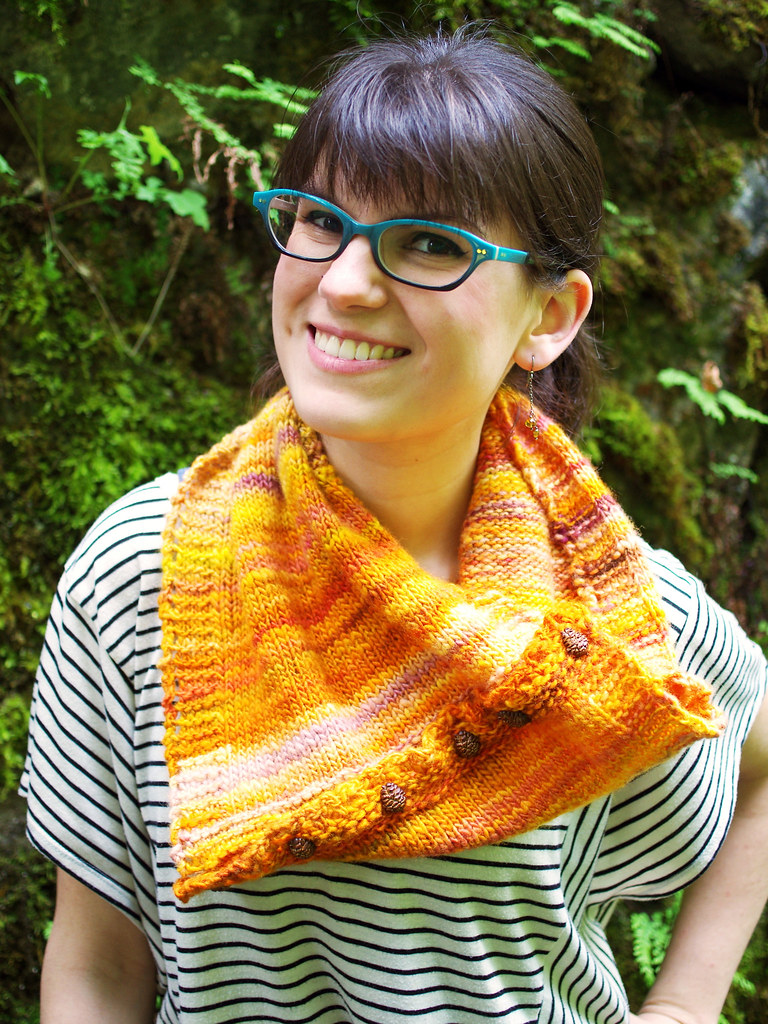
The second photo doesn't work on two levels: first, the background is too busy, and the combination of sunlight and forest canopy gave a green cast to the photo that I couldn't color correct without killing the lovely color of the cowl. Second, this is a design that just doesn't quite make it: it's knit in one of my favorite yarns, but the size I made is weird, and it's hard to wear, which means that it's a no-go. I had it test-knit and everything, but after a bit of consideration, I decided not to release it. In the end, integrity of vision is important, and it's better to be fearless and fail at it than to be too afraid to try something amazing.
And cutting the chaff, so that only I see the truly spectacular failures? That is why I love editing.
---------------------------------------
Whew! Thanks for reading! Ariel has her own post on the subject over here, and the links to the previous posts are below.
Three Fates Design Challenge
Part I: Swatching
Cory
Ariel
Part 2: Color Inspiration
Cory
Ariel
The last - and perhaps most important - element of this whole thing is the editing process. Although for the most part, I want to show my work in the best possible light, I also want to be transparent about the fact that I have bad ideas, and I make bad things, and that is part of the process too. For every ten ideas I have, maybe one is a good one. I've had to learn how to recognize the bad ones for their badness, but also, for their potential goodness; over time, I've found that there's almost always a lesson in bad design. I've also had to learn how to cultivate the good ones after I've found them: to give them plenty of food and light and water, to help them become what they need to be.
Those two photos above are an example of what you haven't seen - what I've edited away - and the reasons are pretty simple. The first photo, on the left, is from one of my failed Talus shoots. This photo just doesn't work! I like the pose and the railing, but the colors are washed out, the hat isn't particularly visible, and the image isn't representative of me or my design aesthetic. It's visual oatmeal.
The second photo doesn't work on two levels: first, the background is too busy, and the combination of sunlight and forest canopy gave a green cast to the photo that I couldn't color correct without killing the lovely color of the cowl. Second, this is a design that just doesn't quite make it: it's knit in one of my favorite yarns, but the size I made is weird, and it's hard to wear, which means that it's a no-go. I had it test-knit and everything, but after a bit of consideration, I decided not to release it. In the end, integrity of vision is important, and it's better to be fearless and fail at it than to be too afraid to try something amazing.
And cutting the chaff, so that only I see the truly spectacular failures? That is why I love editing.
---------------------------------------
Whew! Thanks for reading! Ariel has her own post on the subject over here, and the links to the previous posts are below.
Three Fates Design Challenge
Part I: Swatching
Cory
Ariel
Part 2: Color Inspiration
Cory
Ariel