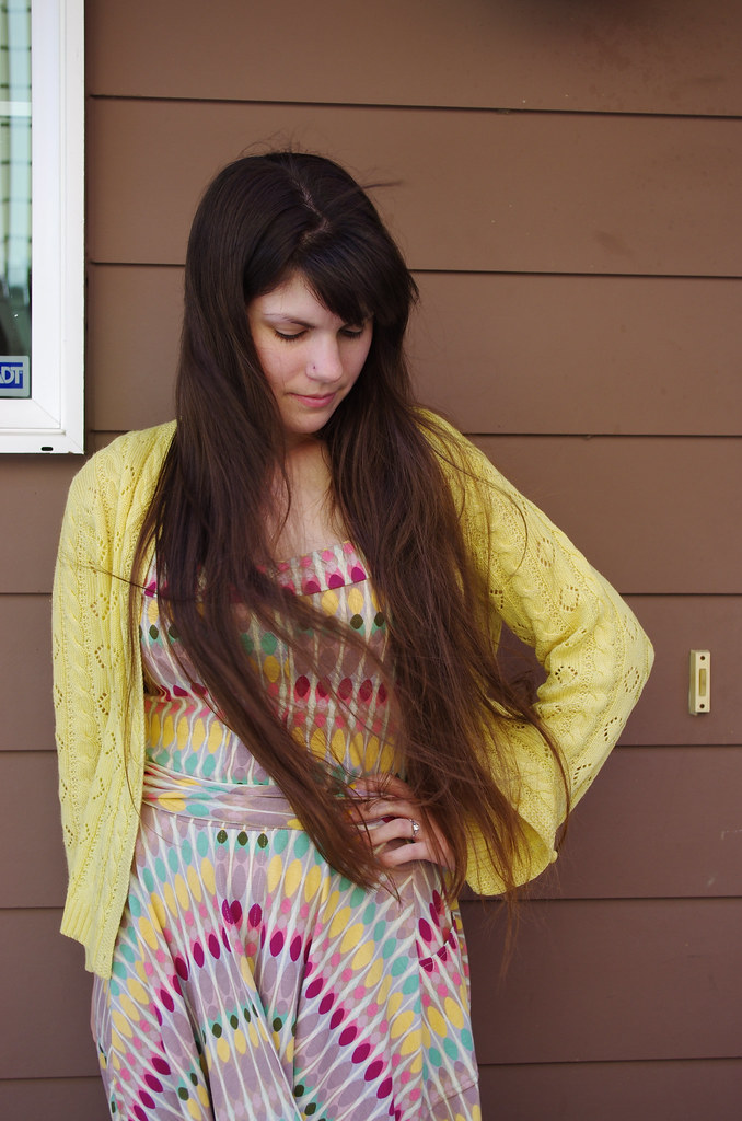
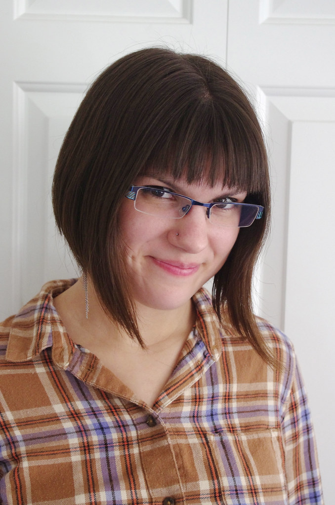
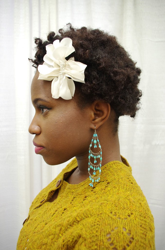
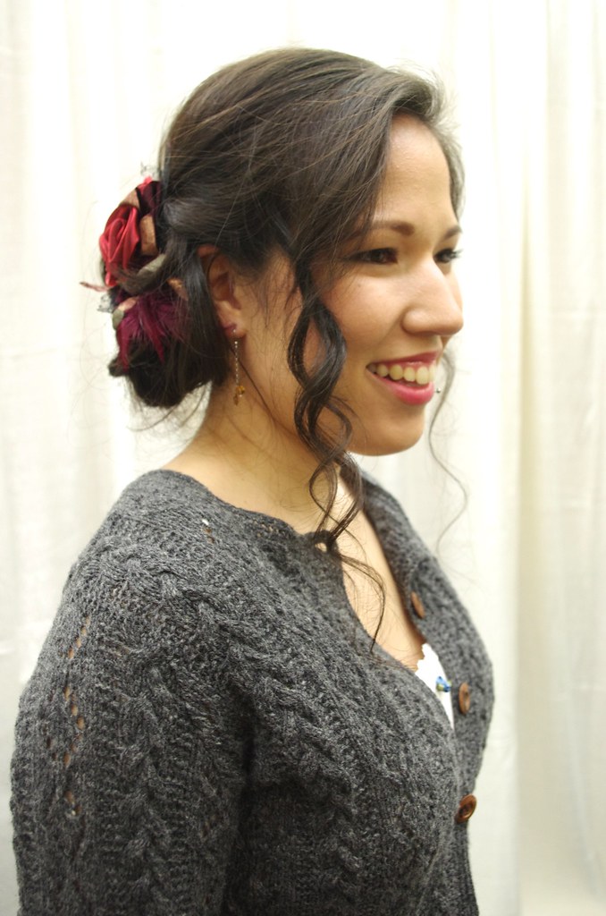
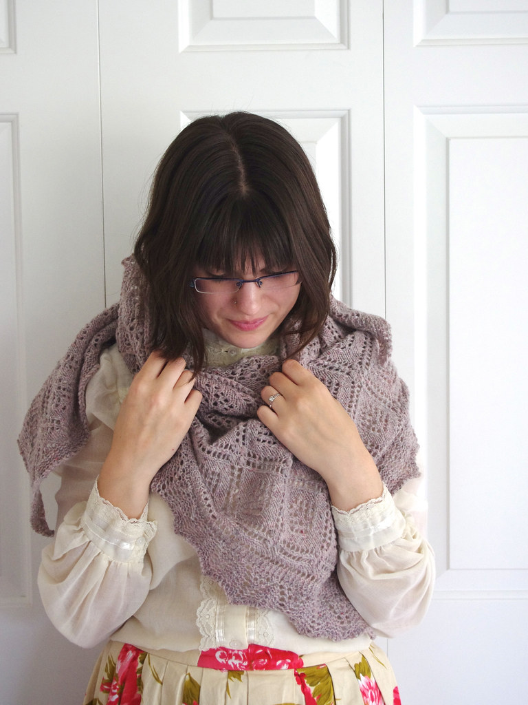
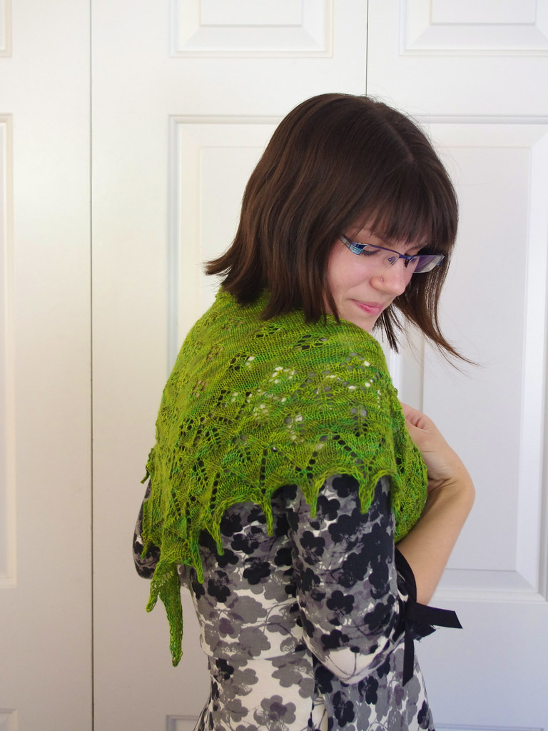
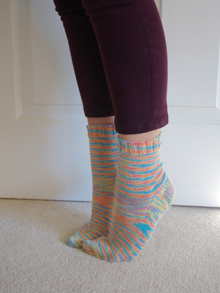
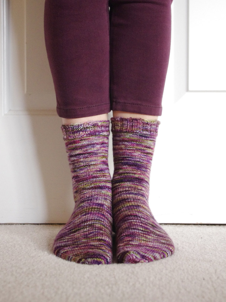
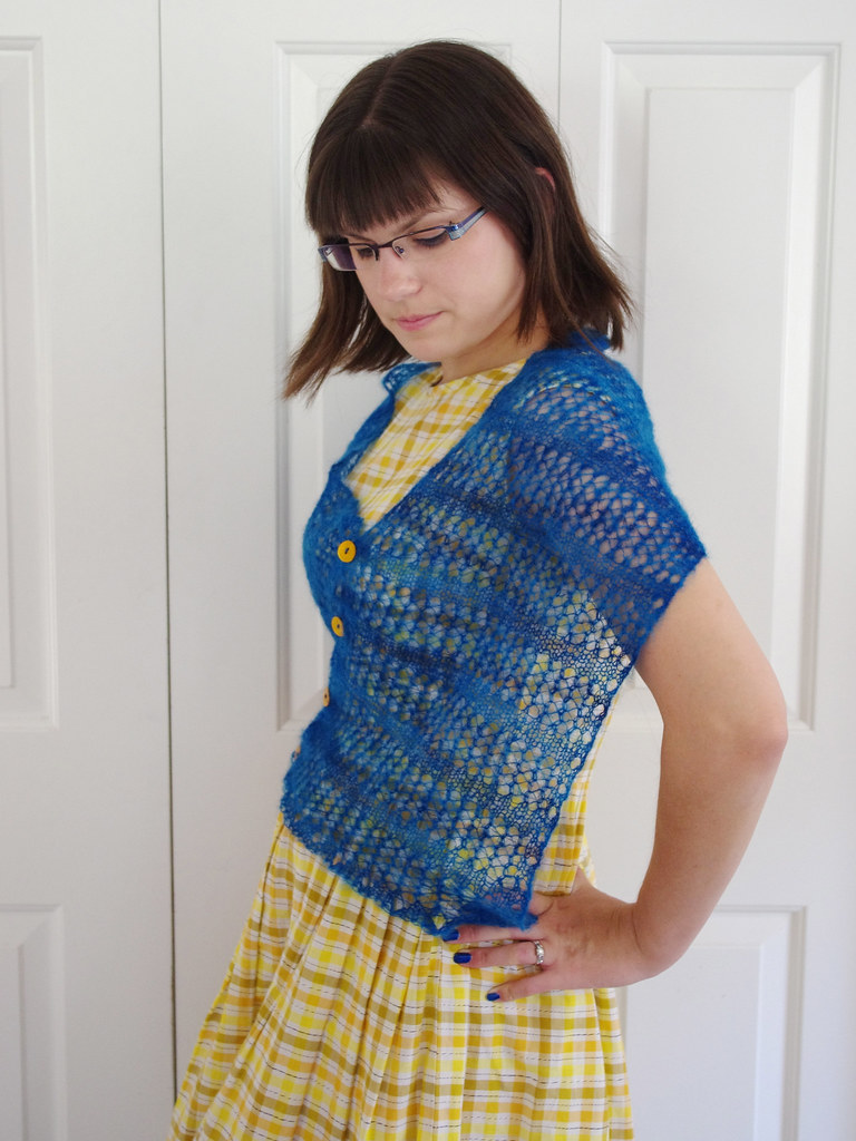
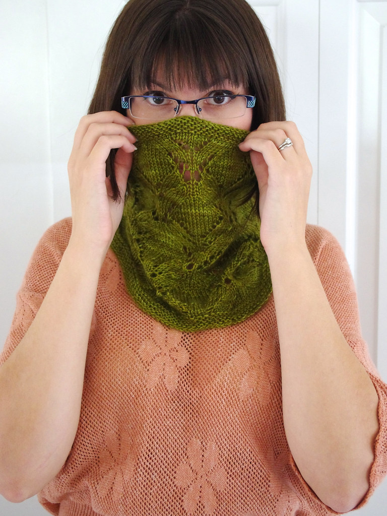
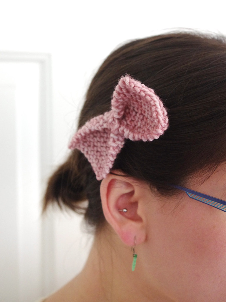
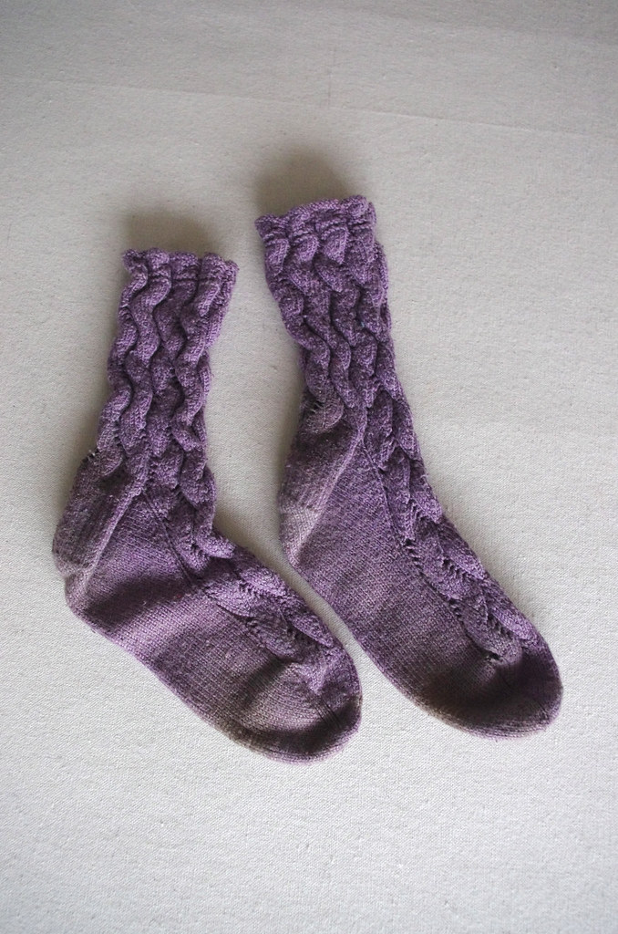
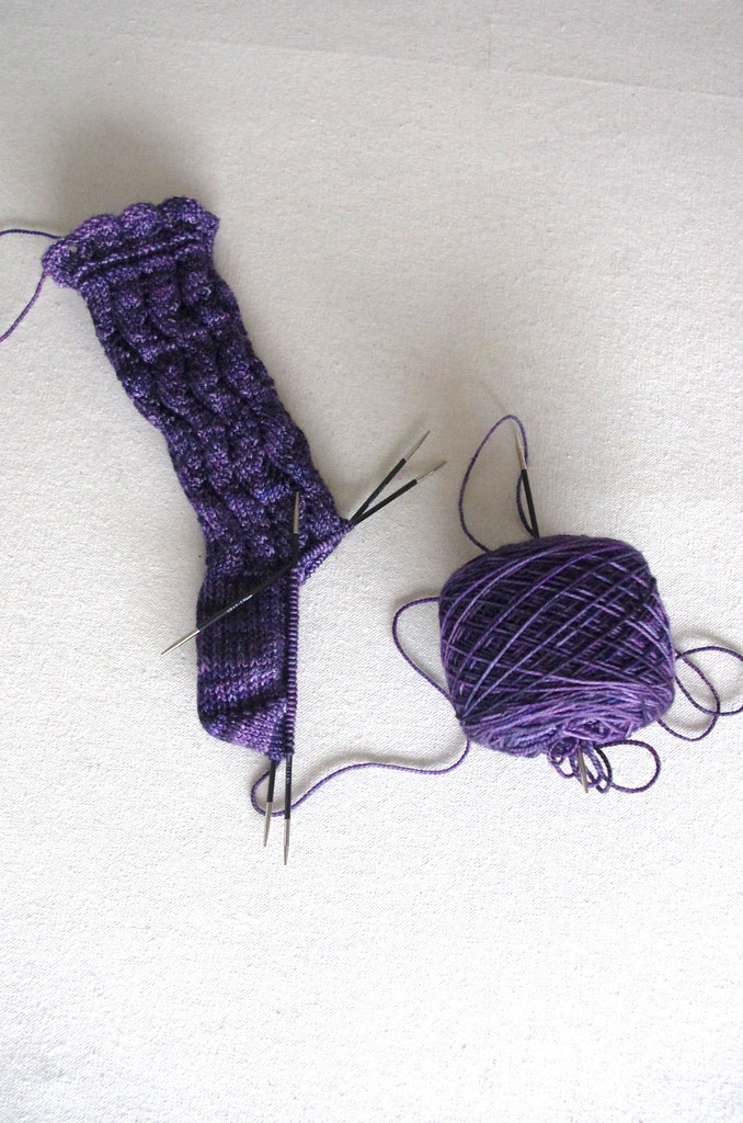
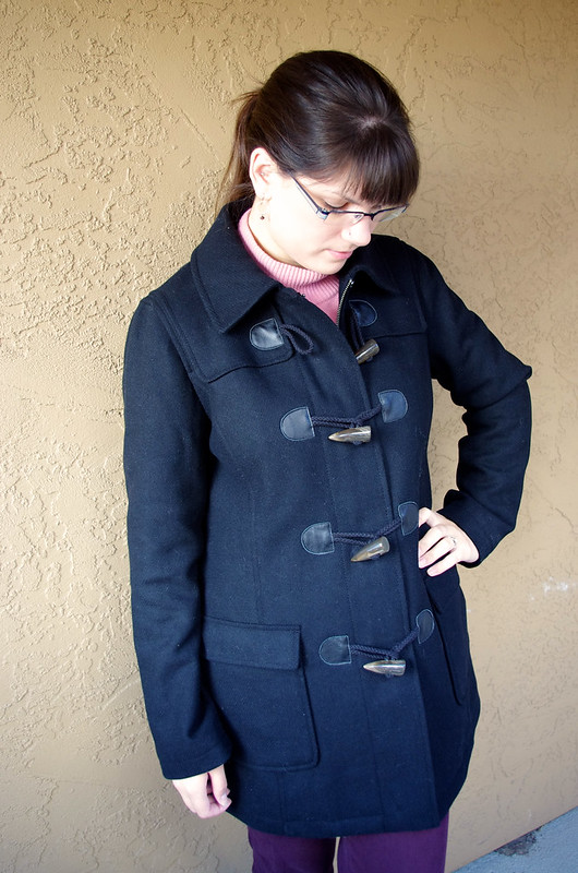
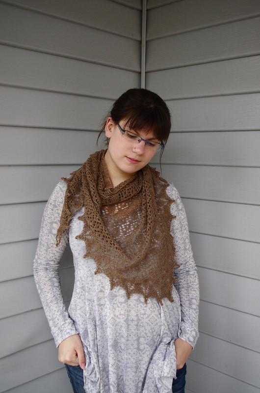
So I was working in Photoshop tonight and was able to noodle around with color correction. Out of curiosity, I practiced by trying to fix something that has been bugging me forever - namely, the crappy colors caused by our old porch. When I got my new coat right before we went to Iceland, Lumberjack took some photos of me wearing it on said porch, and I was never happy with the colors in those photos. Lo and behold, all I had to do in Photoshop was tweak the Blue saturation in the Hue/Saturation adjustment menu, and out came the true black I was looking for. Sorcery!
(Also, in general, I hated that porch, because the color of the stucco made every single color look like crap. Blacks turned blue, oranges looked vomitous, and blues and reds were almost impossible to photograph correctly. The whole time we lived there, I missed the clean light of the Bellevue porch, which produced clean, beautiful colors with minimal post-processing.)
 Sigh
Sigh. I loved that porch.
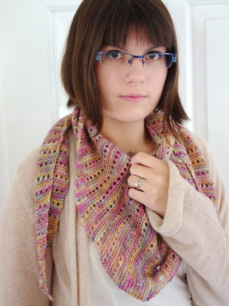
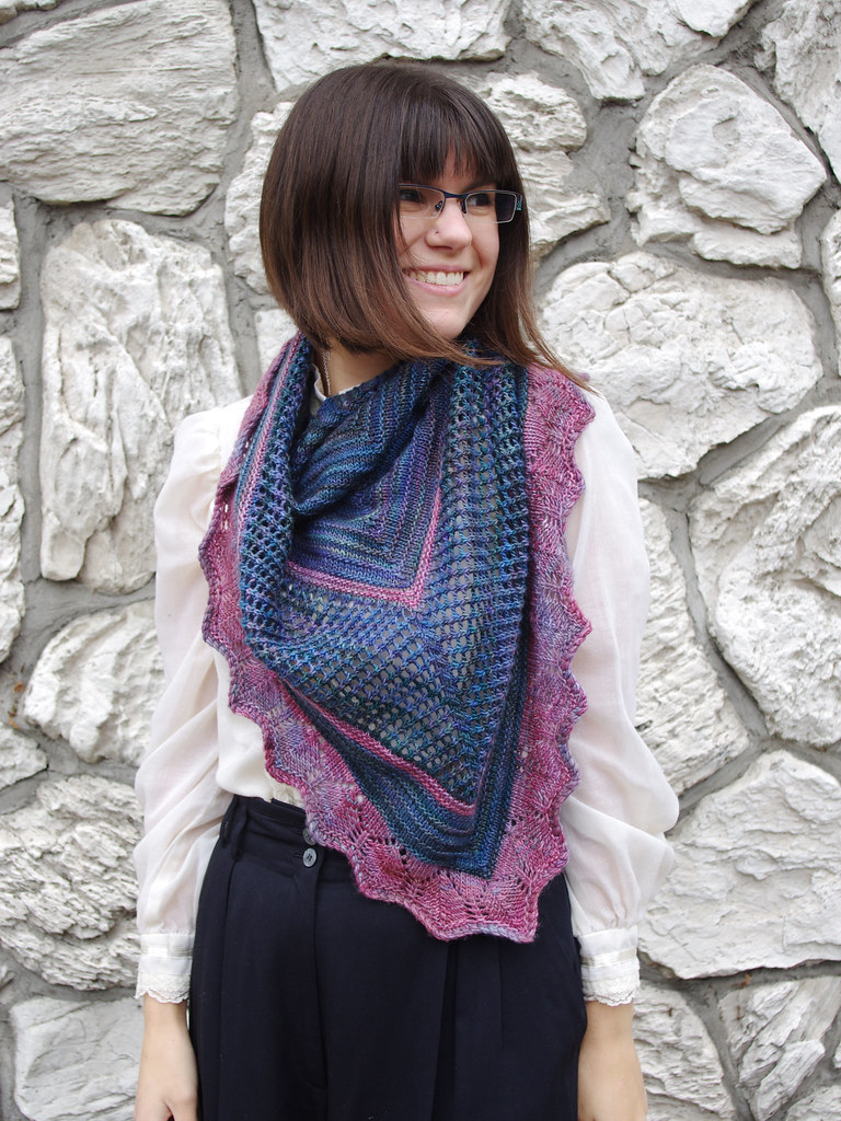
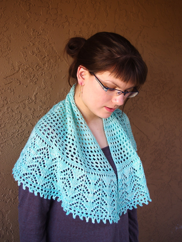
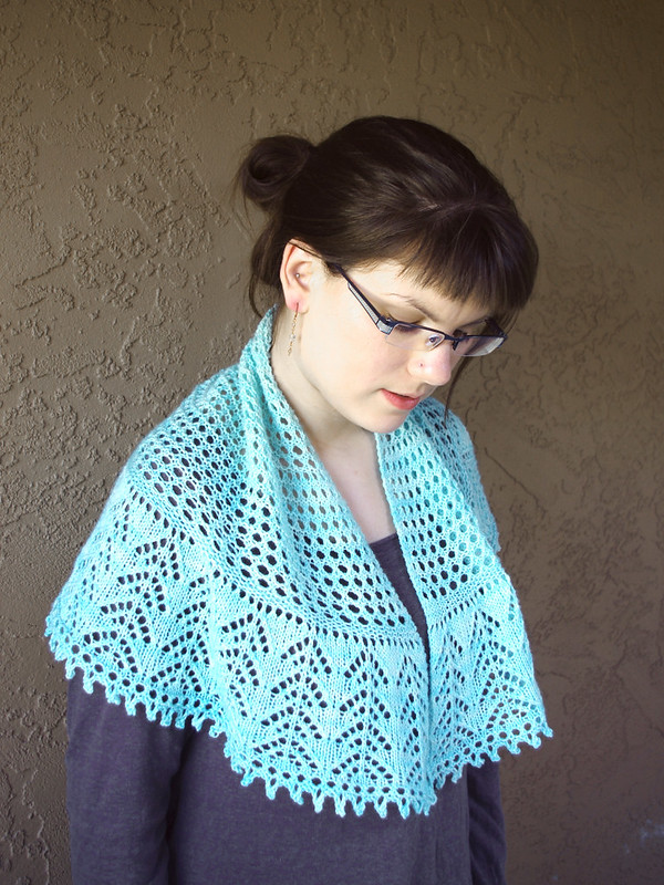
Once I saw a glimpse of how powerful the program can be, I fell down the rabbit hole a little bit, and grabbed more photos to play with color and how it affects the look and feel of the image. I chose another one that I was never quite happy with: a photo of my
Afternoon Tea shawlette. In order to get the shawl to about the right color using iPhoto's color correction, I had to turn the background an odd shade of orange, which made the shawl look weirdly fluorescent. The photo looks bright and beachy, and doesn't reflect the actual colors of pretty much anything in it.


Holy cats. The difference is pretty intense. Admittedly, I'm not sure which of these photos is really "better" - I think the orange/blue contrast in the original photo is interesting, but it's turning my skin orange too; in the second photo, everything - my skin, the shawl, the wall - is closer to its actual color, but now I look a little green, and the blue looks kinda gross with that washed-out brown, so obviously I didn't quite fix it. (Damn you, shitty stucco. You are the worst.)
Usually I do very little post-processing with my photos, mostly just in iPhoto, so doing color correction in Photoshop is a new endeavor for me. Working on my portfolio has made me really interested in graphic design, and my aesthetic tends to lean heavily on photography, so now I'm even more curious about the nitty-gritty details of composition, color, and style. (For example, why do certain photos within a set look "right" and others don't? What makes an image compelling? Is it possible to quantify a photograph's "rightness"? What does "right" even mean, anyhow? SO MANY QUESTIONS.)
I can't wait to fiddle around with it more!

