For some reason, this week I was really motivated to start messing around with my portfolio again. I've been working on it off and on for the last few months, so I had a few ideas about the next step, but Wednesday I finally sat down and worked on it... and ended up finishing a draft of the Fashion Illustration section. Whee!
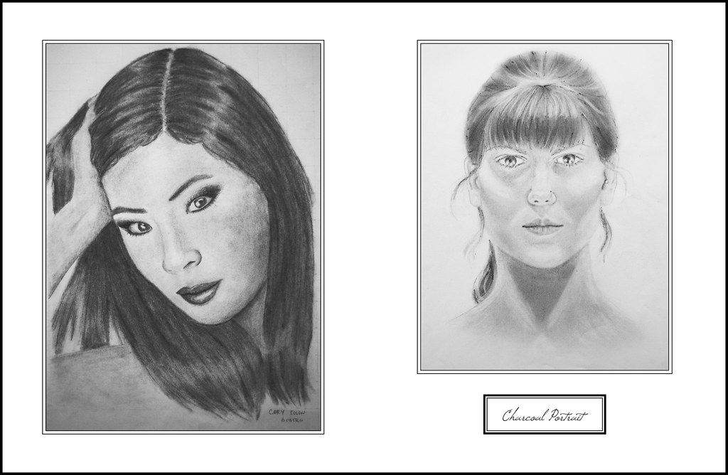
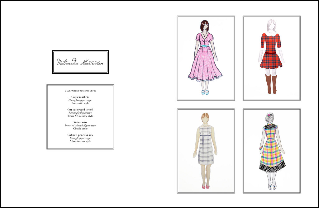
In each section, I'm doing a different layout to exercise my graphic design chops. For this section, I wanted to give a varied but specific range of examples of my illustration skills, with a pretty script balanced out by an unfussy layout and graphic borders.
Over the last three years at NYFA, I've worked with watercolors, pen, colored pencil, markers, cut paper, charcoal, and Illustrator, and I've done a lot of experimentation with different media to get a variety of effects in my illustrations. I really enjoy having the ability and freedom to illustrate garments in all these different ways, and I think it's made me a better designer and patternmaker.
Over the last three years at NYFA, I've worked with watercolors, pen, colored pencil, markers, cut paper, charcoal, and Illustrator, and I've done a lot of experimentation with different media to get a variety of effects in my illustrations. I really enjoy having the ability and freedom to illustrate garments in all these different ways, and I think it's made me a better designer and patternmaker.
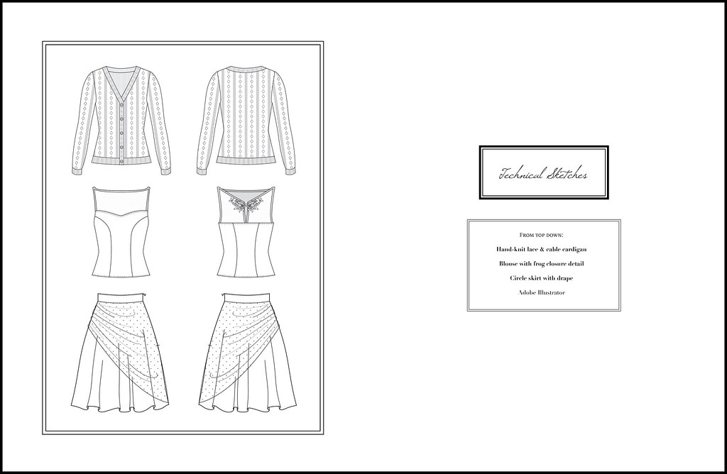
So after the fun, designy illustrations, I decided to include some of my flat sketches as well. I actually love doing these type of illustrations, especially when I haven't created the garment yet; it really forces me to think about all of the functionality of a piece, because ultimately someone should be able to figure out how to make that garment based on the flat sketch alone.
It can also be a nice reference for proportion and details - there were quite a few times during the show that I would look back at a flat sketch to double-check the design lines or seam placement of a garment!
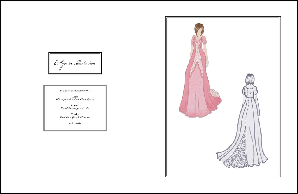
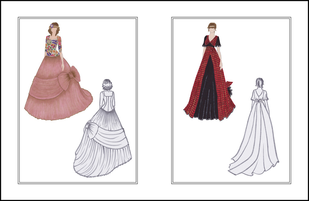
These ones are probably familiar - it seems like just yesterday that I was illustrating my ballgowns! In the process of creating the presentation, I scanned the original illustrations and spent hours editing them, so I have nice clean digital copies that I can print or use digitally as many times as I need to. Thanks, past self, for thinking of everything!
Overall, this draft was probably about 8 hours of work, and I'm really happy with the overall feel of the section. The next section will be ballgown, so that will probably happen sometime in August.
Happy Friday!

2 comments:
Nice work! I have woefully inadequate graphic design skills, and therefore, no digital portfolio. I suppose it's good that I desire to be self-employed, but it's a lot harder to document to best advantage all that I work on, or accomplish.
Thank you! I think the biggest obstacle for me when I started my portfolio was the idea "graphic design" as defined by other people - that it had to be complicated and artistic in a certain way, which is not my aesthetic at all.
Once I was able to look at a publication and recognize what I liked and didn't like about their design choices and why, it gave me a lot more confidence in my own taste and abilities.
So even if you never really dig into graphic design, if you decide to make a digital portfolio, there's no rule that says simplicity is wrong! I'd be happy to give you ideas or feedback if you're ever interested. That said, your work is beautiful, and it will shine through whatever portfolio layout you choose!
Post a Comment