
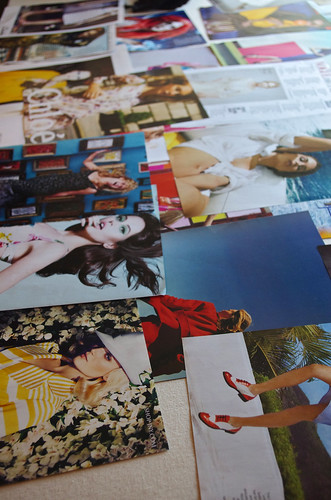
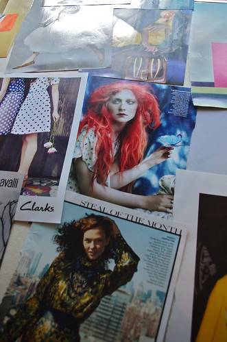
This morning I went in to school to do some magazine tears for my upcoming storyboard class. I had been feeling a little lost in the endeavor, because it was really difficult to find photos that were the style that I was going for and the same color palette. After some feedback from one of my teachers, I changed the way I was thinking about it and started tearing things that were the right color palette and general feeling, even if they weren't literal representations of what I want to design.
And all of a sudden, things started clicking. I looked for particular colors and color combinations, and I'm pretty lucky that bright colors have been trendy for the last few years, because I found not just one but a whole handful of tears that incorporated my colors.
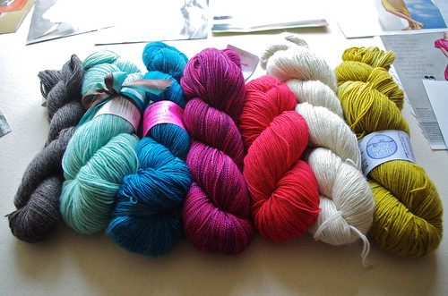
Just for fun, I pulled some yarn in the colors that I'm thinking of. I haven't decided how many of these I'll actually use, but it was pretty cool to get a more cohesive idea of the elements I want to include on my storyboard.
And once again, my stash proves to be useful outside of its intended purpose. Hah!
2 comments:
Those are so BEAUTIFUL! I love the way they look together all lined up like that!! I think you're on to some great things!
The two colors on the right and the two colors on the left are both favorite color combinations of mine. I've especially been feeling like I need to knit something chartreuse and white lately.
Post a Comment